Download
1 / 4
40 likes | 41 Views
To scale your website for different screen sizes, responsive and adaptive web design methodology works. But, whatu2019s more, an effective approach for the user as well as you (the designer) matters.<br><br>Thus, to help you choose the right approach, the website designing company in delhi has brought you an in-depth comparison.

E N D
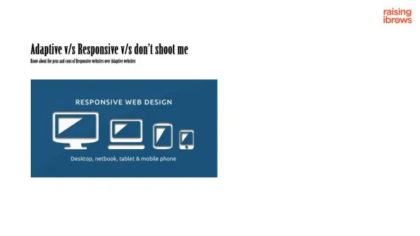
What’s Better: Responsive or Adaptive Web Design? artattackkmedia.hashnode.dev/whats-better-responsive-or-adaptive-web-design Let’s begin with some facts! According to the survey report, 90% of internet users surf through their smartphones, which eventually means more than 50% of the traffic of any website is generated through smartphones. So, it becomes a compulsion for the website design to tap mobile users since most traffic sources are smartphones. You need to develop a website design that is compatible with smartphone users and delivers a good customer experience. To scale your website for different screen sizes, responsive and adaptive web design methodology works. But, what’s more, an effective approach for the user as well as you (the designer) matters. Thus, to help you choose the right approach, the website designing company in delhi has brought you an in-depth comparison. But, before getting into it, let’s understand what they are. What is responsive web design? In responsive web design, a single layout is used and it responsively alters to appropriately fit different screen sizes, no matter which device it is. In technical terms, when you are choosing a responsive web design use media queries to strike breakpoints. This helps to wrap texts, scale images, and alter the layout to fit different sizes of the screen. For this, you can use the following programming languages such as HTML, CSS, HTML5, and CSS3. Here are a few pros and cons of responsive web design: Pros: For the designer, they less work and more time to brainstorm on creation. Responsive websites are easy to maintain. It is also compatible with almost every screen size. Responsive web designs are more mobile-friendly and at the same time, SEO-friendly as well. This approach can also tend to save your resources. Cons: Responsive web design takes a bit more time to load. Some uncertainties, such as uncontrollable layout for every device can lead to degrading the customer experience. What is adaptive web design? 1/4
Adaptive design uses different fixed layouts that are suitable for different screen sizes. For this, you need to have multiple versions of a web page. This type of web page is reordered and remains similar to the original one. The myth with adaptive web design is that many thinks, you need to develop separate sites. Through this approach, you can maintain all your content in a single place and make use of the same content with every adaption. In adaptive sites, you need to have a primed template for each device. Here are a few pros and cons of responsive web design: Pros: It’s easy to create different layouts required for adaptive design because all you need to do is create wireframes for the different screens. You have complete control over the layout. Adaptive websites have faster loading time. The approach is perfect for redesign or enhancement. Cons: There are chances, where users may access the site through a device that isn’t designed can affect the appearance. Responsive web design Vs. Adaptive web design One with expertise in website design can actually experience a big difference between both of these approaches. Loading time: No matter which type of website or how big the site is, what’s crucial is loading speed. Your prime focus on the website’s speed and performance will help you reduce the bounce rate. People surfing on the internet don’t want to spend much time waiting for the website to load. They will wait approximately for up to three seconds. This shows how important website speed and performance are, so choosing the right approach is essential. Responsive web design takes a bit more time, which can affect the customer experience. This happens due to automatically scaling according to screen size. On the other hand, adaptive web designs load faster compared to responsive website designs. This is due to the layouts being ready and it needs to only transfer necessary assets specific to each device. Layout: 2/4
While using the responsive approach, you don’t need to put in a lot of effort, you have to design a fixed layout, which automatically scales to different screen sizes. However, you don’t have complete control over the layout, and viewing the layout is decided by the visitor. It’s not the case with adaptive web design, you need to design each layout for different devices (at least six - the most commonly different screen sizes). Adaptive designs can be controlled and it is determined at the back end. Another factor that’s impressive is, the right design layout is selected, where the server detects the device type and operating system. SEO-friendly: SEO is another aspect to look for. Today, everyone wants their website to get ranked high on the result page. For this, there has been a constant effort from every website holder to improve their ranking. Responsive web designs are more SEO-friendly, which it makes easy for the search engine to crawl with more ease. On the other hand, adaptive web designs are SEO-friendly but not that much as compared to responsive web design. The Result We believe both approaches are great and it helps you overcome the ultimate challenge of delivering a quality customer experience to mobile users. However, you may choose to select the best at the time for you. Here are the greatest website example of responsive and adaptive websites, which shows why both methodologies are excellent. The greatest eCommerce site - Amazon is an example of an adaptive web design, and Starbucks - the luxurious cafe brand is an example of a responsive web design. To experience the difference, you may experiment with them by accessing them through different devices 3/4