Download
1 / 9
90 likes | 263 Views
Mobile designs are the fastest growing strategy on the web. Shouldn't your website be one of those websites that are compatible with your smart phone? If you're ready to join the mobile revolution, we at Red Spot Design are ready to help you make it happen, quickly, simply and cost effectively. http://www.redspotdesign.com/mobile-web-design-dallas.php

E N D
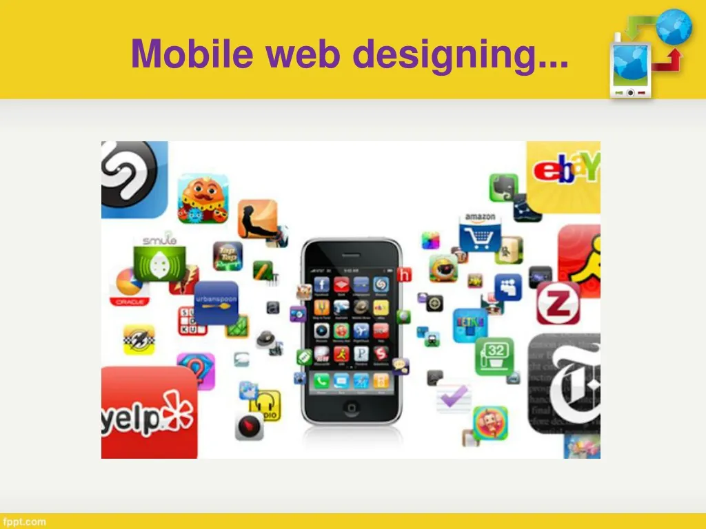
If your mobile website is optimized,it means that it's been designed to fit precisely on the smaller mobile device screen.
The difference between having a desktop website and a mobile website When a visitor tries to access your website on their smart phone, it has to be user-friendly with the mobile device or it's going to look distorted.
If the design is not optimized and laid out correctly, the viewer may see the wrong content or worse they may view what appears to be a disorganized arrangement of words and design, which of course can't be good for business.
Generates new business • Enables easy navigation • Improves the user experience • Is interactive and easy to access • Makes surfing more fun and much easier • Improves SEO performance • Rankings rise on mobile-friendly search • engines • Increases business visibility
Need more details… Contact us: Red Spot Design - Dallas SEO / Web Design3010 LBJ Freeway, Suite 1200Dallas, TX 75234 Dallas / Ft. Worth: 214-432-1608 Toll Free: 888-636-1344 Fax: 214-613-1626 Website: http://www.redspotdesign.com/