Download
1 / 7
80 likes | 102 Views
An image can often convey what’s exactly going on and as per big data visualization is considered, you may recall statements like “a picture is worth a thousand words”. With its data visualization techniques, though big data did the vice versa turning facts and information into pictures, making the decision-making process easier for the viewers as in recognizing what the data has to say and what effects are likely to occur.

E N D
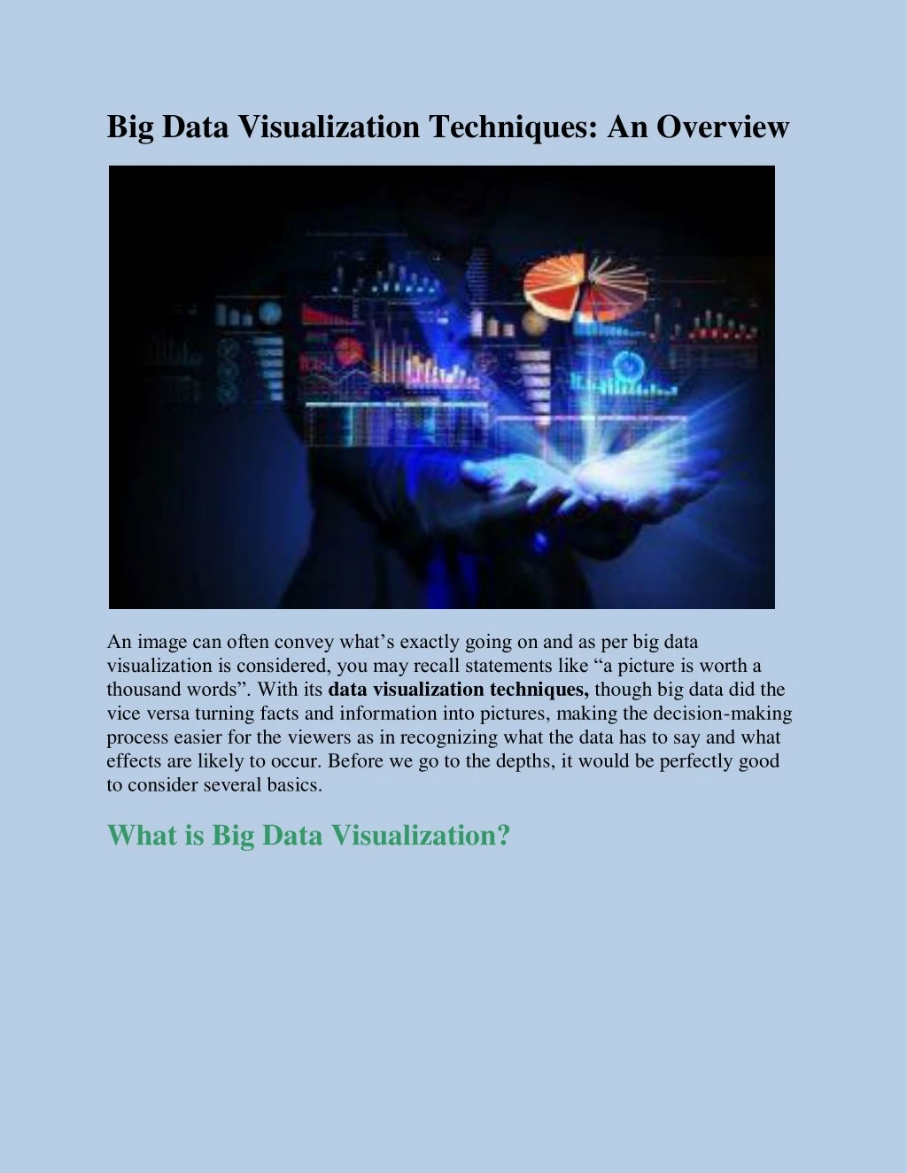
Big Data Visualization Techniques: An Overview An image can often convey what’s exactly going on and as per big data visualization is considered, you may recall statements like “a picture is worth a thousand words”. With its data visualization techniques, though big data did the vice versa turning facts and information into pictures, making the decision-making process easier for the viewers as in recognizing what the data has to say and what effects are likely to occur. Before we go to the depths, it would be perfectly good to consider several basics. What is Big Data Visualization?
via: sina Big Data Visualization considers the presentation of almost any type of data in graphical format, making it easier to interpret and understand. However, these presentations are beyond any typical corporate histograms, graphs, pie charts and any other representations like this. These include even more complex representations like fever charts and heat maps, enabling a better exploration of information, identification of correlations and unexpected patterns. Scale is one of the defining features of big data visualization. Enterprises can store and manage large amounts of data that would have taken numerous years for humans to create and collect. Big Data visualization helps in ingesting large amounts of raw corporate data and processes it further into graphical presentations which make larger analysis possible within a few seconds. ALSO READ: BIG DATA SECURITY: SECURITY ISSUES AND CHALLENGES IN THE QUEUE Big Data Visualization Techniques There are different ways of course for presenting data from various categories. Depending on the cases and situations, the following techniques may be used: Two-Dimensional (2D) Area
Such graphical representations are generally used for geospatial presentations i.e to showcase a certain geographic area or a specific location on the globe. These types of data visualization techniques are helpful when analysis on a large-scale is required. It is the best option to help the representation of voting results, demographics, business growth rates, tourism etc. The probable techniques of representation under this can be: Area or Distance Cartograms: These are usually the copies of specific parts of several maps which also portray certain additional parameters like population size, demography, travel times or any other considered variables. Choropleth: this is a map using different colors for various specific representations of varying levels of the identified variable. For example the biggest inventory stocks or sakes level per state. via: pinterest Dot Distribution Map: This data visualization method uses dots for highlighting the level of the examined variable within an area. Multidimensional Data Visualizations
via: tapclicks These are known to be the most widespread big data visualization approaches. In order to create an image that is easy to grasp it considers combining two or more dimensions. In case of depicting different values from a single data set, this is one of the best techniques. The probable ways of presentation under this are as follows: Pie Chart: This is, of course, one of the most popular tools for data representation. A pie chart illustrates numerical values, split into sectors with angles and with angles and arcs proportionally set as per the values represented. Histogram: Representing both, time periods and value parameters, a histogram is known o be a series of rectangles. It makes easier to grasp the dynamics of parameter adjustments. Scatter Plot: This data visualization model is known to depict two sets of unconnected dots as parameter values. Hierarchical Data Visualizations
via: microsoft Sometimes you are needed to show a comparison between two or more data value sets. Hierarchical or relation data visualizations stand out to be perfect for this. Some considerable forms of presentations under this are: Dendrogram: It is known to be the hierarchical clustering of various data sets which makes it easier to depict and understand the relations between them instantly. Sunburst Chart: Also known as the ring chart, this is basically a pie chart with concentric circles which describe the hierarchy of various data values. Tree Diagram: This big data visualization method, presents the data structure with tree-like relations. These relations are generally presented upside down or from the left to the right. Network Data Models
via: interaction-design When data sets are required to compared and related to each other, the network data visualization technique arrives as the best way of doing so. Here are the considerable presentations under this technique: Alluvial Diagram: This is known to be the representation of a flow diagram that generally depicts the change in data structure over a considered period of time or under specific situations. Node-Link Diagram: This is a circular image consisting of dots which represent dots which further depict lines and data nodes and the links between said nodes. Using this, the relation between data sources can be interpreted and the probable results can be recognized. Matrix: This is a chart or a diagram used to represent two or more data sets connected to each other via some relations. A matrix helps in showcasing the position of data sets against each other and also the relation they behold. Temporal Visualizations
via: niemanlab Though they look like simple linear graphs, temporal visualizations are much more complex and descriptive images with several starting and finish points and some overlap items measured over them creating a descriptive image of variable adjustment. Below mentioned are the types of data visualization under this: Connected Scatter Plot: It consists of a plot of values for two variables that are known to be fetched from a data set. Scattered over the picture these values are known to be connected with a line. Polar Area Diagram: This might create an image like a standard pie chart. However, the difference is that the size of the sector is depicted by the distance from the center with respect to the angle and arc length. Time Series: This is one of the most used examples in case of continuous data evaluations over a considered period of time. This is one of the best data visualization techniques for the presentation of historical data. ALSO READ: IMPORTANCE OF WIREFRAMES, MOCKUPS AND PROTOTYPES... The above-mentioned data visualization techniques would be just the tip of the iceberg. There are still many more that can be successfully implemented. Approach is not an issue; big data can make use of both traditional and special visualization techniques in order to make it understandable for various business users.