Download
1 / 4
40 likes | 49 Views
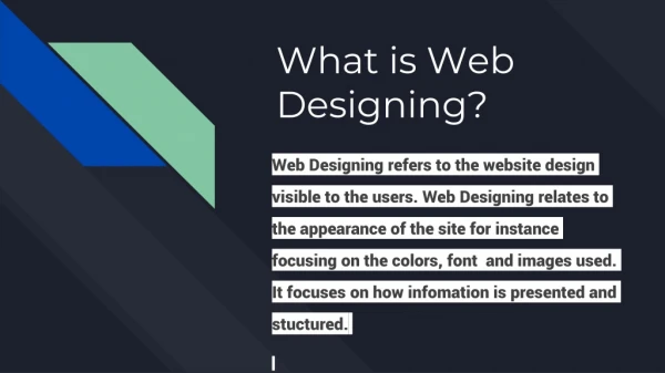
Design of a website is the first and most important part of a website regardless of its content.

E N D
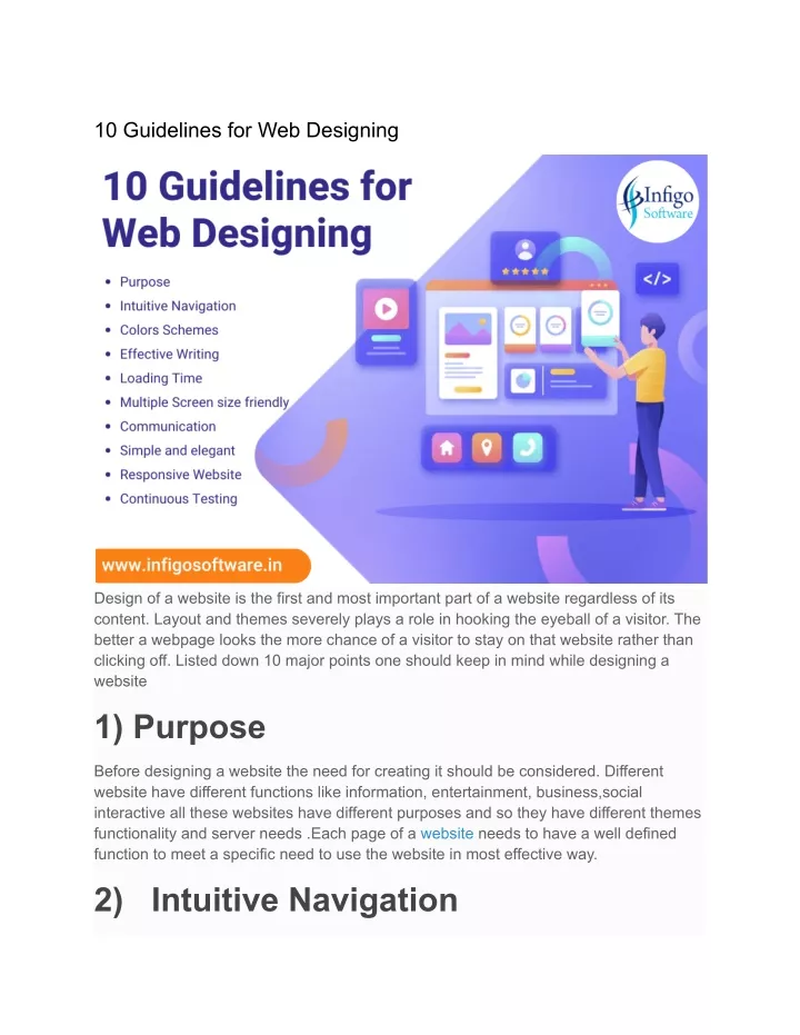
10 Guidelines for Web Designing Design of a website is the first and most important part of a website regardless of its content. Layout and themes severely plays a role in hooking the eyeball of a visitor. The better a webpage looks the more chance of a visitor to stay on that website rather than clicking off. Listed down 10 major points one should keep in mind while designing a website 1) Purpose Before designing a website the need for creating it should be considered. Different website have different functions like information, entertainment, business,social interactive all these websites have different purposes and so they have different themes functionality and server needs .Each page of a website needs to have a well defined function to meet a specific need to use the website in most effective way. 2) Intuitive Navigation
Navigation is all about how easy is for the visitor to move around different pages of a website. It is quite significant, shuffling through web pages should be as smooth as possible and the navigation to any of the sub pages should made as so it don’t take more than 3 clicks for user to reach at any page of the website. Adding a navigation bar in the home page of a website is best way for easing the navigation to sub-pages. Most pages nowadays uses a drop down menu with 3 lines to make uses direct to different webpages of the website. 3) Colors Schemes A well thought color can go hand in hand while making a user experience enhancement. Color scheme of a website should be made according to the theme and the content of the website. Bright or glossy color sometimes makes text unreadable and is not pleasing to eyes as well. Choosing a color which suits the theme content and is eye-catching to the visitor is equally important while designing a website. Right color combination uplift the appearance of a website. Using contrast color of background and text will makes eyes easier on the eye to read. Effective Writing As website texts are different from printed texts it’s important to adjust writing style to the visitor preference and browsing habits. Long text blocks without images and keywords marked differently in bold and italics are likely ignored. Exaggeration should be avoided in writing. An optimal solution is to use short concise phrases, use of plain and objective language, straight to the point information. Loading Time A website is hated and clicked off if it takes forever to load up. So it is important to design such a website that it loads up quickly even when the connection speed is poor. Image size and other aspects should be optimized to speed up load time. Few of the features of the website should be restricted to slow connection speed to make the webpage function quickly. Different modes like text only , low quality images media can also be used for different connection speed and different screen sizes which help in reducing delay time. Multiple Screen size friendly
It is pretty common to use multiple devices to access website from desktop, laptop to tablet and smartphone so it is important to consider each screen size and design according for smooth user experience on each of the devices. The website should be adoptable to different screen sizes and width without affecting it’s original appearance and functioning. If the website is not mobile friendly a different responsive layout can be implemented for mobile and tablet users. Communication Visitors on a webpage tend to want information as quickly as possible,so it is necessary to communicate clearly,and make information as subtle and crisp as possible.Instead of having long paragraphs some effective methods of designing like organizing information using headlines, sub headings, bullets and points makes information more appealing to people on the website. A contact form at the bottom is easiest way to have a visitor and the web host to interact and contact each other. Simple and elegant Keeping it simple should be the primary aim of the site design. Users of a website are rarely on the website to enjoy its design, in most cases they are looking for information instead of a great looking website. Strive for simplicity instead of complexity. For a visitor a site of pure text without any advertisement or further contents blocks matching the query users are looking for . This is the reason why a user-friendly print version of web pages is essential for good user experience. 9) Responsive Website A simple website with text and few images won’t make any significant impact on the visitor. To catch more attention, making a responsive website is the best way possible. Pop-up, moving images , gallary, and other forms make the webpage more interactive to the visitor. Drag and drop-down menu makes a webpage more lively and also saves some good amount of space to display more information and advertisements as well. These responsiveness makes the overall look of the website more neat and simple while having information right in front of users eyes.
Continuous Testing This is called testing early and testing often. These principles should be applied to every web page created as it helps to eliminate any error on the webpage as early as it occurs and help restricting it to that particular webpage. Each web page should be tested on different devices and popular browsers so to check its functionality and appearance on different devices and browsers supporting all its features should also be checked. These checks should also include any loopholes in security that may be present and possibly could be exploited by a hacker to gain access. Regular checking prevents the website form shutdowns and less maintenance .