Download
1 / 9
0 likes | 7 Views
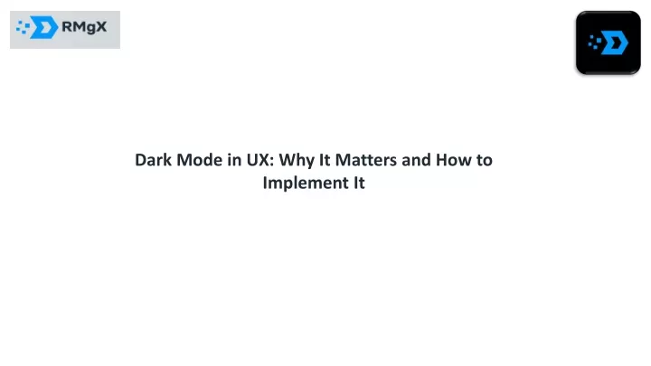
In the ever-evolving world of user interface design, trends come and go. However, one trend that seems here to stay and has captured the imagination of both users and developers is "Dark Mode.<br><br>Visit: https://www.rmgx.in/blog/dark-mode-in-ux-why-it-matters-and-how-to-implement-it

E N D
In the ever-evolving world of user interface design, trends come and go. However, one trend that seems here to stay and has captured the imagination of both users and developers is "Dark Mode." It's not just a visual choice, but a carefully designed and thought-out aspect of the user experience (UX). Dark mode involves using dark colours, often black or dark grey, as the background of an app or website. In this article, we'll delve into the reasons why dark mode matters and how to effectively implement it to create a memorable and user-friendly experience.
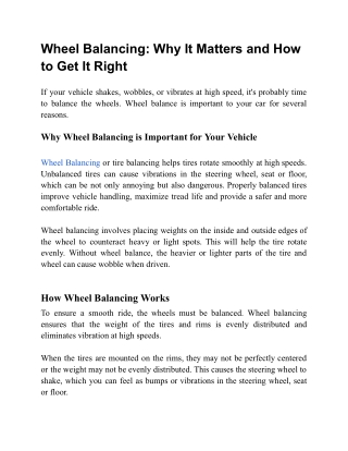
The Benefits of Dark Mode Dark mode offers a myriad of benefits for both users and developers, making it more than just a visual preference. Let's explore why it has become such a hit: 1. Reduced Eye Strain and Enhanced Comfort: Using digital devices in low-light environments or at night can often lead to eye strain and discomfort. Dark mode helps mitigate this by reducing the amount of harsh white or bright colours that can be hard on the eyes
2. Battery Life Savings: For those with devices featuring OLED or AMOLED screens, there's another compelling reason to embrace dark mode. These screens consume less power when displaying dark pixels, which translates to longer battery life. So, in addition to being easier on your eyes, it's also kinder to your battery. 3. Improved Readability and Contrast: Dark mode enhances the readability of text, images, and other elements on the screen. The high contrast between text and background in dark mode ensures that content stands out, making it easier for users to absorb information.
4. Aesthetic Appeal: Dark mode isn't just about functionality; it's also about aesthetics. Many users find the sleek and modern look of dark mode to be visually appealing and trendy. It can give your app or website a cutting-edge feel that resonates with your audience. The Art of Implementing Dark Mode While the benefits of dark mode are clear, implementing it successfully is not as straightforward as flipping a switch. There are some key considerations and best practices that can help you create an engaging and functional dark mode for your users:
Choose the Right Dark Shades: Selecting the appropriate shades of dark colours is crucial. Avoid extremes like overly bright or excessively dim backgrounds. These extremes can be uncomfortable for the eyes. Your choice of dark colours should also align with your brand identity and tone. Achieve a Balanced Colour Scheme: Maintaining balance in your colour scheme is essential. A balanced blend of dark and light colours creates hierarchy, guides users through your interface, and keeps it visually interesting. Striking this balance prevents a dull or gloomy atmosphere.
3. Harmonise Graphics: Graphics, such as icons, logos, illustrations, and charts, need to be adapted for dark mode. They should stand out and harmonise with the dark background. Ensuring that your visuals remain clear and appealing is a vital aspect of the design process. 4. User Preference and Accessibility: Dark mode should be a choice, not a mandate. Provide an option for users to switch between light and dark modes based on their preferences and needs. Additionally, respecting system settings is a considerate touch that enhances accessibility.
5. Thorough Testing: The importance of testing your dark mode design cannot be overstated. Test it on various devices, browsers, and platforms to ensure its consistency and accessibility across the board. This guarantees that your users have a seamless experience, regardless of their chosen device. In conclusion, dark mode is not merely a passing fad; it's a valuable feature that can significantly enhance the user experience and overall satisfaction of your app or website. When implemented correctly, dark mode can offer users reduced eye strain, extend battery life, and provide an aesthetically pleasing experience. So, don't shy away from the power of dark mode of design; embrace it and elevate your user experience.
India Accelerator, LGF - 007, MGF Metropolis Mall, MG Road, Sector - 25, Gurugram, Haryana - 122002 India Accelerator, LGF - 007, MGF Metropolis Mall, MG Road, Sector - 25, Gurugram, Haryana - 122002 contact@rmgx.in (+91) 9818032177 https://www.rmgx.in/ https://www.facebook.com/rmgx.firm https://www.instagram.com/rmgx_tech/?utm_medium=copy_link https://twitter.com/rmgx_firm?t=Jn2HbQWv7FFCU_dDwqzOsA&s=09 https://www.linkedin.com/company/rmgx