Download
1 / 19
190 likes | 200 Views
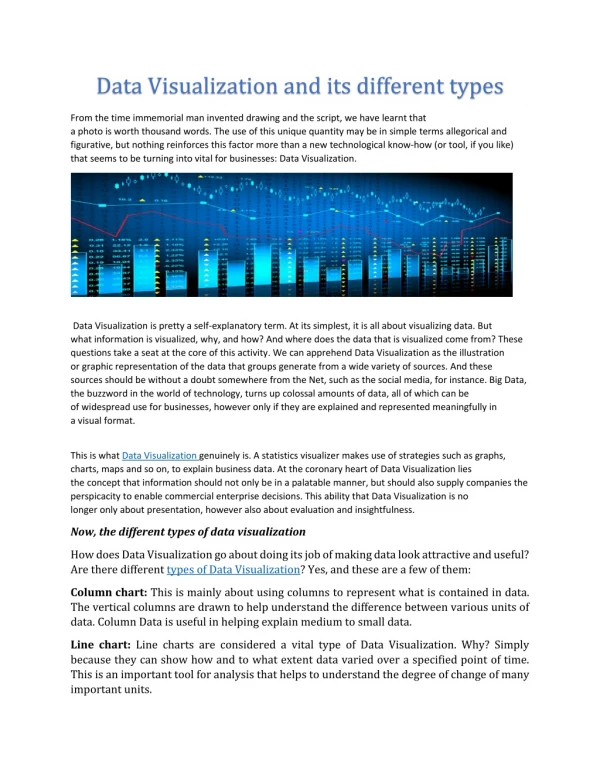
Data visualization is the graphical representation of data to facilitate understanding and analysis. <br>Visit Here: https://nareshit.com/data-science-online-training/<br>contact us: online@nareshit.com| 91-8179191999

E N D
Different Types of DataVisualizationin DataScience https://nareshit.com/data-science-online-training/
Today'sAgenda IntroductiontotheData Visualization TypesofDataVisualization https://nareshit.com/data-science-online-training/
Introduction Datavisualizationisthegraphicalrepresentation ofdatatofacilitateunderstandingandanalysis. There are various types of data visualization techniques,eachsuitedfordifferenttypesofdata andinsights.Herearesomecommontypesofdata visualization: https://nareshit.com/data-science-online-training/
TypesofDataVisualization 05 12 BubbleChart Heatmap 06 13 NetworkGraph ChoroplethMap 07 14 SankeyDiagram WordCloud
40 01 LineChart Alinechartdisplays data points connected byaline,oftenusedto showtrendsovertimeor continuousdata. 30 20 10 0 Item 1 Item 4 Item 5 Item2 Item3 https://nareshit.com/data-science-online-training/
02 BarChart 25 Abarchartrepresentsdata usingrectangularbarsof varyinglengths,commonly usedtocomparecategorical data. 20 15 10 5 0 Item 1 Item 4 Item 5 Item2 Item3 https://nareshit.com/data-science-online-training/
03 PieChart Item 5 20% Item 1 20% Apiechartdividesawhole intoslicestorepresentthe proportionofdifferent categorieswithinthedata. Item 4 20% Item2 20% Item3 20%
04 ScatterPlot 250 Ascatterplotshowsthe relationshipbetweentwo numericalvariables,plotting pointsonaCartesian coordinatesystem 200 150 100 50 0 0 1 0 2 0 3 0 https://nareshit.com/data-science-online-training/
05 Heatmap Aheatmapusescolor-coded cellstorepresentvalues withinamatrix,providinga visualsummaryofdata patternsandrelationships https://nareshit.com/data-science-online-training/
06 AreaChart Anareachartissimilartoa linechartbutwiththearea beneaththelinefilled, emphasizingthecumulative totalordistributionover time https://nareshit.com/data-science-online-training/
07 Histogram 3 Ahistogrampresentsthe distribution of a continuous variablebydividing itinto binsanddisplaying the frequency or proportion of observationswithineachbin 2 1 0 1 1 4 12 16 0
08 Treemap Group1 Atreemaprepresents hierarchical data using nestedrectangles,wherethe sizeofeachrectangle corresponds to a specific attributeorvalue. Subgroup1 Subgroup2 Subgroup3 Group4 Group2 Group3 Subgroup4 Subgroup… Subgroup8 Subgroup9 Subgroup5 Subgroup7
09 BoxPlot Aboxplotdisplaysthe distribution of a numerical variablethroughquartiles, outliers,andothersummary statistics, providing insights into the data's spread and skewness
10 BubbleChart Abubblechartdisplays three variables by using circlesofdifferentsizesand colors to represent the relationshipsbetweenthem
11 NetworkGraph Anetworkgraph,oranode- linkdiagram,illustrates relationships between entities as nodes (points) and their connections as links(linesorarcs) https://nareshit.com/data-science-online-training/
12 ChoroplethMap Achoroplethmapusescolor orpatternstorepresent datavaluesacross geographicregions, providinginsightsinto spatialpatterns
13 SankeyDiagram ASankeydiagramvisualizes theflowofdataorresources throughinterconnected pathways,oftenusedto showenergyflows,migration patterns,orcustomer journeys.
14 WordCloud Awordclouddisplayswords fromatextdataset,where thesizeorcolorofeach wordcorrespondstoits frequencyorimportance. https://nareshit.com/data-science-online-training/
Thankyoufor Visiting https://nareshit.com/data-science-online-training/ support@nareshit.com +91-8179191999