Download
1 / 3
30 likes | 43 Views
Curious to know about the difference between Cross-browser and responsive testing since both play a major role while delivering an exceptional user experience. This blog may help you better understand the specifics of the two.<br><br>

E N D
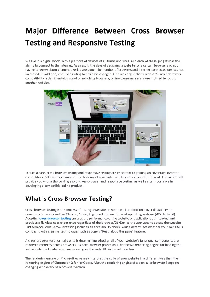
Major Difference Between Cross Browser Testing and Responsive Testing We live in a digital world with a plethora of devices of all forms and sizes. And each of these gadgets has the ability to connect to the internet. As a result, the days of designing a website for a certain browser and not having to worry about element overlap are gone. The number of browsers and internet-connected devices has increased. In addition, end-user surfing habits have changed. One may argue that a website’s lack of browser compatibility is detrimental; instead of switching browsers, online consumers are more inclined to look for another website. In such a case, cross-browser testing and responsive testing are important to gaining an advantage over the competitors. Both are necessary for the building of a website, yet they are extremely different. This article will provide you with a thorough grasp of cross-browser and responsive testing, as well as its importance in developing a compatible online product. What is Cross Browser Testing? Cross-browser testing is the process of testing a website or web-based application’s overall stability on numerous browsers such as Chrome, Safari, Edge, and also on different operating systems (iOS, Android). Adopting cross-browser testing ensures the performance of the website or applications as intended and provides a flawless user experience regardless of the browser/OS/Device the user uses to access the website. Furthermore, cross-browser testing includes an accessibility check, which determines whether your website is compliant with assistive technologies such as Edge’s “Read aloud this page” feature. A cross-browser test normally entails determining whether all of your website’s functional components are rendered correctly across browsers. As each browser possesses a distinctive rendering engine for loading the website elements whenever someone types the web URL in the address box. The rendering engine of Microsoft edge may interpret the code of your website in a different way than the rendering engine of Chrome or Safari or Opera. Also, the rendering engine of a particular browser keeps on changing with every new browser version.
Cross-browser testing can be done in two ways: Manual Cross Browser Testing (important for test verification) Automated Cross-Browser Testing (important for test validation POV) Businesses can perform cross-browser testing to enhance customer experience, either manually or automated. Both the approaches have their own significance. Multiple test scripts are executed in a step-by-step fashion on various browsers. When the current browser’s test execution is complete, another browser will be launched. Importance of Cross Browser Testing You have finished the development of your dream website with all the top-notch features you desired and found out that your top-notch website failed badly on performing different desktop browsers or mobile browsers like Chrome, Opera, Edge, etc. How irritating will it be? All your hard work and resources are good for nothing. Launching a web app without properly incorporating cross-browser testing in the software development life cycle (SDLC) can potentially invite the risk of offering a troublesome user experience to the audience who visit your website. This will not only result in failing to grab new clients for your web product miserably, but you are also going to lose your existing customers to stop using your web product. Not only should you consider UX, but you should also consider the UI (User Interface) for your web application or website. Cross-browser testing will improve your users’ accessibility and readability. What is Responsive Testing? The way different browsers rendered the same code varied as the functionality of front-end languages for the web increased. Responsive web design, created by Ethan Marcotte in 2010 with a forward-thinking perspective, outlined criteria for website designers to adhere to in order to make their online applications useable across multiple devices and browsers. Responsive web design has changed over the years, but the underlying principle of keeping your web content device-independent has not changed. Responsive design involves HTML, JavaScript, and CSS code, that would be responsible for rendering your content on any device that the end-user may use to access your content. It requires creating a viewport and leveraging CSS media queries to render text, images, and navigation in a device-appropriate manner based on the device on which your web application is viewed. Responsive testing is the process of rendering web pages on numerous devices’ viewports using CSS media queries based on the user device from which the website is accessed. In simple terms, responsive testing ensures how well responsive the web page is optimized for all shapes of screen sizes and resolutions. Businesses that have a website that performs well on every screen size have a major advantage of capturing the user base and beating their competitors. The end goal is to make sure that the web page looks great and provide relevant information to the website users regardless of the devices they use. There are various components of responsive web design that are taken into consideration when developing the website, such as adaptable layout design, media queries, media, and typography. Responsive design is the process of creating flexible layouts by utilizing flexible grids. It enables auto-change of the size anytime the website’s dynamics such as width, margins, length, and so on change. Incorporating responsive design into an
ongoing project, no matter how simple it appears, is an arduous task. Before beginning any project, it is best to adhere to its guidelines. Importance of Responsive Testing We are in an age where we can access the internet through our watches. There are multiple devices that we as consumers use to go online. And the internet enables devices numbers to be on a constant rise, performing diverse activities like browsing, using a social application, entertainment, etc. Now, it won’t be possible to develop a unique web page for every device available on the market. So, businesses favor Responsive Web Design for this purpose (RWD). The goal of RWD is to eliminate the time and effort required to generate specific web pages for different screen sizes. Using RWD to develop a website or web application can help the web product to render on different devices seamlessly. Once the development phase is done, the testing phase (Responsive testing) will start. To validate that the RWD works as planned. Cross-browser testing and Responsive testing are both branches of the same tree and are vital to offer a flawless customer experience with good UI&UX. Final Thoughts For testing the compatibility of web applications or websites, both cross-browser testing and responsive testing are crucial. Consider cross-browser testing to be an essential component of responsive web design. Cross-browser and responsive design testing are both responsible for providing an exceptional user experience. When introducing a new project, the testing team should always follow the responsive design standards when developing a website to make it cross-browser compatible and adaptable across different browser-device-OS combinations. ImpactQA offers all kinds of compatibility testing services under one roof. Using industry-leading tools, our experts can assist you in delivering a top-notch user experience.