Download
1 / 22
220 likes | 299 Views
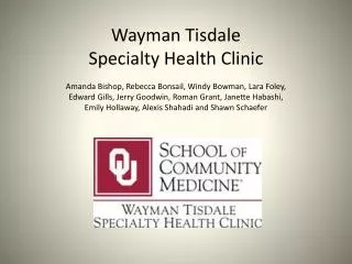
WAYMAN TISDALE COMMUNITY MEDICAL COMPLEX. PRECEDENT STUDIES. CIRCLEBATH FOSTER + PARTNERS. BATH, UK. EXTERIOR LIGHTING:

E N D
WAYMAN TISDALE COMMUNITY MEDICAL COMPLEX PRECEDENT STUDIES
CIRCLEBATH FOSTER + PARTNERS BATH, UK
EXTERIOR LIGHTING: There is an emphasis on natural light and views by incorporating operating theatres and recovery spaces on the lower level which are fully glazed to the south, looking out on to a private garden. The bedrooms on the upper floor look out onto balconies, planted with herbs and shrubs, lining the building’s perimeter and oriented to maximize views across the countryside. Because the building is located in the United Kingdom, any type of sunlight in encouraged. According to multiple articles and books, a major emphasis has been made stating that natural light improves the patients’ moods and shortens the amount of time of recovery. LIGHTING This building has a successful lighting design. Natural light is incorporated into this space through ribbon windows on the exterior. Incorporating natural lighting creates a connection from exterior to interior and solidifies the relationship between the architecture and the environment. The lighting design also incorporates the levels of lighting required for a successful space, including: task, ambient, general, and decorative. The lighting varies by space, which helps to define each individual area and its purpose. The lighting directly relates to the function of each specific space. From this design we would like to incorporate natural lighting, varied interior lighting, and lighting that helps to define the purpose of individual volumes.
VOLUMES • Volumes are used within this space to define individual areas without completely separating them. In the central atrium, the space remains open, but by varying ceiling height, a seating area is more defined within the overall space. • In the patient “bedroom” area, each individual bed space is separated with boundaries created by columns and floating walls. This keeps the overall space open but works to define individual spaces and volumes.
MATERIALS + TEXTURES • This design incorporates a variety of textures to create visual interest within the space. The color palate includes ochre and rust, and incorporates natural wood and glass to create a luxurious atmosphere that compares more to a hotel than a hospital. • The central atrium space is clean and simple without being stark and sterile. It incorporates warm colors with modern structural materials and comfortable furniture. • For our design, we want to stray from the typical healthcare material selections and choose more soothing and luxurious colors, textiles, and furniture.
WAYFINDING • Wayfinding is mostly accomplished in this space through changing volumetrics. Varied ceiling heights show where the space changes purpose. • The use of materials for wayfinding is not strong in this design. Where most healthcare facilities employ flooring changes in large spaces to direct travel, all of the large common spaces have one overall flooring pattern. • We plan on utilizing flooring changes as a major form of wayfinding, as it functions in a very straightforward manner and is easily seen from anywhere in the overall space. • Lighting in this design is primarily to illuminate the space rather than to direct traffic in any specific direction. • We feel that lighting can be a strong wayfinding tool when used properly. We intend to incorporate wayfinding light at entrances and major area changes within the overall space.
CIRCULATION • This design incorporates a thin rectangular footprint, which can serve to stifle circulation. • The building is organized on an extreme cross pattern with two major axis’. • The large common spaces have plenty of room to move around in, which is a good choice for circulation. However, the small corridors lining the rest of the building do not seem like the best solution for circulation. • We believe that circulation functions better when corridors are limited and spaces are more open. For our design, we think that a plan organized in a more square or circular manner allows for circulation to flow through the overall space instead of stagnating in long hallways.
DOMAINS • This space is primarily comprised of individual domains with little relation to one another. • Synergy is created in this space in the central atrium area. Gathering spots in this area create a hub for people to gather from different domains within the overall space. • In our design, we plan to create more synergy throughout the entire space. This keeps the building from feeling sectioned-off and separate. It allows for interaction among different departments and staff as well as ease of use for patients.
ARCHITECTURAL DETAILS • The columns incorporated into the “bedroom” area serve both structurally and as a way of defining the space. • Glazing systems are used along the all exterior faces of the building. This brings natural lighting into the entire space. • The skylights also provide an interesting way to incorporate natural lighting. This lighting is dimmed by a translucent fabric ribbon that trims the skylights. • Varied textures and materials are also incorporated into this space. They provide visual interest but keep the space functional without being too showy.
SUSTAINABILITY ENTRY • No information was provided on sustainability for this project. • However, we would like to make sustainability a major factor in our design decisions. This includes the relationship between building and landscape by preserving as much of the surrounding environment as possible. • We will additionally select building materials and interior finishes that are as green as possible. For interior finishes specifically, we will focus on GreenGuard certified materials.
LIGHTING The curved trapezoidal and organic shapes determine the public spaces while the harsher geometries define the private spaces. Also the dark wood volumes define the public spaces, whereas the white and mint green spaces delineate the private rooms. • This space is very brightly lit and is done so with a variety of fixtures. We do not think that the lighting design is fully successful because it lacks variety. There are no lighting levels, just a general overall brightness. There should generally be differences for task and ambient lighting.
WAYFINDING MATERIALS + TEXTURES The wood material is the best method of wayfinding within this space. It serves as a sort of arrow that navigates its way throughout the entire building. Other wayfinding is done through signage, which, however, is minimal. • The materials and textures within this space are extremely diverse, which fits very strongly with the space’s design, but are very strong and unlikely to work in another design. The architects chose these materials to create a space that was both “friendly and glamorous”.
CIRCULATION DOMAINS While most of the building exists in a long, thin hallway, domains have been created along this corridor. This can decrease traffic flow and make the hallway seem less claustrophobic. • In the entry and waiting area, there is a large amount of open space, which provides for successful circulation. However, the rest of the building is contained in a single hallway, which stifles the circulation and can create traffic.
ARCHITECTURAL DETAILS GRAPHICS + BRANDING • There is little by way of graphics or branding within this space, which can make it feel plain or create the feeling of an ambiguous purpose. • However, each room is clearly labeled, and the color serves to remind of the purpose of the space. The architects purposely chose a minty-green color to be a subtle hint of toothpaste. By widely contrasting the textures and materials in this design, the architects have created an extremely dynamic space. The design of the reception desk creates an interesting form and draws the user in. This form is echoed in the design of the seating in the waiting area.
SUSTAINABILITY ENTRY Although the design is severe, we still believe that the entry is a welcoming space. It seems clean and efficient, which is exactly what someone wants out of a clinic atmosphere. The space can also seem overwhelming because of its stark white-ness. This may be intimidating for someone entering in the space, creating a fear that they may dirty something or cause a disruption within the space. • Little is known about the sustainable aspirations of this design, except for material selection. The wood is a dark Australian nut, the flooring is a coated PVC, and the ceiling is made of polycarbonate plates.
EXTERIORS PATTERSON OB/GYN CLINICBUILDINGSTUDIO MEMPHIS, TENNESSEE
LIGHTING VOLUMES • The sloped wall in this space allows sunlight to come in the east when the sun is rising. The roof overhang then blocks the hotter afternoon sun. There’s also a curtain wall system on the north façade to maximize the northern sunshine. The volumes where the walls jut out at a diagonal from the ground determine the public spaces. The straight vertical walls define the private spaces.
MATERIALS + TEXTURES • There’s more glass for public spaces and less glass for privacy. There seem to be a maximum amount of sunlight allowed in the public areas whereas the private sectors have a reasonable amount to allow sunlight. Also, some materials that were used in the public areas were not used in the private areas. The public materials tend to be more transparent while the private materials are more opaque.
WAYFINDING CIRCULATION The circulation in this space is similar to the wayfinding. Everything falls along a primary axis. • The wayfinding in this space uses a primary axis for main circulation. Also, wood is used in various formats to support and guide circulation.
BRANDING + GRAPHICS DOMAINS • The main public spaces all tend to be on the ground level, whereas the private rooms and care are on the upper level. Obviously, the main public spaces will be on the main floor since it is the most accessible to everyone. Vertical circulation makes the patients understand that they are going from a public area to a more private one. There is no visible branding or graphics on the exterior. What makes it noticeable is the form and size. The concept seems to be that the public areas are very transparent and open and available all the while the private areas are separated and semi-covered. The extremely green landscape emphasizes a tranquil and natural environment that creates a feeling opposite of the normal, sterile, and institutional atmosphere.
ARCHITECTURAL DETAILS SUSTAINABILITY • Due to the exterior building being fairly simple geometric forms, the architects tended to use an interesting mix of materials all the while playing with textures to create some sort of dynamism. There is a large emphasis on glazing systems and natural light especially with the juxtaposition of the metal or brick materials on the other parts of the building. Sustainability seems to be very important part of the building concept. Natural lighting and green spaces seems to be the main factors. Also, just having smart site design has been seen as well. ENTRY This building seems to have a well defined entry. It is very welcoming and it includes a covered drop-off area. An additional factor that makes the entry welcoming is the calm landscaping around the exterior building entrance.