Download
1 / 23
230 likes | 351 Views
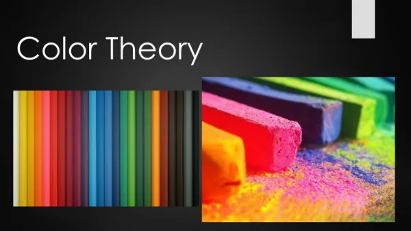
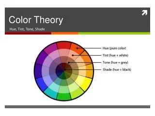
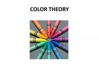
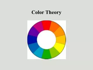
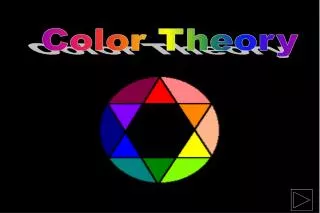
COLOR THEORY. 1810 COLOR WHEEL DEVISED BY GOETHE. COLOR WHEEL. PRIMARY, SECONDARY & INTERMEDIATE COLORS.

E N D
Red is the color of extremes. It’s the color of passionate love, seduction, violence, danger, anger, and adventure. Our prehistoric ancestors saw red as the color of fire and blood – energy and primal life forces – and most of red’s symbolism today arises from its powerful associations in the past. • Red is also a magical and religious color. It symbolized super-human heroism to the Greeks and is the color of the Christian crucifixion
RED Red is one of the top two favorite colors of all people. Red is the most popular color used on flags in the world. Approximately 77% of all flags include red. Red is the international color for stop. The history of languages reveals that red is the first color after black and white. (All languages have words for black and white. If a third hue exists, it is red.)
Red is the color of good luck in Asia and is the most popular color in China. • Most Japanese children draw the sun as a big red circle.In East Asian stock markets, red is used to denote a rise in stock prices. (Note: In North American stock markets, red is used to denote a drop in stock prices.) • Red is an auspicious color for marriage. Brides in India and Nepal wear red saris; in Japan, a red kimono symbolizes happiness and good luck.
BLUE • Blue is the favorite color of all people. It’s nature’s color for water and sky, but is rarely found in fruits and vegetables. Today, blue is embraced as the color of heaven and authority, denim jeans and corporate logos. It is cold, wet, and slow as compared to red’s warmth, fire, and intensity. • Blue has more complex and contradictory meanings than any other color.
Blue is the #1 favorite color of all people. • 53% of the flags in the world contain blue.Blue is the most commonly used color in corporate identity. • A dark blue suit is professional business attire.Blue jeans are worn all over the world. • Aristocracy is blue-blooded in all European languages. • Unique Meanings of Blue in Different Cultures • Greeks believe that blue wards off "the evil eye. • The English “to feel blue” has no equivalent in other languages while in German “blausein” (literally: to be blue) means to be drunk or in Russian “голубой” (literally: light blue) means to be homosexual. • Dark blue is the color of mourning in Korea. • The god Krishna has blue skin. • Shades of blue are described as shallow or deep instead of light or dark in China.Blue is for a baby girl; pink for a baby boy in Belgium. • “Prince Charming” is called “The Blue Prince” in Italy and Spain.
YELLOW • Yellow is the most luminous of all the colors of the spectrum. It’s the color that captures our attention more than any other color. • In the natural world, yellow is the color of sunflowers and daffodils, egg yolks and lemons, canaries and bees. In our contemporary human-made world, yellow is the color of Sponge Bob, the Tour de France winner’s jersey, happy faces, post its, and signs that alert us to danger or caution. • It’s the color of happiness, and optimism, of enlightenment and creativity, sunshine and spring. • Lurking in the background is the dark side of yellow: cowardice, betrayal, egoism, and madness. Furthermore, yellow is the color of caution and physical illness (jaundice, malaria, and pestilence). Perhaps it’s no coincidence that the sources of yellow pigments are toxic metals - cadmium, lead, and chrome - and urine.
In almost every culture yellow represents sunshine, happiness, and warmth. • Yellow is the color most often associated with the deity in many religions (Hinduism and Ancient Egypt) • Yellow is the color of traffic lights and signs indicating caution all over the world.In Japan, yellow often represents courage. • In China, adult movies are referred to as yellow movies. • In Russia, a colloquial expression for an insane asylum used to be "yellow house." • Bright “marigold” yellow may be associated with death in some areas of Mexico.Those condemned to die during the Inquisition wore yellow as a sign of treason. • A yellow patch was used to label Jews in the Middle Ages. European Jews were forced to wear yellow or yellow “Stars of David” during the Nazi era of prosecution.
ANALOGOUS • Analogous color schemes use colors that are next to each other on the color wheel. They usually match well and create serene and comfortable designs. • Analogous color schemes are often found in nature and are harmonious and pleasing to the eye. • Make sure you have enough contrast when choosing an analogous color scheme.
WARM • Warm colors are vivid and energetic, and tend to advance in space.
COOL • Cool colors give an impression of calm, and create a soothing impression.
COMPLEMENTARY • Complementary color schemeColors that are opposite each other on the color wheel are considered to be complementary colors (example: red and green). • The high contrast of complementary colors creates a vibrant look especially when used at full saturation. This color scheme must be managed well so it is not jarring. • Complementary color schemes are tricky to use in large doses, but work well when you want something to stand out.
SPLIT COMPLEMENTARY • The split-complementary color scheme is a variation of the complementary color scheme. In addition to the base color, it uses the two colors adjacent to its complement. • This color scheme has the same strong visual contrast as the complementary color scheme, but has less tension. • The split-complimentary color scheme is often a good choice for beginners, because it is difficult to mess up.
MONOCHROMATIC • One color A monochromatic color scheme consists of different values (tints and shades) of one single color. These color schemes are easy to get right and can be very effective, soothing and authoritative.[ They do, however, lack the diversity of hues found in other color schemes and are less vibrant.
TRIADIC • A triadic color scheme uses colors that are evenly spaced around the color wheel. • Triadic color schemes tend to be quite vibrant, even if you use pale or unsaturated versions of your hues. • To use a triadic harmony successfully, the colors should be carefully balanced - let one color dominate and use the two others for accent.