Download
1 / 34
340 likes | 525 Views
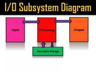
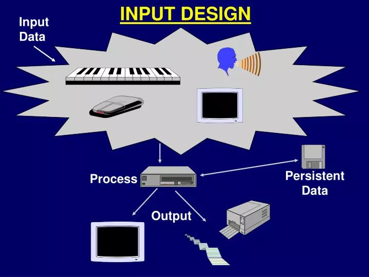
Input Data. INPUT DESIGN. Persistent Data. Process. Output. Why be concerned about INPUT DESIGN?. Garbage In - Garbage Out (GIGO). Self-checking digits or check-digit Combination check Limit and Range checks Completeness checks. Data Verification & Validation (V&V):.

E N D
Input Data INPUT DESIGN Persistent Data Process Output
Why be concerned about INPUT DESIGN? Garbage In - Garbage Out (GIGO) • Self-checking digits or check-digit • Combination check • Limit and Range checks • Completeness checks Data Verification & Validation (V&V):
“Input” involves 3 steps: 1. Collecting 2. Entering 3. Processing • Batch • On-Line (real-time) • Hybrid “Input” Methods:
BATCH INPUT - ADVANTAGES • Collecting and Entering can be done off-line. • Entering data can be done by trained personnel. • Processing can be done very quickly. • Processing can be done during non-peak times.
BATCH INPUT - DISADVANTAGES • Data collection usually has to be a centralized activity. • Data entry usually needs to be done by specially trained personnel. • The processing activity is delayed, hence the possibility exists for data to be considered old or untimely when it finally gets processed. • Since processing is usually done during off-hours, input errors detected during processing would not get corrected until the next regularly scheduled processing of input data. • The off-hours computer operator may have to call the systems analyst or programmer if the program malfunctions.
ON-LINE INPUT - ADVANTAGES • The data can be entered by its owners. • The data can be entered as close to their origination as possible. • Immediate feedback can usually be given regarding the correctness and acceptability of the data. • The input data can immediately update a database thus making it as current as possible.
ON-LINE INPUT - DISADVANTAGES • Equipment may be more costly to perform the input. • Users are not always well trained to input data. • User data entry procedural controls may be lacking. • Software must have additional controls to handle it. • Data is often only entered during business hours thus impacting the normal computer load. • The data entry activity could actually be slower than the equivalent batch processing for the same data.
Keyboard Magnetic Ink Character Recognition (MICR) Optical Character Recognition (OCR) Optical Mark Recognition (OMR) Digitizer Image Scanner & Facsimile (Fax) Machines Point-of-Sale Device (POS) Automatic Teller Machine (ATM) Mouse Track Ball Joystick Pens Scales Voice Recognition Touch Screen INPUT DEVICES
GENERAL GUIDELINES FOR INPUTING DATA • Input only necessary data • Let the system calculate or derive data • Use Business Codes where appropriate • Movement should be left-to-right, then top-to-bottom
BUSINESS CODES • Serial - based on arrival time • Sequential - based on an ordered table • Block - based on range of letters/numbers • Alphabetic - based on an abbreviation or other convention • Group - any combination of the above four
SERIAL BUSINESS CODES Based on Arrival Time - “first come, first serve” BANK 1 2 3 4
SEQUENTIAL BUSINESS CODES Based on “meaningful organization” - sorted BANK 1 2 3 4 1 2 3 4 Bob Carol Sharon Stan This example: sort by first name, then assign a number
BLOCK BUSINESS CODES Based on a range of letters and/or numbers Bank Customer Types Merchant/Business A0001 - E9999 Personal Checking F0001 - M9999 Personal Saving N0001 - T9999 Custodial U0001 - Z9999 BANK
ALPHABETIC BUSINESS CODES Based on an abbreviation or some other scheme UNITS OF MEASURE STATES AZ = Arizona CA = California MI = Michigan NY = New York etc.... GA = Gallon QT = Quart PI = Pint YD = Yard FT = Foot IN = Inch etc...
GROUP BUSINESS CODES Legend Product Class Base Color Base Type Unit of Measure 100-199 = Browns 200-299 = Greens 300-399 = Blues 400-499 = Yellows 500-599 = Reds 0 = None 1 = Lacquer 2 = Water 3 = Oil P = Pint Q = Quart G = Gallon P = Paint S = Stain P 286 3 G Paint Product Examples: S 206 2 G P 399 1 Q S 547 0 P Example: Use of a Group Code in a Paint Store
Designing for Usability*(Graphical User Interface [GUI] Design) * Portions Copyright © 1997, Intuitive Design, Carlsbad, CA and based on a presentation by Larry Marine. URL: http://www.intuitivedesign.com
GRAPHICAL USER INTERFACE (GUI) DESIGN • Pop-up menus • Pull-down menus • Drop-down/List boxes • Option (Radio) Buttons • Check Boxes • Text Boxes • Spinners • Command (Push) Buttons • Menu Bars • Menu Pads • Maximize/Minimize • Button Bars • Tool Bars • Scroll Bars • Docking O B J E C T S Modes of Operation: • Navigation • Data Entry
Data Entry Form/Window With Navigation Choices Command Buttons Option (Radio) Buttons (choose one) Spinner Pop-Up Menu
The Prime Objectives • Make the user's tasks easier to perform with the information system than without it • It should be intuitively obvious to the most casual user • Design the interface to meet the user's needs • Adapt technology to the user instead of forcing the user to adapt to the technology • Meet time and resource allocations • Get it out on time and under budget
GUI Design Considerations • Icons are often intuitive • Consistent use of icons is important • Size of icons & text is important • Number of icons - not too many • Use of color - not too much
Five Basic Steps for User Interface Design • Get to know the users • Analyze user tasks and goals • Establish design and usability goals • Storyboard some design ideas • Evaluate the designs • Repeat as necessary
1 of 3 Establish Design and Usability Goals • Design for the most common users and tasks • Design for 80% of users and tasks • Design for users, not engineers • Establish usability metrics • Average time to perform a task • Maximum number of errors
2 of 3 Prioritize the Features • Importance to the users or their tasks • The most common actions must be addressed first • Required time and resources • Which features can wait • Bells and whistles • Future release plans
3 of 3 Costs of Not Making a Feature Usable • Increased documentation costs • Increased technical support costs • Increased training requirements • Maintaining backward compatibility • $$$ Liability $$$
1 of 8 Storyboard Some Ideas • Construct usability prototypes • Low fidelity • Paper and pencil • Screen printouts • High fidelity • Visual basic • Hypercard
2 of 8 More than One Solution Exists • Generate several designs and test them all • When designers cannot agree, test the designs • Document the designs and the reasoning behind them • This inhibits going back to an old design that has problems
3 of 8 Design References • Use platform guidelines • IBM CUA (Common User Access) • Windows Style Guide • Mac Human Interface Guidelines • User Interface Design Books • The Design of Everyday Things by Donald Norman • Usability Engineering by Jacob Nielsen • Practical Guide to Usability Testing by Janice Redish and Joe Dumas • About Face: The Essentials of User Interface Design by Alan Cooper
4 of 8 Exploit User Intuitions and Expectations • Left to right & top to bottom • Obvious actions should be default actions • Speak the user's language • Use terminology that users use • Capture user metaphors • Word processor = typewriter
5 of 8 Remain Consistent • ENTER is progressive • ESC is regressive • Avoid custom controls • If it behaves the same, it should look the same • If it behaves differently, it should look different
6 of 8 Make Information Visible • Human memory is fallible • Interfaces that rely on human memory are prone to error • Provide the information users need when they need it • Suggest formats with examples • Provide immediate feedback
7 of 8 Provide Obvious Error Control • Prevent errors • Limit the effect the user has on the system • Confirm all destructive actions • Make errors recognizable as soon as they occur • People believe that what they see is a result of their last action • Allow immediate error recovery
8 of 8 Careful with Colors • Use colors consistently • If red is a danger color, don't use it as part of the non-functional aesthetic fluff • Never use more than 7 colors • No more than 5 is better
USABILITY CONSIDERATIONS*(User-Centered Design) • Field studies to observe potential users to determine needs • Behavioral designers devise conceptual models and ensure that the model works through-out a complete task cycle rather than merely supporting isolated tasks • Prototypers create testable models • User-testers place models in users’ hands and report what works and what doesn’t • Graphical and industrial designers make products attractive to use and affordable to build • Technical writers, however good tools communicate their own functionality * Excerpt from: Norman, D.A., The Invisible Computer, MIT Press, 1998 - as presented in: Coffee, Peter, “When ‘Good Enough’ Is All the Market Needs”, PC Week, September 7, 1998, page 43.