Download
1 / 5
50 likes | 149 Views
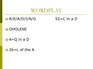
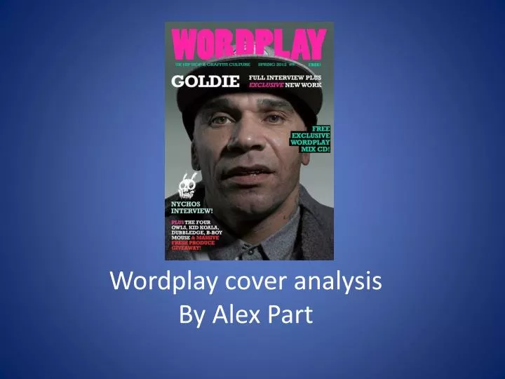
Wordplay cover analysis By Alex Part. Layout. The mast head is positioned in the centre to tell the reader what magazine it is. It need to be easy to identify so the reader or consumer can pick it out among the sea of other covers

E N D
Layout • The mast head is positioned in the centre to tell the reader what magazine it is. It need to be easy to identify so the reader or consumer can pick it out among the sea of other covers • This particular mast head sits very well against the man featuring on the cover because it contrasts well being presented in pink writing
Central Image • The central image is used as a lure. As it is someone famous the image is a close up shot at eye level to giver the observer a sense of intimacy and closeness with the person • The actual person is partially bearing is gold teeth which draws readers in as well the “free wordplay mix cd” is also a lure
What attracts an audience? • I think the basic colour scheme is very eye catching of the pink against the different shades of grey • I think also when looking in detail at this magazine is its free! • Which couldn’t be more appealing as I am a consumer as well