Download
1 / 10
100 likes | 104 Views
Here are the top eCommerce web design trends you can pursue in 2021 in order to remain competitive and attract customers.

E N D
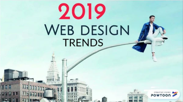
Web Design Trends to Follow In 2021
High-Contrast Gradients People believed dead live longer! In the past, color gradients were frowned upon after an absolute oversaturation on the web. Today, they are becoming socially acceptable again. And whoever thinks it is about subtle gray gradients has cut. The gaudier the gradient, the better. On Gradient, you can let yourself be inspired. These new color gradients have a dynamic effect and the combinations of retro colors create an emotionality. These color gradients are usually combined with a sober, clean design. This combination is new. In the past, color gradients were celebrated and used with all possibilities. Today, they serve more as a contrast to the clean rest of the respective website – for example in the header. But these color gradients do not only appear as CSS3 backgrounds. Color gradients with strong contrasts are also increasingly being used as icon colors and logo colors.
Standard Layouts/Design Templates The web is becoming increasingly complex and fast-paced. Good web design has to adapt to all device sizes. This would involve a very high technical effort if you want to reinvent the wheel with every new web design project. There are templates and frameworks so that customers on a small budget can also afford a modern website. Simply put, these are ready-made code blocks from which the respective website is then put together. The consequence of this is that many websites look the same. On the other hand, there is now also learned user behavior. The navigation is mostly on the top right. The user knows that and can find his way around websites that are structured similarly. This increases user guidance. The user does not have to have much cognitive capacity for navigation and can, therefore, concentrate more on the content. If each website looks the same, the operation of the individual websites is the same. So, you see there are not only disadvantages of having a uniform look. The established layouts have prevailed because they work. However, this is only partially true. After all, the slider in the header is still standing even though there are already studies that prove that such sliders are ignored by the user.
Home Slider / Hero Images You can see it again and again: Slider in the header of the homepage. Unfortunately, the user ignores these sliders consistently. These sliders should actually build more emotionality. Meanwhile, header sliders are part of the standard repertoire of a website. No WordPress theme that cannot do without such a head slider. In general: Sliders hardly pay attention to the second or third slide and if your slider or hero image looks too much like advertising, this element gets no attention from the user. The user cannot view everything on a website. What happens now is selective attention. The user focuses on the things that seem useful to him. A header slider without real content or a marketing hero image will get no attention from the user.
Asymmetrical Layouts The oversaturation of the typical grid layout of websites created a counter-trend: asymmetrical layouts. Technically speaking, these websites are of course based on a grid. The user can only see it at first glance. This web design trend was formerly state- of-the-art and actually only reserved for puristic companies or institutions (theaters, galleries, museums). In the meantime, this web design trend has become mainstream and there are also WordPress themes with asymmetrical layouts. This trend is probably not interesting for established and reputable companies. We personally have never been able to get excited about this trend. Falling out of the ordinary with all means – this usually came at the expense of usability. And so, users are left alone with content and now have to fight through a confusing layout. Because: The difficulty with such asymmetrical layouts is user guidance. Removing it from the grid certainly pays more attention to certain web elements and makes the layout interesting. On the other hand, with this raster lessens, you can quickly overdo it and the content will go under.
Experimental Navigation In the meantime, navigation has prevailed at the top right. For the web designer, this means less leeway in the layout, but the user knows this conventional structure of the website/navigation. In this way, the user is guided optimally and does not have to look at how he can navigate every time he visits a website. However, some web designers are trying to reinvent the navigation wheel. The experimental navigation concept tries to be particularly innovative. And sometimes it works – the user has to “think inside” the website. This creates a special level of interactivity. However, this experimental navigation is not suitable for every project. If it is a conventional information website that is intended to provide the user with information as simply as possible, experimental navigation may be a hindrance. Here, the user does not want to discover anything new, just to get information quickly. With innovative websites, the special form of navigation can involve the user in a special way. Then experimental navigation has advantages.
Split-Screen Design A very nice web design trend is the split-screen design. The website is divided into two vertical areas. Sometimes it looks like a print magazine. The design of the two vertical halves is often different. Sometimes a page is used for navigation and sometimes a page is used for a full-frame image. This increases emotionality, but can only be used on websites with little content. Unfortunately, this design cannot be consistently drawn through on particularly small screens – in most cases, the full-format image material is then omitted. The split-screen web design is very nice and offers unique user experiences, especially in connection with scroll telling or scroll effects.
Videos Videos on the web are now standard. Hero Video Header, Youtube, and other services ensure that the user is provided with videos. And the users thankfully accept these videos. Nevertheless, these web design trends are further expanded in 2021! Videos provide variety on your website and meanwhile, decision-makers also watch a video at least once a week. Explainers, employee portrait videos, branded storytelling clips, and mood videos are just a small extract from the various types of video on the web. The video is aimed at a very specific target group. This has no time for long texts and would rather watch a video to consume content. Google also prefers audio-visual content more and more and more videos are now displayed preferentially in the search results for some search queries.
Minimalism What started as a flat design was soon to be pushed further and ended in minimalism. Apple demonstrated it: the omission of unnecessary design elements and the use of white space as a design element. Some web designers have taken this style to the extreme and have completely abandoned colors and other design elements. What was left was some writing and a lot of white. The focus should be on the content and the design shouldn’t distract from it. That sounds good in theory, but you should be careful because the user can be guided by color and design. If everything is minimalistic, it is also difficult to guide the user. Therefore (as with all web design trends) minimalism is good but should be used with sense and understanding.
For more resources visit us at https://www.seodiscovery.com/ https://www.seodiscovery.com/blog/web-design-trends/ https://www.seodiscovery.com/web-design-company-india.php