Download
1 / 3
30 likes | 40 Views
The key to obtaining a reliable and accurate data and statistics from a survey is to perform the right analysis. Learn how you can do that with this article.<br>

E N D
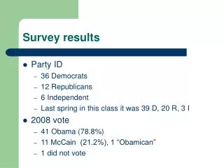
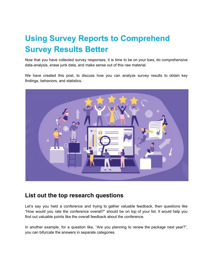
Using Survey Reports to Comprehend Survey Results Better Now that you have collected survey responses, it is time to be on your toes, do comprehensive data-analysis, erase junk data, and make sense out of this raw material. We have created this post, to discuss how you can analyze survey results to obtain key findings, behaviors, and statistics. List out the top research questions Let’s say you held a conference and trying to gather valuable feedback, then questions like “How would you rate the conference overall?” should be on top of your list. It would help you find out valuable points like the overall feedback about the conference. In another example, for a question like, “Are you planning to renew the package next year?”, you can bifurcate the answers in separate categories.
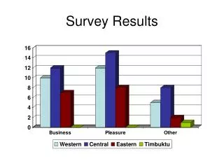
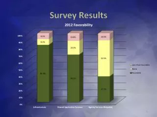
If out of 100 users, around 30 said NO and 70 said YES, then it is clear that 70% of them are planning to continue the use of your product. Further, the opportunity lies in 30%. You can try connecting to them to know what went wrong or maybe offer some discounts. Analyze quantitative data first With quantitative data, you can draw conclusions and reliable statistics. This type of data is mostly obtained from close-ended questions that you can easily convert into a numeric value. For example, a question like, “What were the key points of the event according to you?” can allow the user to share their personal experience. Once the data is quantified, you can easily convert results into a numeric value to compare them and identify trends in customer behavior. The reason behind starting with quantitative data is because they help you better understand qualitative data. For example, if 70% of customers are not satisfied with your services, then you need to focus on how you can enhance their experience. For that, you can start by identifying roadblocks in the journey and working on pain points. Leverage reports by cross-tabulating It is important that the data you are analyzing contains the responses from your target audience. For example, if you are analyzing the report where you want to see area wise results, then create segments accordingly. After that, take variables like age, interests, occupations for further analysis. Cross tabulating the data of these variables will help you understand the relationship between these variables based on which you can craft your targeted marketing strategies. Continuing the above example, in the area wise report, after segmenting responses according to your target areas, you can start analyzing their responses by taking multiple variables into count. This way, you can get precise results by not letting junk data overrun your actual data. Understand the statistical significance This point talks solely about your target audience. It’s natural that we get excited after receiving a good number of responses which is very rare. But it is possible to miss out on accuracy between large data sets. For example, in your recent survey, 80% of responders are over 35 years old, but your target audience is 18 to 29 years old. In such cases, the data will not be statistically significant.
To avoid this, you can simply leverage survey reports of SugarCRM Survey Module, and segment individuals from a larger population into smaller and niche groups. This will help you simplify your survey responses and you would get more accurate and presentable results. Consider causation vs correlation In the end, when you drive conclusions from surveys, they shouldn’t be inaccurate or insufficient. For instance, you observed a correlation between T-shirt sales and Shirt sales. In the next quarter, when you saw a surge in the t-shirt sales on your e-store, you estimated that professional shirt sales will pick up too but they didn’t. In this case, you probably thought that those two sections had a connection but -- no they don’t. Just because they seem correlated, it doesn’t mean one causes the other. In such cases, there is typically a third variable -- trend -- that influences the two independent variables. So before coming to conclusions, check if any new influencer or celebrity promoted shirts and because of that, they were in trend. If so, then that was the reason for the surge in shirt sales. Hence, analyze what drives a customer to think, act in a certain way rather than making assumptions. Do not forget to compare When you have current data, ascertain that you are comparing it with previously accumulated data. It can be yearly or quarterly. For example, say 50% of responders said they would recommend your business, which is a great number. But you have to see where were you the previous year to calculate the change. After analyzing the data for the first time, you can benchmark those results for the next analysis. This way you can track changes monthly, quarterly, yearly or the interval that is preferable for your industry. Once you have the final insights in place, it is time to convert the data in a presentable format for everyone’s understanding. You can present your data in the form of charts, infographics, data tables, etc. Also, it is important that others understand the insights the way you’ve understood them. Because it is very easy to misinterpret data. Source Link : https://www.appjetty.com/blog/using-survey-reports-comprehend-survey-results