Download
1 / 22
220 likes | 427 Views
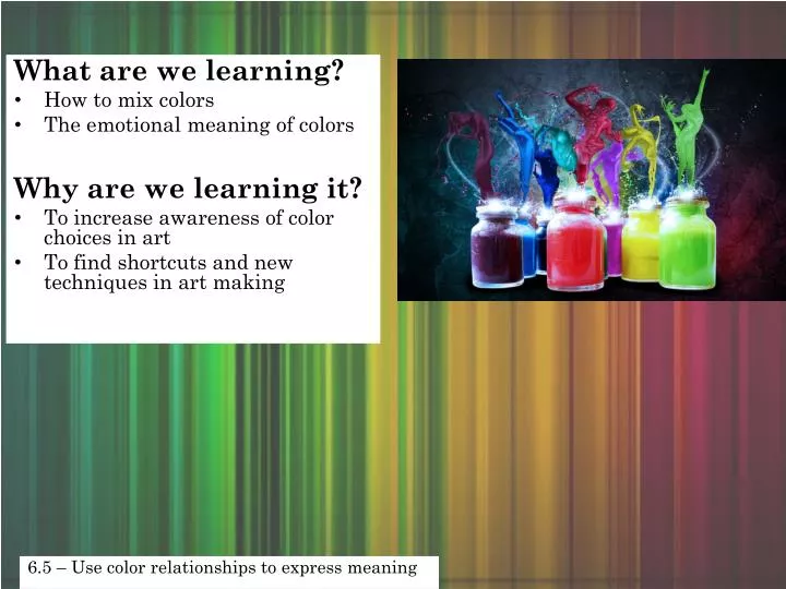
What are we learning? How to mix colors The emotional meaning of colors Why are we learning it? To increase awareness of color choices in art To find shortcuts and new techniques in art making. 6.5 – Use color relationships to express meaning. Primary Colors.

E N D
What are we learning? • How to mix colors • The emotional meaning of colors Why are we learning it? • To increase awareness of color choices in art • To find shortcuts and new techniques in art making 6.5 – Use color relationships to express meaning
Primary Colors • The primary colors are red,blue, and yellow. • Primary colors cannot be made from other colors.
When you mix the Primary Colors together, you get the Secondary Colors. What colors do these make? Red + Yellow = Orange Purple Red+ Blue = Blue + Yellow= Green
Tertiary Colors • Mixing primary and secondary colors creates tertiary colors.Tertiary colors include: • Yellow-orange • Red-orange • Red-violet • Blue-violet • Blue-green • Yellow-green • On the color wheel, the tertiary colors are located between the primary and secondary colors they are made from.
The lightness or darkness of a color is called its value. • Tints are light values that are made by mixing a color with white. For example, pink is a tint of red and gray is a tint of black. • Shades are dark values that are made by mixing a color with black. Maroon is a shade of red, and navy is a shade of blue.
Analogouscalming because it is natural Tip: Work light to dark when using analogous colors
Monochromatic easy on the eyes Tip: Add small amounts slowly to blend from light to dark
Why do artists make art? • To inspire • To heal • To inform • To advocate • To teach
To inspire Albert Bierstadt, 1869
To heal Vietnam Veterans Memorial, Maya Lin
To inform Keith Haring
To advocate Kathe Kollwitz
To teach Paul Cezanne
Still Life Settings • What is a still life? • Why would an artist use a still life as subject? • What would be good items to put in a still life?
Today we will: -Create symmetrical vases -Draft our last artwork -Use color in our art So that we can: -Increase drawing skills -Make decisions about color in our art 6.5 – Use color relationships to express meaning 6.2 – Increase skill and control in use of media and techniques
Fold your paper in half. Put your finger on the folded side Draw ½ a bottle shape on this side Open and make sure it will connect to the other side Cut! ~~~~~~~~ FOLD ~~~~~~~~
6. Trace your bottle shape on the far left side of your paper. 7. Swap bottles with someone and trace theirs – OVERLAPPING the 1st 8. Swap again and trace until you have @ least 5 bottles drawn.
Designs on your bottles Highlights Bottom of the bottle