Download
1 / 1
10 likes | 166 Views
The Effect of Warm and Cool Object Colors on Depth Ordering. Reynold J. Bailey, Cindy M. Grimm, & Christopher Davoli. Contact: rjb1@cse.wustl.edu. Goal. Experiment Design. To explore the color-depth relationship for realistic, colored objects with varying shading and contours. Stimuli:.

E N D
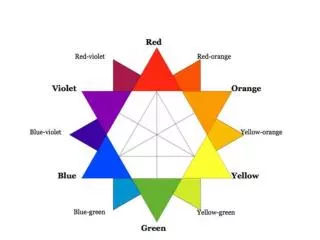
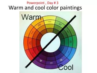
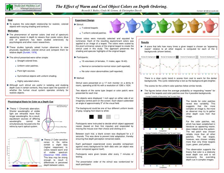
The Effect of Warm and Cool Object Colors on Depth Ordering. Reynold J. Bailey, Cindy M. Grimm, & Christopher Davoli Contact: rjb1@cse.wustl.edu Goal Experiment Design To explore the color-depth relationship for realistic, colored objects with varying shading and contours. Stimuli: • 7 colored teapots • 7 uniform colored patches Motivation The phenomenon of warmer colors (red end of spectrum) appearing nearer in depth to viewers than cooler colors (blue end of spectrum) has been studied extensively by psychologists and other vision researchers. These studies typically asked human observers to view physically equidistant, colored stimuli and compare them for relative depth [Sundet, 1978]. The stimuli presented were rather simple: Seven colors were manually selected and equated for luminance. Each of the resulting equiluminant colors was applied to an image of a teapot. The colors were scaled by the pixel luminance values of the original teapot to create the stimuli used in this study. This approach preserves the shading and specular highlights of the original teapot. Results A score that tells how many times a given teapot is chosen as “appearing nearer” relative to all other teapots is computed for each of the 4 backgrounds (shown below). Participants: Scores for background Scores for background Scores for background Scores for background 90 • Straight colored lines. • Uniform color patches. • Point light sources. • Symmetrical objects with uniform shading. • Highly saturated colors. • 15 volunteers (4 females, 11 males, ages 18-40). • Normal or corrected-to-normal vision (self-reported). • No color vision abnormalities (self-reported). Score 0 Method: There is a clear cyclic trend in scores from cool to warm for the darker backgrounds. This cyclic relationship is lost as the background gets brighter. The scores for the uniform color patches follow similar trends. Stimuli were presented on a 17 inch monitor (in a dimly lit room), operating at 60 Hz with a resolution of 1280 x 1024. Two objects of the same type (teapot or color patch) were presented for each trial. The objects were displayed 1 inch apart on either side of an imaginary central point on the screen. Each object subtended an angle of approximately 5o of the visual field. The background could be one of four different uniform levels of gray, ranging from black to white: Participants were instructed to decide which object appeared nearer (based on their first impulse) and responded by moving the mouse over their choice and clicking on it. Between each trial, a blank screen was displayed for a 2 seconds. This was done to prevent total adaptation, thereby ensuring that depth perception remained stable. Each participant experienced every possible comparison against every background for both data sets (an object was never compared against itself). Participants were given breaks after every 7 minutes of testing. The presentation order of the stimuli was randomized for each participant. Although such stimuli are useful in isolating and studying depth cues in certain contexts, they leave open the question of whether the human visual system operates similarly for realistic objects. The figures below show the average probability or responding “nearer” for each of the teapots and color patches over the 4 possible backgrounds. The trends for color patches reveal less variability. This suggests that the more complex an image is, the more an observer may try to gather other depth cues from that image. For the color patches, red, which has been established in literature as appearing nearer, does indeed show this pattern. The red patch was chosen reliably more than all other patches. The red teapot, however, was chosen reliably more than only three teapots (cyan, green, and yellow). This observation supports the theory that color is a relatively weak depth cue and is not necessarily the overriding depth cue in complex images. Physiological Basis for Color as a Depth Cue Theory 1: Chromatic aberration. Shorter wavelengths of visible light are refracted more than longer wavelengths. As a result, equidistant sources of differing wavelengths cannot be simultaneously focused onto the retina by eye’s optical system. Theory 2: Color sensitive cones in the retina exhibit a slight bias (higher responses) to colors toward warm end of visible spectrum [Stockman 1999, 2000]. This bias may be strong enough to result in differences in perceived depth between colors.