Download

1 / 37
370 likes | 376 Views
Human-Computer Interaction (HCI). Mario Čagalj. University of Split. Using Colors Effectively in Graphical Design. Based on: „ Designing with the Mind in Mind ” by Jeff Johnson „Non-Designers Design Book” by Robin Williams. Introduction.

E N D
Human-Computer Interaction (HCI) Mario Čagalj University of Split
Using Colors Effectively in Graphical Design Based on: „Designing with the Mind in Mind” by Jeff Johnson „Non-Designers Design Book” by Robin Williams
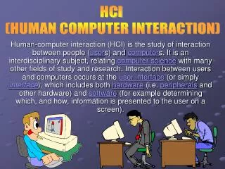
Introduction • Color is a powerful (visual) communication meduim • shapes our perception, interpretetion and memory or what we see • it can enhance the effectiveness of a message • likewise, it may imapir it
Introduction • Human color perception has both strengths and limitations • vision is optimized to detect contrast (edges), not absolute brightness • our ability to distinguish colors depends on how colors are presented • color-blindeness • the user’s display and the enviromental conditions affect color perception
How color vision works?Trichromatic and opponent-process theory of color vision Based on: „Designing with the Mind in Mind” by Jeff Johnson
How color vision works? • An eye focuses light on the retina at the back of the eye • Retina has two types of light photoreceptor cells • rods – detect light levels (brightness) but not colors • cones – detect colors • sensitive to red light • sensitive to green light • sensitive to blue light • other colors detected through different combinations of RGB
How color vision works? • Most of the time, our vision is based entirely on input from cones • Rods are barely used (only in poorly lighted enviroments) • dinner by candlelight • dark house • walking a dog after dark • those who live in industrialized societies hardly use their rods at all
How color vision works? • The relative quantities of the three cone types are approximatelly in the ratio red:green:blue = 40:20:1 • The eye’s overall sensitivity to b is much lower than to r and g
How color vision works? • Color-sensitive photoreceptors (cones) are sensitive to wider range of light frequencies • their sensitivity ranges overlap considerably • their sensitivity differs considerably Retinal receptors Artifitial RGB receptors
How do we see a broad range of colors? • Our brain combines the signals from the cones by subtraction • It is more efficient to record differences between the responses of thecones, rather than cone's individual response (they overlap in response) • Neurons in the visual cortex (at the back of our brain) subtruct signals coming over the optic nerves • from the green (medium- ) and red (low-frequency) cones, producing red-greendifference channel • from the high- and low-frequency cones, yielding a yellow-bluedifference channel • Finally, a third group of neurons adds the signals coming from the low- and medium-frequency cones to produce an overall luminance (black-white) channel • These 3 channels are called color-opponent channels
Implications of color processing theories Based on: „Designing with the Mind in Mind” by Jeff Johnson
Vision is optimized for contrast, not brightness • Oponnent color process (subtractions) make our visual system much more sensitive to differences in color and brightness (contrast) than to absolute brightness levels
Vision is optimized for contrast, not brightness • Oponnent color process (subtractions) make our visual system much more sensitive to differences in color and brightness (contrast) than to absolute brightness levels
Vision is optimized for contrast, not brightness • Oponnent color process (subtractions) make our visual system much more sensitive to differences in color and brightness (contrast) than to absolute brightness levels The squares marked A and B are the same gray! We see B as white because it is shaded by the cylinder.
Ability to discriminate colors • Even our ability to detect color differences is limited; it depends on how colors are presented • Three presentation factors affect our ability to distinguishcolors • Paleness: the paler (less saturated) two colors are, the harder is to tell them apart • Color patch size: the smaller or thinner objects are, the harder it is to distinguishtheir colors • Separation: the more separated color patches are, the more difficult it is todistinguish their colors, especially if the separation is great enough to requireeye motion between patches
Limited ability to discriminate colors • Example: white and pale yellow to indicate the current step in the reservation process • Example:tiny color patches hard to distinguish
Limited ability to discriminate colors • Example:Large color patches make it easier to distinguish the colors
Limited ability to discriminate colors • Example: Color contrast between visited and unvisited links too subtle. Moreover two shades of blue color used; the color range in which our eyes are least sensitive.
Color-blindness • Being color-blind does not mean seeing grey or black and white • It means that one or more color subtraction channels do not function normally • It becomes difficult to distinguish certain pairs of colors • Approximatelly 8% of male and around 0.5% female population suffer some form of color-blindness • The most common type of colorblindness is red/green • This means that your boss or even worse your investor is potentially affected Alex Bigman @99designs.com
Some guidelines for using colors Based on: „Designing with the Mind in Mind” by Jeff Johnson
Some guidelines for using colors • Make sure the contrast between colors is high (but see later) • One way to test whether colors are different enough is to viewthem in grayscale (if not distinguishable in grays, they aren’t different enough) • Use distinctive colors • Our visual system combines the signals from retinal cone cells to produce color opponent channels: red-green, yellow-blue, and black-white • The collors that people distinguish most easily are those that cause a strong signal on one of the three channles, and neutral signals on the other two channels
Some guidelines for using colors • Avoid color pairs that color-blind people cannot distinguish • Use color redundantly with other signifiers • E.g. Use different color + different symbol • Separate strong opponent colors • Placing them right next to each other causes a flickering sensation normal color vision (1% of male population) (6% of male population) (1% of male population)
Some good examples • Example:white, yellow and blue to indicate the current step in the reservation process
Some good examples • Example:white, yellow and blue to indicate the current step in the reservation process
The amazing color wheel Based on: „Non-Designers Design Book” by Robin Williams
The color wheel • Amazingly useful when you need to make a conscious decisionabout choosing colors for a project • The color wheel begins with yellow, red, and blue (primary colors) • cannot result from mixing of other colors
The color wheel • If you take your watercolor box and mix each of these colors withan equal amount of the one next to it, you’ll get the secondary colors
The color wheel • To fill in the empty spots in the color wheel, mix equal parts of the colors on each side to obtain tertiary colors
Color relationships • So now we have a color wheel with the basic twelve colors • With thiscolor wheel, we can create combinations of colors that are pretty muchguaranteed to work together
Color relationships: complementary • Colors directly across from each other, exact opposites, are complements • Because they’re so opposite, they often work best when one is the maincolor and the other is an accent
Color relationships: triads • A set of three colors equidistant from each other always creates atriad of pleasing colors • Red, yellow, and blue is an extremely popularcombination for children’s products -primary triad
Color relationships: triads • Another form of a triad is the split complement • Choosea color fromone side of the wheel • Findits complement directly across the wheel • Use the colors on each side of the complement
Color relationships: analogous colors • An analogous combination is composed of those colors that are next toeach other on the wheel • No matter which two or three you combine, they allshare an undertone of the same color, creating a harmonious combination
Extending the wheel: shadesand tints • Hue = the pure color • Shade = color + black (reduces lightness) • Tint = color + white (increases lightness)
Shadesand tints: monochromatic colors • Combination composed of one hue with any numberof its corresponding tints and shades
Shadesand tints in combination • Choose one of the four color relationships described onColor Relationshipsslides, but instead of using pure colors (hues), use various tints and shadesof those colors • This expands your options tremendously, but you canstill feel safe that the colors work together