Download
1 / 12
120 likes | 129 Views
Media Art Design Typography Notes. Mr. Torres. Keyboarding. Keyboarding is the activity of typing information into a computer or word processor. The home row keys are the row of keys on the computer keyboard your fingers rest on when not typing.

E N D
Media Art Design Typography Notes Mr. Torres
Keyboarding • Keyboarding is the activity of typing information into a computer or word processor. • The home row keys are the row of keys on the computer keyboard your fingers rest on when not typing. • The home row keys for your left-hand are A, S, D, and F and your right-hand are J, K, L, and ; (semicolon). For both hands, the thumbs rest on the spacebar. • GWAM stands for gross words a minute
Typography • Typography is the selection and arrangement of typefaces (fonts), sizes, and spacing on a printed publication or web page. • Typography has a major impact on the overall look and image of your page and its overall quality. • Another name for a typeface is font.
Font • All letters, numerals, and any symbols that make up any typestyle in any one size is called a type font. • Fonts are divided into four categories: uppercase (ABC), lowercase (abc), numbers (123), and miscellaneous symbols (!@#).
Alignment • Alignment is the placement of elements on a page or in columns, especially text. Left alignment is also called flush-left, left-justified, or ragged right. Right alignment is also called flush-right, right-justified, or ragged left. In justified alignment the text goes from edge to edge. Justified text can also be referred to as full justification. Justified text is used most often in newspaper articles and magazine columns.
Centered Text • Lends a formal appearance to text. • Generally harder to read because the starting position of each line changes. • Works best with fairly short lines and extra space between text. • Often used for headlines, invitations, greeting cards, and certificates.
Contrast • Contrastis the difference between two or more elements in a composition. • The greater difference the greater the contrast. • Contrast adds interest to the page and provides a means of emphasizing what is important or directing the reader’s eye. • Contrast aids in readability by making headlines and subheadings stand out.
Line Spacing • Line Spacing shows how much space appears between lines of text or between paragraphs. • Single spaced lines and double spaced lines are examples of line spacing. • Another term for line spacing is leading.
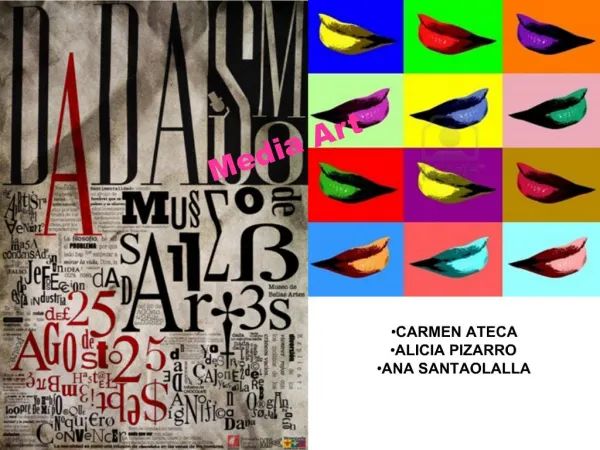
Script Font • In typography, Script Fonts mimic handwriting styles that look as if written with writing instruments like calligraphy pens. • Script Fonts are perfect for invitations, greeting cards, headlines or very short, expressive texts. • They range from classic, flowing scripts for elegant designs to light-hearted types with rounded forms for a fresh, peppy look. • YOU SHOULD NEVER USE ALL UPPERCASE WHEN USING SCRIPT FONTS.
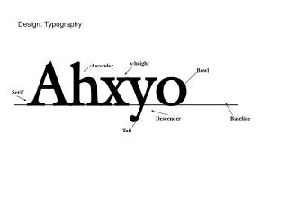
Serif vs. Sans Serif • A serif is a little extra stroke found at the end of some letterforms. • Times New Roman is an example of a serif font. • Fonts without serifs are called sans serif. (In French the word sans means without.) • Tahoma is an example of san serif font.
Font Effects & Styles Different font effects and styles can create a “font family” and interest in your typography designs. • Bold-Makes your text thicker. • Italic- Makes your text slanted. • Italic Bold- Makes your text slanted and thicker. • Underline- Puts a stroke under your text. • Shadow-Adds a shadow behind your text. • ALL CAPS BOLD-ALL TEXT IS IN CAPITAL LETTERS & BOLD • Small Caps Bold-All Text Is Capital But Use Lowercase Typesets and is Bold • Reverse – The color of the text is a positive against a negative background.
Character Spacing • Character Spacing is the amount of empty space between text characters. • Another term for Character Spacing is Kerning. • Condensed -The character spacing between text is tight & narrow. • Expanded-The character spacing between the text is lengthened.