Download
1 / 1
20 likes | 135 Views
Type the Title of Your Research Presentation Here, in Arial Bold, Left Justified on Two or Three Lines as Needed for Length and Appearance (60 to 54 point size).

E N D
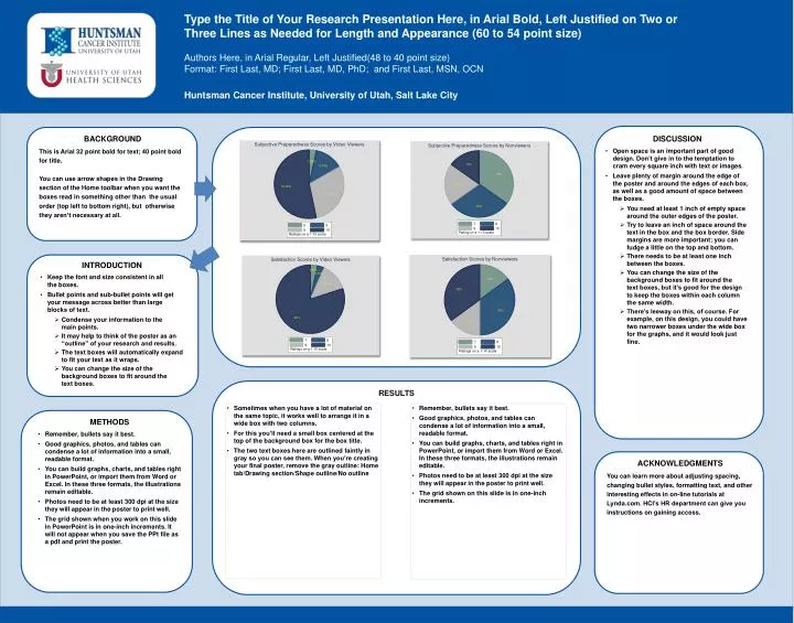
Type the Title of Your Research Presentation Here, in Arial Bold, Left Justified on Two or Three Lines as Needed for Length and Appearance (60 to 54 point size) Authors Here, in Arial Regular, Left Justified(48 to 40 point size)Format: First Last, MD; First Last, MD, PhD; and First Last, MSN, OCN Huntsman Cancer Institute, University of Utah, Salt Lake City BACKGROUND This is Arial 32 point bold for text; 40 point bold for title. You can use arrow shapes in the Drawing section of the Home toolbar when you want the boxes read in something other than the usual order (top left to bottom right), but otherwise they aren’t necessary at all. • DISCUSSION • Open space is an important part of good design. Don’t give in to the temptation to cram every square inch with text or images. • Leave plenty of margin around the edge of the poster and around the edges of each box, as well as a good amount of space between the boxes. • You need at least 1 inch of empty space around the outer edges of the poster. • Try to leave an inch of space around the text in the box and the box border. Side margins are more important; you can fudge a little on the top and bottom. • There needs to be at least one inch between the boxes. • You can change the size of the background boxes to fit around the text boxes, but it’s good for the design to keep the boxes within each column the same width. • There’s leeway on this, of course. For example, on this design, you could have two narrower boxes under the wide box for the graphs, and it would look just fine. • INTRODUCTION • Keep the font and size consistent in all the boxes. • Bullet points and sub-bullet points will get your message across better than large blocks of text. • Condense your information to the main points. • It may help to think of the poster as an “outline” of your research and results. • The text boxes will automatically expand to fit your text as it wraps. • You can change the size of the background boxes to fit around the text boxes. RESULTS • Sometimes when you have a lot of material on the same topic, it works well to arrange it in a wide box with two columns. • For this you’ll need a small box centered at the top of the background box for the box title. • The two text boxes here are outlined faintly in gray so you can see them. When you’re creating your final poster, remove the gray outline: Home tab/Drawing section/Shape outline/No outline • Remember, bullets say it best. • Good graphics, photos, and tables can condense a lot of information into a small, readable format. • You can build graphs, charts, and tables right in PowerPoint, or import them from Word or Excel. In these three formats, the illustrations remain editable. • Photos need to be at least 300 dpi at the size they will appear in the poster to print well. • The grid shown on this slide is in one-inch increments. • METHODS • Remember, bullets say it best. • Good graphics, photos, and tables can condense a lot of information into a small, readable format. • You can build graphs, charts, and tables right in PowerPoint, or import them from Word or Excel. In these three formats, the illustrations remain editable. • Photos need to be at least 300 dpi at the size they will appear in the poster to print well. • The grid shown when you work on this slide in PowerPoint is in one-inch increments. It will not appear when you save the PPt file as a pdf and print the poster. ACKNOWLEDGMENTS You can learn more about adjusting spacing, changing bullet styles, formatting text, and other interesting effects in on-line tutorials at Lynda.com. HCI’s HR department can give you instructions on gaining access.