Download
1 / 17
170 likes | 266 Views
Scatterplots. Please view this tutorial and answer the follow-up questions on loose leaf or graph paper to be handed in to your teacher. Scatterplot Basics. Scatterplots have an x and y axis that represent two sets of data

E N D
Scatterplots Please view this tutorial and answer the follow-up questions on loose leaf or graph paper to be handed in to your teacher.
Scatterplot Basics • Scatterplots have an x and y axis that represent two sets of data • They can be used to compare two sets of information or track trends over time • You DO NOT connect the points in a scatterplot • In previous graphs, we would often sort data to make graphing easier. You CAN NOT sort data in a scatterplot.
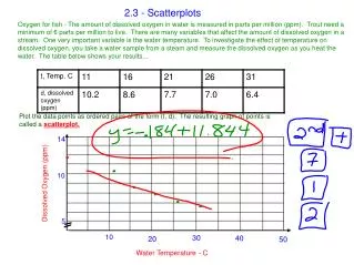
Making a Scatterplot Since we have two sets of information, draw both a horizontal and a vertical axis. (Disregard the names!) The height information will go on the x-axis and armspan will go on the y-axis.
Making a Scatterplot Making a window for a scatterplot is slightly different than making a window for other graphs because you need to worry about both the x and y axis. For the x-axis, look at your x values and go a little lower than your lowest for the minimum and a little higher than the highest for your maximum. For the y-axis, look at your y values and go a little lower than your lowest for the minimum and a little higher than the highest for your maximum.
Making a Scatterplot 180 175 170 Don’t forget to label each axis! This is very important! Choose your x min, xmax and xscl based on your height information. Choose your y min, ymax and yscl based on your armspan information. 165 Armspan (in cm) 160 155 150 145 145 150 155 160 165 170 175 180 Height (in cm)
Making a Scatterplot 180 Next, you’ll need to plot the points. Take our first pair of (height, armspan) values. 175 170 165 Armspan (in cm) 160 155 150 145 145 150 155 160 165 170 175 180 Height (in cm)
Making a Scatterplot 180 175 170 Imagine that you draw a line up from 156 on the x-axis. 165 Armspan (in cm) 160 Imagine that you draw a line across from 154 on the y-axis. 155 150 Mark your point where the two lines meet. 145 145 150 155 160 165 170 175 180 Height (in cm)
Making a Scatterplot 180 175 170 Now mark the rest of your points the same way. 165 Armspan (in cm) 160 155 150 145 145 150 155 160 165 170 175 180 Height (in cm)
Making a Scatterplot 180 When using a scatterplot to make comparisons, sometimes it helps to make a y=x line. 175 170 165 Armspan (in cm) This will help you figure out if the x-values are greater than the y-values or vice versa. 160 155 150 145 145 150 155 160 165 170 175 180 Height (in cm)
Making a Scatterplot 180 Make sure that the y=x line goes through coordinates that have the same value for x and y. 175 170 165 Armspan (in cm) Sometimes the line will go diagonally through the graph, other times it will not. It depends on your mins, maxs, and scales. 160 155 150 145 145 150 155 160 165 170 175 180 Height (in cm)
Making a Scatterplot y = x Points that fall exactly on the line will have the same x-coordinate and y-coordinate. 180 175 y > x Points that are below the line have x values that are larger than their corresponding y values. 170 165 Armspan (in cm) Points that are above the line have y values that are larger than their corresponding x values. 160 y < x or x > y 155 150 145 145 150 155 160 165 170 175 180 Height (in cm)
Making a Scatterplot Notice that we have two points that are exactly on the line. 180 175 170 These points have values where x and y are equal. 165 Armspan (in cm) (164, 164) 160 (148, 148) 155 150 145 145 150 155 160 165 170 175 180 Height (in cm)
Making a Scatterplot Are heights or armspans larger for this class? 180 175 170 There is only one value above the y=x line which means only one student had an armspan that was greater than the height. There are six values below the y=x line. This means that six students had heights greater than armspan. Since there are more points below the line, the heights are typically larger than the armspans for this class. 165 Armspan (in cm) 160 155 150 145 145 150 155 160 165 170 175 180 Height (in cm)
Creating a Scatterplot on the Calculator • Enter your data into a list • 2nd Y= • Select Plot 1 then Highlight “On” and hit ENTER • Under Type select the first choice.
Creating a Scatterplot on the Calculator • Make sure that you identify your x information and y information in Xlist and Ylist. • Set your window. • Hit Graph.
Follow Up Questions Answer the following questions and hand them in to your teacher.
Follow Up Questions Construct a scatterplot of these data pairs. Explain what the graph tells you about the relation between the teams’ batting and pitching. Draw the y = x line on the scatterplot. Explain the relationship between the teams’ batting and pitching by looking at the points shown above, on, or below that line.