Download
1 / 25
250 likes | 433 Views
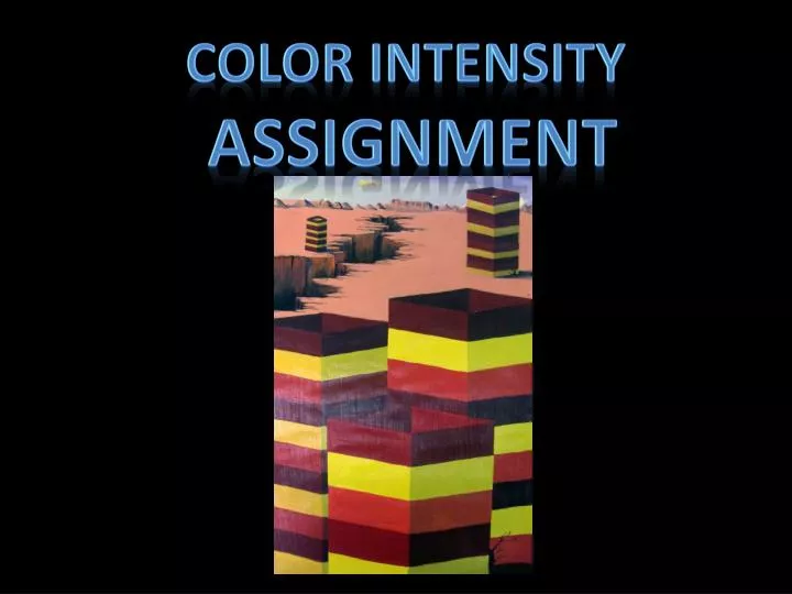
Color intensity assignment. Here is a list of attributes that objects have as they recede in space:. •UPWARD ANGULAR LOCATION-creates depth if juxtaposed to ground and sky lines, e.g. tall buildings.

E N D
Color intensity assignment
Here is a list of attributes that objects have as they recede in space: •UPWARD ANGULAR LOCATION-creates depth if juxtaposed to ground and sky lines, e.g. tall buildings.
•OVERLAPPING OR SUPERIMPOSING-by partially covering one object with another it gives an appearance of depth (distortions also occur if viewer is too close). •TEXTURE-density increases as an object gets further away.
SIZE OF OBJECTS-smaller objects seem farther away (distortions can occur if objects are the same size or too close to the viewer).
FOCUS-objects lose detail as they recede into space. SPACING-objects clustered closer together seem farther away. Horizontal lines which get closer as they near the horizon line appear to be defining a recession in space.
•SHADE AND SHADOW-darker shadows seem closer especially if overlapping other shadows.
BRIGHTNESS-objects are brighter when closer to the viewer, except for reflective surfaces. •COLOR-color intensity is much greater closer to the viewer and tends toward medium gray as it recedes.
As objects recede away from the viewer in atmospheric perspective, bright whites and rich blacks tend toward medium gray and eventually disappear into a blue/gray background. Even colors have greater intensity closer to a viewer than they do further away.
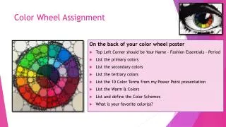
Complementary colors On the opposite site of the wheel you find the complementary color. For example, the complementary color to green is purple. To yellow its blue, and so on.
Mixing two complementary colors, will produce gray. For example, you can try to mix neutral grays and browns, and to mix a some of the complementary color in the paint to reduce color intensity.
Color intensity is, well, the intensity of a color. Think about it as “brightness” or “radiance”. Color straight out of the tube is generally high intensity. In order to lower the intensity of a color (aka make it less bright) you are going to add a small amount of it’s complimentary color. For example: for red, you add a small amount of green to lower the intensity of the red. Just a dab of green and the intensity of that red will come down. Yes they do get darker.
Objectives 15 Points possible Color Value and Intensity change to demonstrate depth Value: Columns demonstrate change in value (adding the black) on the opposite side of the light source (modeled shadow). Intensity: Columns demonstrate change in intensity (duller) as they go back in to space. The farthest column being the dullest.
Objectives Depth Concepts 10 Points possible OVERLAPPING-demonstrates the partially covering one object with another which provides the appearance of depth (distortions also occur if viewer is too close). SIZE OF OBJECTS-smaller objects seem farther away (distortions can occur if objects are the same size or too close to the viewer). SHADE AND SHADOW-darker shadows seem closer especially if overlapping other shadows.
Objectives 10 Points possible Craftsmanship Artwork demonstrates a high quality and attention to details. Neatness was of primary concern. Careful brush strokes, straight edges. Apparent care taken during the painting process.
Objectives 15 Points possible Effort and Participation Student never needed to be reminded to stay on task. Made good use of class time and really put forth enormous effort and thought in the creation of the work. Always prepared for class. Clear evidence of planning and budgeting time in order to complete a quality project on time
Intensity columns instructions • Flip the pattern horizontally and complete the top of the column. Repeat tracing until the pattern goes completely off the tag board • Flip the pattern horizontally and repeat step 3 on the left side of the column. Place a line down the center of the tag board (vertically). Place the 70 degree pattern at the top of the vertical line and trace around the pattern • Begin with the 70 degree pattern, ruler and 12x18 tag board.
Draw the second column by drawing a vertical line behind the first column.
Label the sections with three colors of your choosing. The pure color (highest intensity) will go on the side that is receiving a light source On the other side (the side not receiving the light), demonstrate a modeled shadow by adding black. Label your color + black. Blue Blue with Black Blue with Black Blue Red with Black Red Yellow with Black Yellow Blue with Black Blue Red with Black Red Yellow with Black Yellow
On the second column we will demonstrate depth, by using a colors complement to change the intensity of that color. Blue with its compliment Blue with its compliment and black Blue with its compliment and black Blue with its compliment Red with its compliment Red with its compliment and black Blue Blue with Black Yellow with its compliment Yellow with its compliment Blue with Black Blue Blue with its compliment and black Blue with its compliment Red with Black Red Red with its compliment and black Red with its compliment Yellow with Black Yellow Yellow with its compliment Yellow with its compliment Blue with Black Blue Blue with its compliment and black Blue with its compliment Red with Black Red Yellow with Black Yellow
Blue with more compliment Blue with more compliment and black Blue with more compliment and black Blue with more compliment Blue with its compliment Blue with its compliment and black Blue with its compliment and black Blue with its compliment Red with more compliment Red with more compliment and black Red with its compliment Red with its compliment and black Yellow with more compliment and black Blue Blue with Black Yellow with its compliment Yellow with its compliment Blue with Black Blue Blue with more compliment and black Blue with its compliment and black Blue with its compliment Red with Black Red Red with more compliment and black Red with its compliment and black Red with its compliment Yellow with Black Yellow Yellow with more compliment and black Yellow with its compliment Yellow with its compliment Blue with Black Blue Blue with more compliment and black Blue with its compliment and black Blue with its compliment Red with Black Red Red with more compliment and black Yellow with Black Yellow