Download
1 / 16
160 likes | 310 Views
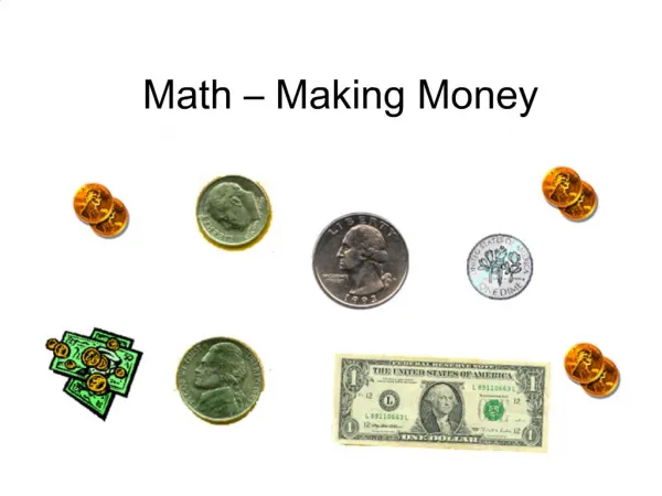
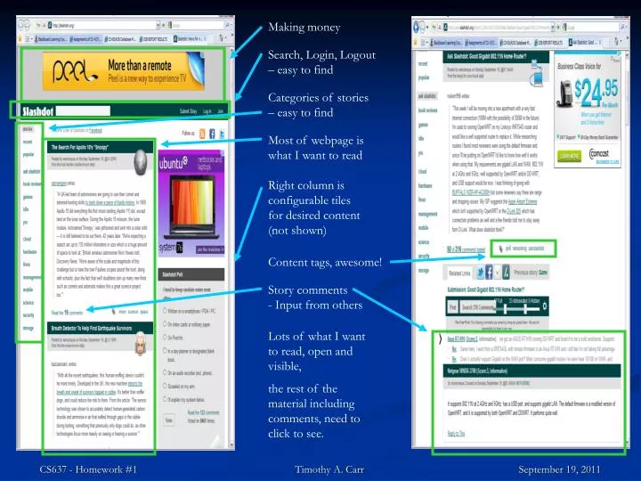
Making money. Search, Login, Logout – easy to find. Categories of stories – easy to find. Most of webpage is what I want to read. Right column is configurable tiles for desired content (not shown). Content tags, awesome!.

E N D
Making money Search, Login, Logout – easy to find Categories of stories – easy to find Most of webpage is what I want to read Right column is configurable tiles for desired content (not shown) Content tags, awesome! CS637 - Homework #1 Timothy A. Carr September 19, 2011 Storycomments - Input from others Lots of what I want to read, open and visible, the rest of the material including comments, need to click to see.
Ronnie Sekamwa Evaluation of http://arcyber.army.mil/ • The homepage has nice colors and background which reflects the organization of cyber war (spears) • Website navigation is easy and it contains slides of graphics. • Spelling and grammar are correct. • Website is connected to external social networks such as youtube, facebook and twitter where by one can follow all the website updates. • I like how the layers of the contents are arranged and all links are functional. • I like the horizontal menu as opposed to vertical. • I also like mouse overfunctionality
Babeu Alex • Like: • Each page show exactly what website does: • Allows ordering takeout online • Has useable mobile version for smart phones • Good use of symbols and pop-ups to show what pages mean • No doubts about who to contact with problems. • Dislikes: • No faceted browsing, so cannot search for a specific set of attributes. • Some graphics on the page are small and • Makes you fat. • How I would change: • Would add a “wizard” to allow specifying options and seeing what the site recommends. • Would make many of the graphics larger and to make them easier to read.
Craigslist.org AlenaBertash Pros: 1. mostly free service, not supported by adverts 2. easy to use 3. covers all 50 states, 450 cities all over the world, and still growing 4. large number of users (easy to sell or find goods) Cons: 1. limited search function 2. since it is free it attracts criminals for easy target 3. lots of scam and fraud
Al Jazeera English Cordeiro Evan http://english.aljazeera.net Design Strengths: Intuitive, Tiered, Accessible Navigation Relevant, Well Formatted Search Results Featured Interactive Content, Video Simple, Bold Color Scheme Prominent Logo/Branding No Ads Design Weaknesses: Full Page Reloads Unused Space in Header Initial View Skewed Non-Interactive Search
University of Massachusetts at Bostonwww.umb.edu Das Priyanka About the Website • Design reflects the brand of the university • Integrates with social media networks • Easier access to information • Information can be downloaded easily to different formats • Mobile application download capability About the Design • Browser Compatibility • Easy Navigation • High Quality Content • Accessibility • Information Security/ Data Privacy • Technical Merit • Quick Response/Load time • Efficient Search Capability • Database Integration • Wiser system functionalities should be improved • Career services should be more comprehensive and informative
Fan Peihong Ted.com offers many talk videos about different ideas from different people. Home page design: simple and clean Very informative Interesting and educative Usability: Fast loading Well organized Intuitive Supported by almost all browsers(with flash) Fits in all size of windows Easy to share Accessibility: All buttons have plain text Subtitles are available for many languages Improvement? More colors. Non-flash support Powerful search engine No fancy colors(Black and white) Website url: http://www.ted.com/
Website: www.bbc.co.uk Jain Praerit • PROs: • Visually driven. • Lesser advertisements makes the website more secure. • Good database linkage. • Website layout is good. • Many language options caters to a larger audience hence, more web traffic. • CONs: • Less multimedia content on the homepage. • Lengthy page design which could be distracting. • Does not utilize full workspace. • Webpage design isn't very viewer-interactive, e.g a viewer would need to dig in for comments/subscription options. • I BELIEVE THIS WEBSITE IS A WELL DESIGNED WEBPAGE. • NEW ADDITIONS: • More multimedia content available on the homepage, e.g live streaming. • Continuous news ticker for people who just want to skim over the news. • Better utilization of free space, e.g push the language option and different sections on the side.
http://www.baseball-reference.com • Provides a vast database of baseball statistics. • Individual player pages • Batting, pitching, and fielding data • Sortable player stats • Teams, leagues, playoff records and individual awards • Data from all major-league games in the last 50 years or so • It’s extremely fast and easy to use • Easy to look up almost anything MLB related • Targeted to people with a basic knowledge of the game • Very simple, effective, table-based layout. • Mimics box score data which is common in baseball records from newspapers • Capable of settling bets rather quickly. • Other features: • Wiki pages for different players and teams • Daily Trivia • Articles relating to current baseball topics • Areas to Improve • Not much. Sometimes on a player page it’s a little difficult to locate a certain dataset. It might be useful to reorganize the top of the page for navigation. • Although it’s pretty good as-is! McGivney Kyle
Evaluation: Domino’s website MangireddyMayuri Basic Web UI Design Principles: Maintain Consistency across all the pages. Provide effective feedback Allow user to customize and control the interaction Should minimize reliance on user memory Error handling I dislike Domino’s website because of the following factors: Menu bar Navigation is not consistent Calculating calories for the order placed is not user-friendly This website is poorly designed considering the below listed reasons: No feedback on user action Inconsistent menu bar interface User has no option of ordering a pizza without specifying the home address for a take away. Nutritional Info functionality is provided at the bottom of the page in small font which appears out of glance to user. Even if noticed and used, the nutritional information cannot be related to a meal being ordered by user. Website URL: http://www.dominos.com/ Improvements to the website: • Redesign the menu bar to maintain consistency throughout the website and to provide feedback on user action. Existing: Proposal: • Embed Nutritional Info functionality and price details in the build order page, which gives intermediate feedback on price and calories at every step of the selection and helps the users to plan their meal within the allocated budget and not to exceed the calories advised as per their dietary recommendations.
DBLP (Digital Bibliography & Library Project) a computer science bibliography website Main features An open Problem (1) What is the best way to correct error? (2) (3) Yang Mu
Gates n Fences – An Evaluation http://gatesnfences.com/ Why NO to Gates n Fences? Very distracting Not very eye-catching Not at all neat and attractive Design Flaws • Different font sizes and colors • Text above the heading on the page • Unattractive color combinations • Clustered text on the left side • Lots of empty space on the right side • Big buttons for links Improvements • Standardize font size and color • Remove the paragraph above the heading • Change the color and background in the heading • Instead of buttons use some neat hyperlinks or reduce the size of buttons • Make some space in between the paragraphs by making use of the empty space on the right • Put some advertisements on the home page or links to some social networking sites like facebook By RinkyPandya CS 437, Fall 2011
Let’s call Wiser 2.0 Smarter Tran Tu
“is almost certainly the best online photo management and sharing application in the world.” Is it perfect? Maybe not… Wang Dawei
Neat, simple and clear • There are some big section at the top • Convenient • Can access some major section quick and easy • Some meaningful pictures show around, make this website lively • Clear categories • Well designed • Use a lot hyperlink to navigate you to where you want to visit • Each picture is a hyperlink, visually give you an idea about it • Search • Like its style and color Xu Chao From my point of view, this website looks good and also user friendly, I don’t have any better idea to improve it.
The Eco Zoo Zhang yi • Innovative Design • Amazing Graphics • Rich and Vibrant Sound • Simple & Easy Browsing • Visual Demonstration • Shortcut Icons • Educational Contents • Protect Resources • Save Resources