Download
1 / 18
190 likes | 393 Views
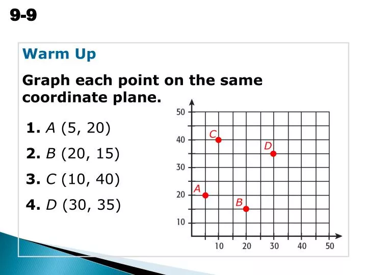
C. D. A. B. Warm Up Graph each point on the same coordinate plane. 1. A (5, 20) 2. B (20, 15) 3. C (10, 40) 4. D (30, 35). Problem of the Day What is the least number that can be divided evenly by each of the numbers 1 through 12?. 27,720.

E N D
C D A B Warm Up Graph each point on the same coordinate plane. 1.A (5, 20) 2.B (20, 15) 3. C (10, 40) 4. D (30, 35)
Problem of the Day What is the least number that can be divided evenly by each of the numbers 1 through 12? 27,720
Vocabulary scatter plot correlation line of best fit
A scatter plot is a graph with points plotted to show a relationship between two sets of data. Correlation describes the type of relationship between two data sets.
No correlation: changes in one data set do not affect the other data set. Negative correlation: as one data set increases, the other decreases. Positive correlation: both data sets increase together.
Additional Example 1: Making a Scatter Plot of a Data Set Use the given data to make a scatter plot of the weight and height of each member of a basketball team, and describe the correlation. The points on the scatter plot are (71, 170), (68, 160), (70, 175), (73, 180), and (74, 190). There is a positive correlation between the two data sets.
Check It Out: Example 1 Use the given data to make a scatter plot of the weight and height of each member of a soccer team, and describe the correlation. 200 190 180 170 160 150 140 130 120 Height (in) Weight (lbs) 63 125 67 156 Weight 69 175 68 135 62 120 The points on the scatter plot are (63, 125), (67, 156), (69, 175), (68, 135), and (62, 120). 60 61 62 63 64 65 66 67 68 69 Height There is a positive correlation between the two data sets.
Additional Example 2: Using a Scatter plot to Make Predictions Make a scatter blot of the data, and draw a line of best fit. Then use the data to predict how much a worker will earn in tips in 10 hours. Tips earned may be dependent on the number of hours worked. Step 1: Make a scatter plot. Let hours worked represent the independent variable x and tips earned represent the dependent variable y.
Additional Example 2 Continued Step 2: Draw a line of best fit. Draw a line that has about the same number of points above and below it.
Additional Example 2 Continued Step 3: Make a prediction. According to the graph, working 10 hours will earn about $24 in tips. Find the point on the line whose x-value is 10. The corresponding y-value is about 24.
Check It Out: Example 3 Use the data to predict how many circuit boards a worker will assemble in 10 hours. 141210 8 6 4 2 Hours According to the graph, a worker will assemble approximately 10 circuit boards in 10 hours. 2 4 6 8 10 12 14 Circuit Board Assemblies
Lesson Quizzes Standard Lesson Quiz Lesson Quiz for Student Response Systems
Lesson Quiz: Part I 1. Use the given information to make a scatter plot, and describe the correlation. positive correlation
Lesson Quiz: Part II 2. Draw a line of best fit for the scatter plot you drew in Problem 1. Then use the data to predict the number of A’s in grading period 6. approximately 13 A’s
Lesson Quiz for Student Response Systems 1. Identify a scatter plot for the given data. A.B.
Lesson Quiz for Student Response Systems 2. Do the data sets have a positive, a negative, or no correlation? distance covered and time taken at constant speed A. positive B. negative C. none
Lesson Quiz for Student Response Systems 3. Do the data sets have a positive, a negative, or no correlation? value of a used car and the total distance traveled A. positive B. negative C. none