Download
1 / 17
170 likes | 325 Views
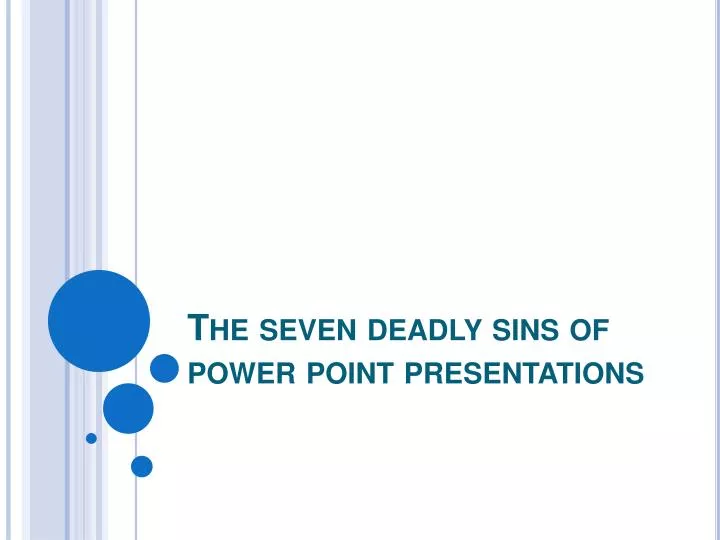
The seven deadly sins of power point presentations. Sin # 1 L etter fonts are ornate, or there are too many different fonts, styles, and font colors in a single presentation. Serif – with embellishment Sans Serif – without embellishment. Examples of serif fonts:. Computer tech

E N D
Sin #1Letter fonts are ornate, or there are too many different fonts, styles, and font colors in a single presentation. • Serif – with embellishment • Sans Serif – without embellishment
Examples of serif fonts: Computer tech Computer tech Computer Tech Computer tech Computer tech Computer tech Computer tech Computer tech Computer tech
Examples of sans serif: Computer tech Computer tech Computer tech Computer tech Computer tech Computer tech Computer tech
Colors • Limit use of colors to one or two in a presentation • The primary colors are red, yellowandblue • Avoid using red • Difficult to read • Some people are color blind to red • Did you know that color blindness is passed on genetically?
Sin #2Font sizes and/or graphics are too small. • Titles : 35 to 40 or larger size font • Text : 24 to 29 size font • Make sure the back row can read words
Photos Save photo as: largest size available
Sin #3the background is too busy or the colors lack contrast • When a photo is used as a slide background, it is often difficult to read text • Text color and background color need to have enough contrast for legibility
Background colors • It is difficult for people to read when there isn’t enough contrast • Light colors on dark backgrounds are not always the solution • A contrasting color is easier for reading
When the background is too busy, it is difficult for people to read the text
Sin #4Crowding too much information onto a single screen or transparency • Keep screens simple and clear • Do not crowd text • Use short phrases and key words • Six by Six rule • No more than six lines of text per screen • No more than six words per line
Sin #5Leaving a screen unchanged for too long or not leaving a screen up long enough for the audience to take notes • Solutions • Reveal information progressively • Use handouts of slides • Don’t overcrowd slides with words
Sin #6Overusing special effects(animations & transitions) • Be consistent • Don’t use too many different effects • Audience will be more interested in effects than presentation
Special effect overload Effects are cool One per slide
Sin #7Presentation is all text, no pictures • Some people are visual learners • Pictures and graphs make your presentation interesting