Download
1 / 17
170 likes | 362 Views
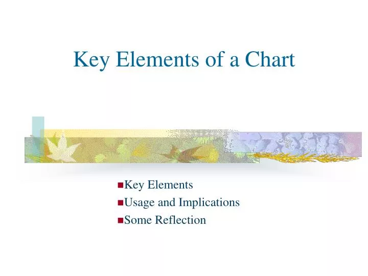
Key Elements of a Chart. Key Elements Usage and Implications Some Reflection. Key Elements of a Chart. Introduction & Instructions The following slides are on the topic of Key Elements of a Chart, their usage and implication. Use your mouse click or return button to view.

E N D
Key Elements of a Chart Key Elements Usage and Implications Some Reflection
Key Elements of a Chart • Introduction & Instructions • The following slides are on the topic of Key Elements of a Chart, their usage and implication. • Use your mouse click or return button to view. • You can view by activating the “slide show” button, however, when you read instruction to do some exercises, please pause by pressing the “esc” key of your keyboard to do the exercise and later resume the “slide show”.
A Typical Chart • Please examine the above chart carefully. What do you see as the key elements of a chart? (Please press “esc” key and write down your answers on a piece of a paper, before you read the subsequent slides. You learn faster this way. Later press “slide show” to continue …)
Key Elements of a Chart • Price or value of the Y-axis • The shape of the graph, in this case a continuous line. • The time frame / time unit on the X-axis • The name of the market, in this case KLCI • The graphical representation of the volume traded on the time unit. Go back to the previous slide (press PgUp) and write down what is the Time Frame (from which date, or month of year to what date, or month of year.). Important point, which will be emphased again and again.
Graph Displays and Timeframe • In this session, we only want to focus on types of graph displays and the timeframe / time unit. • We will also discuss their usage and implication. Remember one of the objectives is practical application of what we learn for sound investment decision, not too much theoretical knowledge.
Types of Graph display • We only discuss on 3 types of graph displays of the Y-axis, commonly used for Technical Analysis • Line graph, (Like the previous chart having continuous line shape) • Bar Graph • Japanese Candlesticks
A Line Graph • Line graph is usually drawn by joining the closing price, or the average price at the end of the trading day (or unit of time, can be 15 min. or 1 week, or 1 month.) with the next closing / average price. • In using line graph display, we are interested in the over-shape over time, to identify possible patterns and trends. We are not too concerned with the changing in price within the trading day or time unit.
A Bar Graph • A Bar graph is also referred to as HLOC, I.e. within the time unit, say a trading day, the High, Low, Open and Close prices. If the High and Low prices are in a big range, we have a long bar for that trading day, or time unit. • HLOC, further explained. Say today Market e.g. KLSE opens at 9.00 a.m. closes at 5.00 p.m. The first price transacted at 9.00 a.m. or a few min. later is the O = Opening price, the last price transacted on or before 5.00 p.m. is the C= Closing price. During the day, the highest price recorded is H, the lowest price recorded is L. • HLOC can be for unit time of 1-day, 1-month, or 15-min interval.
A Line Graph A Bar Graph • Do you notice that bar graph display gives us different information and “feeling” as compared with line graph? (Note: both charts are of the same market and timeframe.)
Japanese Candlesticks • Innovative Japanese put color and “body” to the HLOC bar. Roughly white candle represents “bullish market”, price up, of the day or time unit; black candle represents “bearish market”, price dropping. • We will have another more elaborate lesson on Japanese Candlesticks later. • It suffices to note that different graph display, or representation gives rise to different effects and feelings, for us to capture the mood and sentiments of the market.
Learning Summary Types of Graph display • Line graph • Bar Graph • Japanese Candlesticks Each type is used for different purpose. After some practices, you may have your own preference.
The Significance of Time unit & Time frame • In our interaction with people, we deal differently with different people, especially people of different ages. • We handle 3-month old baby delicately, while we as adult may deal with another adult in a take-for-granted manner, but we respect an old person with much wisdom and experience. • Likewise we have to apply this similar attitudes when studying a graph of different timeframe / time unit. • A graph can be 50 years of timeframe, with each time unit of 1-month. Another graph of similar market may be 6-month timeframe with each time unit of 1-day. And another 1-day timeframe, with time unit of 15 min. interval. • We will repeatedly emphasize on this important point throughout this course, as this will help us to make good strategies to position ourselves before making the investment decision. That is, the need to consider different timeframes to better understand the overall and eventual market behavior. Don’t just be happy handling 3-month old baby!
The Significance of Time unit & Time frame • The above is a Candlestick graph. The timeframe is from 9.00 a.m. to 5 p.m. During lunch break, there was no trading, hence no data. • This graph is on 31st Oct. 2003 – one day trading. This is the one day candlestick of the daily chart of the previous chart, which I will show both in the next slide.
The Significance of Time unit & Time frame • In the daily chart (Chart A), the graph shows market rising for the last few months, hence bullish feeling. But in the one day graph with 15-min. intervals, there are many black candles, hence bearish feeling for that day. • WE MUST HAVE THE DISCIPLINE TO CHECK THE LONGER TIMEFRAME DIRECTION AND SENTIMENT, WHILE WE ALSO LOOK AT SHORTER TIMEFRAME SIGNALS. ONE OF THE KEY FACTOR TO DESIGN INVESTMENT STRATEGIES. Chart A
Learning Summary The Significance of Time unit & Time frame • Carefully handle people of different ages to understand the whole human behavior. • Likewise always study different timeframes of the market to appreciate its sentiment. • Don’t be greedy to pluck the fruit at a branch when the whole tree maybe collapsing. • Neither be too cautious of a tree with yellowish leaves when the whole forest is about to turn into life. • We need to handle both the forest and the tree carefully, like a good manager.
Question and Reflection • What sort of timeframe most newspapers display of the market (stock) graph? • What sort of timeframe do most newspapers broadcast about the market news … ? • Do newspapers regularly give perspectives of the past pattern and trend beside current market news? • If investors are bombarded with only current news without different timeframe perspectives, what happen to investors? • Will you likely be over reactive to market news or speculation? Please post your views and comments by email 360qBC03@yahoogroups.com or go to our virtual classroom http://groups.yahoo.com/group/360qBC03/, and post there.
End of this lesson. If you have questions or comments, please email to the class 360qBC03@yahoogroups.com, or post at http://groups.yahoo.com/group/360qBC03/ or post your question in the “Database” on Question file. All students are encouraged to participate, share your view, or teach those you think you have some knowledge.