Download
1 / 56
580 likes | 606 Views
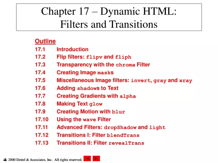
Chapter 17 – Dynamic HTML: Filters and Transitions. Outline 17.1 Introduction 17.2 Flip filters: flipv and fliph 17.3 Transparency with the chroma Filter 17.4 Creating Image mask s 17.5 Miscellaneous Image filters: invert , gray and xray 17.6 Adding shadow s to Text

E N D
Chapter 17 – Dynamic HTML:Filters and Transitions Outline 17.1 Introduction 17.2 Flip filters: flipv and fliph 17.3 Transparency with the chroma Filter 17.4 Creating Image masks 17.5 Miscellaneous Image filters: invert, gray and xray 17.6 Adding shadows to Text 17.7 Creating Gradients with alpha 17.8 Making Text glow 17.9 Creating Motion with blur 17.10 Using the wave Filter 17.11 Advanced Filters: dropShadow and light 17.12 Transitions I: Filter blendTrans 17.13 Transitions II: Filter revealTrans
17.1 Introduction • Many visual effects implemented in client-side browser • No server-side processing delays • DHTML code usually small • Filters • Cause changes to text and images • Persistent • Transitions • Transfer from page to page • Temporary • Filters and transitions built into Windows IE5 • CSS filter property • Can only be applied to block-level elements or inline-level elements which have height or width CSS properties set
17.2 Flip filters: flipv and fliph • flipv filter • Mirrors text or images vertically • fliph filter • Mirrors text or images horizontally • Filters applied in the STYLE attribute • <TD STYLE = “filter: flipv fliph”>
1<!DOCTYPE html PUBLIC "-//W3C//DTD HTML 4.0 Transitional//EN"> 2<HTML> 3 4<!-- Fig. 17.1: flip.html --> 5<!-- Using the flip filters --> 6 7<HEAD> 8<TITLE>The flip filter</TITLE> 9 10<STYLE TYPE ="text/css"> 11BODY { background-color: #CCFFCC } 12 13TABLE { font-size:3em; 14font-family:Arial, sans-serif; 15background-color:#FFCCCC; 16border-style: ridge ; 17 border-collapse:collapse } 18 19TD { border-style:groove; 20padding:1ex } 21</STYLE> 22</HEAD> 23 24<BODY> 25 26<TABLE> 27 28<TR> 29<!-- Filters are applied in style declarations --> 30<TD STYLE ="filter: fliph">Text</TD> 31<TD>Text</TD> 32</TR> 33 Apply flipv and fliph filters using the STYLE attribute
34 <TR> 35 <!-- More than one filter can be applied at once --> 36 <TD STYLE ="filter: flipv fliph">Text</TD> 37 <TD STYLE ="filter: flipv">Text</TD> 38 </TR> 39 40 </TABLE> 41 42 </BODY> 43 </HTML> 2. Page rendered by browser
17.3 Transparency with the chroma Filter • chroma filter • Apply transparency effects dynamically • Each filter has a property enabled • If set to true, filter applied • If set to false, filter not applied • ONCHANGE event • Fires whenever the VALUE of a form field changes
1<!DOCTYPE html PUBLIC "-//W3C//DTD HTML 4.0 Transitional//EN"> 2<HTML> 3 4<!-- Fig 17.2: chroma.html --> 5<!-- Applying transparency using the chroma filter --> 6 7<HEAD> 8<TITLE>Chroma Filter</TITLE> 9 10<SCRIPT LANGUAGE ="JavaScript"> 11 12function changecolor() 13 { 14if ( colorSelect.value ) { // if the user selected a color, 15 16 // parse the value to hex and set the filter color. 17 chromaImg.filters( "chroma" ).color = 18 parseInt( colorSelect.value, 16 ); 19 chromaImg.filters( "chroma" ).enabled = true; 20 } 21else// if the user selected "None", 22 23 // disable the filter. 24 chromaImg.filters( "chroma" ).enabled = false; 25 } 26 27</SCRIPT> 28</HEAD> 29 30<BODY> 31 32<H1>Chroma Filter:</H1> Define function changecolor 1.1 use parseInt function to convert value to hexadecimal integer
33 34<IMG ID ="chromaImg"SRC="trans.gif"STYLE = 35"position: absolute; filter: chroma"> 36 37<!-- The ONCHANGE event fires when a selection is changed --> 38<SELECT ID = "colorSelect" ONCHANGE = "changecolor()"> 39<OPTION VALUE = "">None 40 <OPTION VALUE = "00FFFF">Cyan 41<OPTION VALUE = "FFFF00">Yellow 42 <OPTION VALUE = "FF00FF">Magenta 43<OPTION VALUE = "000000" SELECTED>Black 44</SELECT> 45 46</BODY> 47</HTML>
17.4 Creating Image masks • mask filter • Create an image mask • Background of element solid color • Foreground of element transparent to image or color behind • color parameter specifies mask color
1<!DOCTYPE html PUBLIC "-//W3C//DTD HTML 4.0 Transitional//EN"> 2<HTML> 3 4<!-- Fig 17.3: mask.html --> 5<!-- Placing a mask over an image --> 6 7<HEAD> 8<TITLE>Mask Filter</TITLE> 9</HEAD> 10 11<BODY> 12 13<H1>Mask Filter</H1> 14 15<!-- Filter parameters are specified in parentheses, in --> 16<!-- the form param1 = value1, param2 = value2, etc. --> 17<DIV STYLE = "position: absolute; top: 125; left: 20; 18 filter: mask( color = #CCFFFF )"> 19<H1 STYLE = "font-family: Courier, monospace"> 20AaBbCcDdEeFfGgHhIiJj<BR> 21KkLlMmNnOoPpQqRrSsTt 22</H1> 23</DIV> 24 25<IMG SRC = "gradient.gif" WIDTH = "400" HEIGHT = "200"> 26</BODY> 27</HTML> Applying mask filter 1.1 Specify color parameter
17.5 Miscellaneous Image filters: invert, gray and xray • invert filter • Negative image effect • Dark areas become light • Light areas become dark • Good use of invert filter: • Signify something has just been clicked or selected • gray filter • Grayscale image effect • Color stripped from image • All that remains is brightness data • xray filter • Xray effect • Inversion of grayscale effect
1<!DOCTYPE html PUBLIC "-//W3C//DTD HTML 4.0 Transitional//EN"> 2<HTML> 3 4<!-- Fig 17.4: misc.html --> 5<!-- Image filters to invert, grayscale, or xray an image --> 6 7<HEAD> 8<TITLE>Misc. Image filters</TITLE> 9 10<STYLE TYPE = "text/css"> 11.cap { font-weight:bold; 12background-color:#DDDDAA; 13text-align:center } 14</STYLE> 15</HEAD> 16 17<BODY> 18<TABLE> 19 <TR CLASS = "cap"> 20 <TD>Normal</TD> 21<TD>Grayscale</TD> 22<TD>Xray</TD> 23<TD>Invert</TD> 24 </TR> 25 26<TR> 27<TD><IMG SRC ="harvey.jpg"></TD> 28<TD><IMG SRC = "harvey.jpg"STYLE ="filter: gray"></TD> 29<TD><IMG SRC ="harvey.jpg"STYLE ="filter: xray"></TD> 30<TD><IMG SRC ="harvey.jpg"STYLE ="filter: invert"></TD> 31 </TR> Apply invert, gray and xray filters to harvey.jpg
32 </TABLE> 33 34 </BODY> 35 </HTML> 2. Page rendered by browser
17.6 Adding shadows to Text • shadow filter • Creates shadowing effect • Property direction • Direction of shadow • 0 (up), 45 (above-right), 90 (right), 135 (below-right), 180 (below), 225 (below-left), 270 (left) and 315 (above-left) • Property color • Increase padding if cut off by element borders
1<!DOCTYPE html PUBLIC "-//W3C//DTD HTML 4.0 Transitional//EN"> 2<HTML> 3 4<!-- Fig 17.5: shadow.html --> 5<!-- Applying the shadow filter --> 6 7<HEAD> 8<TITLE>Shadow Filter</TITLE> 9 10<SCRIPT LANGUAGE = "JavaScript"> 11var shadowDirection = 0; 12 13function start() 14 { 15 window.setInterval( "runDemo()", 500 ); 16 } 17 18function runDemo() 19 { 20 shadowText.innerText = 21 "Shadow Direction: " + shadowDirection % 360; 22 shadowText.filters( "shadow" ).direction = 23 ( shadowDirection % 360 ); 24 shadowDirection += 45; 25 } 26</SCRIPT> 27</HEAD> 28 29<BODY ONLOAD = "start()"> 30 31<H1 ID = "shadowText" STYLE = "position: absolute; top: 50; Define function runDemo to cycle through all values of direction property
32left: 50; padding: 10; filter: shadow( direction = 0, 33color = red )">Shadow Direction: 0</H1> 34</BODY> 35</HTML> 2. Page rendered by browser (at different times) 2.1 Apply padding so shadow effect is not cut off
17.7 Creating Gradients with alpha • Gradient effect • Gradual progression from starting color to target color • alpha filter • style property • What style opacity applied • 0: uniform opacity • 1: linear gradient • 2: circular gradient • 3: rectangular gradient • opacity and finishopacity properties • Percentages for opacity of specified gradient • startX, startY, finishX, finishY • Specify x-y coordinates for start and finish of gradient
1<!DOCTYPE html PUBLIC "-//W3C//DTD HTML 4.0 Transitional//EN"> 2<HTML> 3 4<!-- Fig 17.6: alpha.html --> 5<!-- Applying the alpha filter to an image --> 6 7<HEAD> 8<TITLE>Alpha Filter</TITLE> 9<SCRIPT LANGUAGE = "JavaScript"> 10function run() 11 { 12 pic.filters( "alpha" ).opacity = opacityButton.value; 13 pic.filters( "alpha" ).finishopacity = opacityButton2.value; 14 pic.filters( "alpha" ).style = styleSelect.value; 15 } 16</SCRIPT> 17</HEAD> 18 19<BODY> 20 21<DIV ID = "pic" 22 STYLE = "position: absolute; left:0; top: 0; 23filter: alpha( style = 2, opacity = 100, 24 finishopacity = 0 )"> 25 <IMG SRC = "flag.gif"> 26</DIV> 27 28<TABLE STYLE = "position: absolute; top: 250; left: 0; 29background-color: #CCFFCC" BORDER = "1"> 30 31 <TR> 32<TD>Opacity (0-100):</TD> Applying the alpha filter to a DIV element containing an image
33 <TD><INPUT TYPE = "text" ID = "opacityButton" SIZE = "3" 34 MAXLENGTH = "3" VALUE = "100"></TD> 35</TR> 36 37<TR> 38<TD>FinishOpacity (0-100):</TD> 39 <TD><INPUT TYPE = "text" ID = "opacityButton2" SIZE = "3" 40 MAXLENGTH = "3" VALUE = "0"></TD> 41 </TR> 42 43 <TR> 44<TD>Style:</TD> 45<TD><SELECT ID = "styleSelect"> 46 <OPTION VALUE = "1">Linear 47 <OPTION VALUE = "2" SELECTED>Circular 48 <OPTION VALUE = "3">Rectangular 49</SELECT></TD> 50</TR> 51 52<TR> 53 <TD ALIGN = "center" COLSPAN = "2"><INPUT TYPE = "button" 54 VALUE = "Apply" ONCLICK = "run()"></TD> 55 </TR> 56</TABLE> 57 58</BODY> 59</HTML>
17.8 Making Text glow • glow filter • Add aura of color around text • Specify color and strength • Add padding if large strength cuts off effect with element borders
1 <!DOCTYPE html PUBLIC "-//W3C//DTD HTML 4.0 Transitional//EN"> 2 <HTML> 3 4 <!-- Fig 17.7: glow.html --> 5 <!-- Applying the glow filter --> 6 7 <HEAD> 8 <TITLE>Glow Filter</TITLE> 9 <SCRIPT LANGUAGE = "JavaScript"> 10 var strengthIndex = 1; 11 var counter = 1; 12 var upDown = true; 13 var colorArray = [ "FF0000", "FFFF00", "00FF00", 14 "00FFFF", "0000FF", "FF00FF" ]; 15 function apply() 16 { 17 glowSpan.filters( "glow" ).color = 18 parseInt( glowColor.value, 16); 19 glowSpan.filters( "glow" ).strength = 20 glowStrength.value; 21 } 22 23 function startdemo() 24 { 25 window.setInterval( "rundemo()", 150 ); 26 } 27 28 function rundemo() 29 { 30 if ( upDown ) 31 glowSpan.filters( "glow" ).strength = strengthIndex++; 1.1 Define functions apply, startdemo and rundemo
32else 33 glowSpan.filters( "glow" ).strength = strengthIndex--; 34 35if ( strengthIndex == 1 ) { 36 upDown = !upDown; 37 counter++; 38 glowSpan.filters( "glow" ).color = 39 parseInt( colorArray[ counter % 6 ], 16 ); 40 } 41 42if ( strengthIndex == 10 ) { 43 upDown = !upDown; 44 } 45 } 46</SCRIPT> 47</HEAD> 48 49<BODY STYLE ="background-color: #00AAAA"> 50<H1>Glow Filter:</H1> 51 52<SPAN ID = "glowSpan" STYLE = "position: absolute; left: 200; 53 top: 100; padding: 5; filter: glow( color = red, 54strength = 5 )"> 55<H2>Glowing Text</H2> 56</SPAN> 57 58<TABLE BORDER = 1 STYLE = "background-color: #CCFFCC"> 59 <TR> 60<TD>Color (Hex)</TD> 61 <TD><INPUT ID = "glowColor" TYPE = "text" SIZE = 6 62 MAXLENGTH = 6 VALUE = FF0000></TD> 1.2 Apply glow filter to SPAN element containing text 2. Increase padding so effect is not cut off by element borders
63 </TR> 64 <TR> 65<TD>Strength (1-255)</TD> 66 <TD><INPUT ID = "glowStrength" TYPE = "text" SIZE = 3 67 MAXLENGTH = 3 VALUE = 5></TD> 68 </TR> 69 <TR> 70 <TD COLSPAN = 2> 71 <INPUT TYPE = "BUTTON" VALUE = "Apply" 72 ONCLICK = "apply()"> 73 <INPUT TYPE = "BUTTON" VALUE = "Run Demo" 74 ONCLICK = "startdemo()"></TD> 75 </TR> 76</TABLE> 77 78</BODY> 79</HTML> 2. Page rendered by browser
17.9 Creating Motion with blur • blur filter • Creates illusion of motion • Blurs text or images in a certain direction • Three properties: • add • true adds a copy of original image over blurred image • direction • Angular form (like shadow filter) • strength • Strength of blur effect
1 <!DOCTYPE html PUBLIC "-//W3C//DTD HTML 4.0 Transitional//EN"> 2 <HTML> 3 4 <!-- Fig 17.8: blur.html --> 5 <!-- The blur filter --> 6 7 <HEAD> 8 <TITLE>Blur Filter</TITLE> 9 <SCRIPT LANGUAGE = "JavaScript"> 10 var strengthIndex = 1; 11 var blurDirection = 0; 12 var upDown = 0; 13 var timer; 14 15 function reBlur() 16 { 17 blurImage.filters( "blur" ).direction = 18 document.forms( "myForm" ).Direction.value; 19 blurImage.filters( "blur" ).strength = 20 document.forms( "myForm" ).Strength.value; 21 blurImage.filters( "blur" ).add = 22 document.forms( "myForm" ).Add.checked; 23 } 24 25 function startDemo() 26 { 27 timer = window.setInterval( "runDemo()", 5 ); 28 } 29 30 function runDemo( ) 31 { 32 document.forms( "myForm" ).Strength.value = strengthIndex; Using the blur filter 1.2 Various blur parameters
33 document.forms( "myForm" ).Direction.value = 34 ( blurDirection % 360 ); 35 36if( strengthIndex == 35 || strengthIndex == 0 ) 37 upDown = !upDown; 38 39 blurImage.filters( "blur" ).strength = 40 ( upDown ? strengthIndex++ : strengthIndex-- ); 41 42if ( strengthIndex == 0 ) 43 blurImage.filters( "blur" ).direction = 44 ( ( blurDirection += 45 ) % 360 ); 45 } 46 47</SCRIPT> 48</HEAD> 49 50<BODY> 51<FORM NAME = "myForm"> 52 53<TABLE BORDER = "1" STYLE = "background-color: #CCFFCC"> 54<CAPTION>Blur filter controls</CAPTION> 55 56<TR> 57<TD>Direction:</TD> 58<TD><SELECT NAME = "Direction"> 59<OPTION VALUE = "0">above 60<OPTION VALUE = "45">above-right 61<OPTION VALUE = "90">right 62<OPTION VALUE = "135">below-right 63<OPTION VALUE = "180">below 64<OPTION VALUE = "225">below-left
97<DIV ID = "blurImage" STYLE = "position: absolute; top: 0; 98left: 300; padding: 0; filter: 99 blur( add = 0, direction = 0, strength = 0 ); 100 background-color: white;"> 101 <IMG ALIGN = "center" SRC = "shapes.gif"> 102</DIV> 103 104</BODY> 105</HTML> 2. Apply blur filter to DIV element containing an image
Using the blur filter with the add property false, then true
17.10 Using the wave Filter • wave filter • Apply sine-wave distortions to text and images • Properties: • add • Adds a copy of text or image underneath filtered effect • freq • Frequency of sine wave • How many complete sine waves applied • phase • Phase shift of sine wave • strength • Amplitude of sine wave • Processor intensive
1<!DOCTYPE html PUBLIC "-//W3C//DTD HTML 4.0 Transitional//EN"> 2<HTML> 3 4<!-- Fig 17.9: wave.html --> 5<!-- Applying the wave filter --> 6 7<HEAD> 8<TITLE>Wave Filter</TITLE> 9 10<SCRIPT LANGUAGE = "JavaScript"> 11var wavePhase = 0; 12 13function start() 14 { 15 window.setInterval( "wave()", 5 ); 16 } 17 18function wave() 19 { 20 wavePhase++; 21 flag.filters( "wave" ).phase = wavePhase; 22 } 23</SCRIPT> 24</HEAD> 25 26<BODY ONLOAD = "start();"> 27 28<SPAN ID = "flag" 29 STYLE = "align: center; position: absolute; 30left: 30; padding: 15; 31filter: wave(add = 0, freq = 1, phase = 0, strength = 10)"> Define function start to demonstrate wave filter (with various parameter settings)
32 <H1>Here's some waaaavy text</H1> 33 </SPAN> 34 35 </BODY> 36 </HTML> 2. Page rendered by browser (at different times)
17.11 Advanced Filters: dropShadow and light • dropShadow filter • Places blacked-out version of image behind original image • Offset by specified number of pixels • offx and offy properties • color property
17.11 Advanced Filters: dropShadow and light (II) • Light filter • Simulates effect of light source • addPoint method • Adds point light source addPoint (xSource, ySource, height, R, G, B, strength%); • addCone method • Adds a cone light source addCone (xSource, ySource, height, xTarget, yTarget, R, G, B, strength%);
1 <!DOCTYPE html PUBLIC "-//W3C//DTD HTML 4.0 Transitional//EN"> 2 <HTML> 3 4 <!-- Fig 17.10: dropshadow.html --> 5 <!-- Using the light filter with the dropshadow filter --> 6 7 <HEAD> 8 <TITLE>DHTML dropShadow and light Filters</TITLE> 9 10 <SCRIPT LANGUAGE = "JavaScript"> 11 function setlight( ) 12 { 13 dsImg.filters( "light" ).addPoint( 150, 150, 14 125, 255, 255, 255, 100); 15 } 16 17 function run() 18 { 19 eX = event.offsetX; 20 eY = event.offsetY; 21 22 xCoordinate = Math.round( eX-event.srcElement.width/2, 0 ); 23 yCoordinate = Math.round( eY-event.srcElement.height/2, 0 ); 24 25 dsImg.filters( "dropShadow" ).offx = xCoordinate / -3; 26 dsImg.filters( "dropShadow" ).offy = yCoordinate / -3; 27 28 dsImg.filters( "light" ).moveLight(0, eX, eY, 125, 1); 29 } 30 </SCRIPT> 31 </HEAD> 32 1.1 Define function setLight 1.2 Use method addPoint to add a point light source 1.3 Use method moveLight to update position of light source
33<BODY ONLOAD = "setlight()" STYLE = "background-color: green"> 34 35<IMG ID = "dsImg" SRC = "circle.gif" 36 STYLE = "top: 100; left: 100; filter: dropShadow( offx = 0, 37offy = 0, color = black ) light()" ONMOUSEMOVE = "run()"> 38 39</BODY> 40</HTML> 2. Add dropShadow and light filters to IMG element
1 <!DOCTYPE html PUBLIC "-//W3C//DTD HTML 4.0 Transitional//EN"> 2 <HTML> 3 4 <!-- Fig 17.11: conelight.html --> 5 <!-- Automating the cone light source --> 6 7 <HEAD><TITLE>Cone lighting</TITLE> 8 9 <SCRIPT LANGUAGE = "JavaScript"> 10 var upDown = true; 11 var counter = 0; 12 var moveRate = -2; 13 14 function setLight() 15 { 16 marquee.filters( "light" ).addCone( 0, marquee.height, 8, 17 marquee.width/2, 30, 255, 150, 255, 50, 15 ); 18 marquee.filters( "light" ).addCone( marquee.width, 19 marquee.height, 8, 200, 30, 150, 255, 255, 50, 15 ); 20 marquee.filters( "light" ).addCone( marquee.width/2, 21 marquee.height, 4, 200, 100, 255, 255, 150, 50, 50 ); 22 23 window.setInterval( "moveLight()", 100 ); 24 } 25 26 function moveLight() 27 { 28 counter++; 29 30 if ( ( counter % 30 ) == 0 ) 31 upDown = !upDown; 32 Use addCone method to add cone light source
33if ( ( counter % 10 ) == 0 ) 34 moveRate *= -1; 35 36if ( upDown ) { 37 marquee.filters( "light" ).moveLight( 0,-1,-1,3,0 ); 38 marquee.filters( "light" ).moveLight( 1,1,-1,3,0 ); 39 marquee.filters( "light" ).moveLight(2,moveRate,0,3,0); 40 } 41else { 42 marquee.filters( "light" ).moveLight( 0,1,1,3,0 ); 43 marquee.filters( "light" ).moveLight( 1,-1,1,3,0 ); 44 marquee.filters( "light" ).moveLight(2,moveRate,0,3,0); 45 } 46 } 47</SCRIPT> 48 49<BODY STYLE = "background-color: #000000" ONLOAD = "setLight()"> 50 51<IMG ID = "marquee" SRC = "marquee.gif" 52 STYLE = "filter: light; position: absolute; left: 100; 53top: 100"> 54 55</BODY> 56</HTML> 2. moveLight method, when used with cone source, moves the target of the light
17.12 Transitions I: Filter blendTrans • Transitions • Set as values of filter CSS property • blendTrans transition • Creates a smooth fade-in/fade-out effect • Parameter duration • Determines how long the transition will take
1<!DOCTYPE html PUBLIC "-//W3C//DTD HTML 4.0 Transitional//EN"> 2<HTML> 3 4<!-- Fig 17.12: blendtrans.html --> 5<!-- Blend transition --> 6 7<HEAD> 8<TITLE>Using blendTrans</TITLE> 9 10<SCRIPT LANGUAGE = "JavaScript"> 11function blendOut() 12 { 13 textInput.filters( "blendTrans" ).apply(); 14 textInput.style.visibility = "hidden"; 15 textInput.filters( "blendTrans" ).play(); 16 } 17</SCRIPT> 18</HEAD> 19 20<BODY> 21 22<DIV ID = "textInput" ONCLICK = "blendOut()" 23 STYLE = "width: 300; filter: blendTrans( duration = 3 )"> 24<H1>Some fading text</H1> 25</DIV> 26 27</BODY> 28</HTML> 1.1 apply method initializes transition 1.2 Set visibility of element to hidden; takes effect when invoke play
1 <!DOCTYPE html PUBLIC "-//W3C//DTD HTML 4.0 Transitional//EN"> 2 <HTML> 3 4 <!-- Fig 17.13: blendtrans2.html --> 5 <!-- Blend Transition --> 6 7 <HEAD> 8 <TITLE>Blend Transition II</TITLE> 9 10 <SCRIPT LANGUAGE = "JavaScript"> 11 var whichImage = true; 12 13 function blend() 14 { 15 if ( whichImage ) { 16 image1.filters( "blendTrans" ).apply(); 17 image1.style.visibility = "hidden"; 18 image1.filters( "blendTrans" ).play(); 19 } 20 else { 21 image2.filters( "blendTrans" ).apply(); 22 image2.style.visibility = "hidden"; 23 image2.filters( "blendTrans" ).play(); 24 } 25 } 26 27 function reBlend ( fromImage ) 28 { 29 if ( fromImage ) { 30 image1.style.zIndex -= 2; 31 image1.style.visibility = "visible"; 32 } 1.1 Define blend function 1.2 zIndex is JavaScript’s version of z-index
33else { 34 image1.style.zIndex += 2; 35 image2.style.visibility = "visible"; 36 } 37 38 whichImage = !whichImage; 39 blend(); 40 } 41</SCRIPT> 42</HEAD> 43 44<BODY STYLE = "color: darkblue; background-color: lightblue" 45 ONLOAD = "blend()"> 46 47<H1>Blend Transition Demo</H1> 48 49<IMG ID = "image2" SRC = "cool12.jpg" 50 ONFILTERCHANGE = "reBlend( false )" 51 STYLE = "position: absolute; left: 50; top: 50; width: 300; 52filter: blendTrans( duration = 4 ); z-index: 1"> 53 54<IMG ID = "image1" SRC = "cool8.jpg" 55 ONFILTERCHANGE = "reBlend( true )" 56 STYLE = "position: absolute; left: 50; top: 50; width: 300; 57filter: blendTrans( duration = 4 ); z-index: 2"> 58 59</BODY> 60</HTML> 1.3 BODY tag’s ONLOAD event calls function blend
17.13 Transitions II: Filter revealTrans • revealTrans filter • Transition using professional-style transitions • From box out to random dissolve • 24 different transitions
1 <!DOCTYPE html PUBLIC "-//W3C//DTD HTML 4.0 Transitional//EN"> 2 <HTML> 3 4 <!-- Fig 17.14: revealtrans.html --> 5 <!-- Cycling through 24 transitions --> 6 <HEAD> 7 <TITLE>24 DHTML Transitions</TITLE> 8 9 <SCRIPT> 10 var transitionName = 11 ["Box In", "Box Out", 12 "Circle In", "Circle Out", 13 "Wipe Up", "Wipe Down", "Wipe Right", "Wipe Left", 14 "Vertical Blinds", "Horizontal Blinds", 15 "Checkerboard Across", "Checkerboard Down", 16 "Random Dissolve", 17 "Split Vertical In", "Split Vertical Out", 18 "Split Horizontal In", "Split Horizontal Out", 19 "Strips Left Down", "Strips Left Up", 20 "Strips Right Down", "Strips Right Up", 21 "Random Bars Horizontal", "Random Bars Vertical", 22 "Random"]; 23 24 var counter = 0; 25 var whichImage = true; 26 27 function blend() 28 { 29 if ( whichImage ) { 30 image1.filters( "revealTrans" ).apply(); 31 image1.style.visibility = "hidden"; 32 image1.filters( "revealTrans" ).play(); Cycle through 24 transitions using revealTrans 1.1 Create array containing different transition names