Download
1 / 4
40 likes | 48 Views
If your website is mobile-friendly it will benefit your business because of the high rate of mobile users. If you want to reach more customers your website should be mobile responsive

E N D
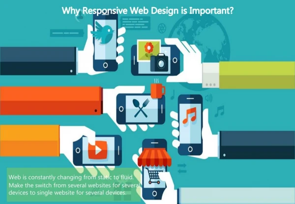
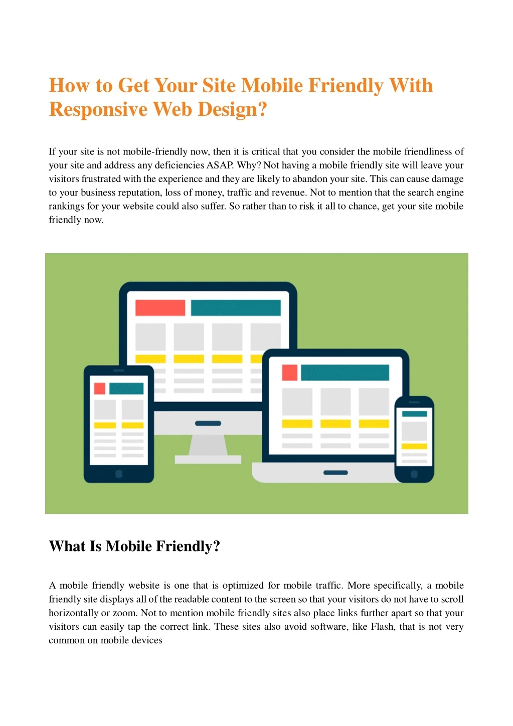
How to Get Your Site Mobile Friendly With Responsive Web Design? If your site is not mobile-friendly now, then it is critical that you consider the mobile friendliness of your site and address any deficiencies ASAP. Why? Not having a mobile friendly site will leave your visitors frustrated with the experience and they are likely to abandon your site. This can cause damage to your business reputation, loss of money, traffic and revenue. Not to mention that the search engine rankings for your website could also suffer. So rather than to risk it all to chance, get your site mobile friendly now. What Is Mobile Friendly? A mobile friendly website is one that is optimized for mobile traffic. More specifically, a mobile friendly site displays all of the readable content to the screen so that your visitors do not have to scroll horizontally or zoom. Not to mention mobile friendly sites also place links further apart so that your visitors can easily tap the correct link. These sites also avoid software, like Flash, that is not very common on mobile devices
How to Get Mobile Friendly? There are three main ways to get your site mobile friendly, including dynamic serving, a separate mobile site and responsive web design. Here is a brief summary of each approach: A Separate Mobile Site A separate mobile site serves a separate code to each device, on a different URL. This configuration detects the device of the user, then redirects it to the appropriate page. Responsive Web Design Responsive web design serves the same HTML code, on the same URL. It dynamically adapts to any device (desktop computers, tablets, mobile, non-visual browser) that your website is being viewed on. Dynamic Serving Dynamic serving responds to each device with a different HTML and CSS code, using the same URL.
Get Mobile Friendly with Responsive Web Design According to Google, there are three main ways to get your site mobile friendly, including dynamic serving, a separate mobile site and responsive web design. Although all of these approaches can get your site mobile ready, Google only recommends responsive web design as the best way to get your site mobile friendly. Beyond making Google happy, here are some benefits of going responsive. Responsive web design dynamically responds to the screen size that it is being viewed on, while using the same URL and code. In other words, there is no need to create and maintain multiple website, as you only have to keep up content for one site. Using one URL also makes it simpler for users to share and link your content. Responsive design is future friendly, as it is built to dynamically adapt to any device, either now or in the future. Responsive web design can help to boost your search engine optimization (SEO). For example, responsive web design does not require redirection which reduces load time and improves SEO. Also, there is no fear that you will get penalized for duplicate content because there is only one site to maintain. Responsive design provides your users with a better experience. In other words, browsers will not have to scroll, pinch or zoom to view your content. How to Get Your Website Responsive? There are a few ways to get your site responsive. Here is a summary of your options: If your site allows, you can buy a responsive template or theme for your site. If you have the technical knowledge and skill, then you can build your site to be responsive. Google does provide tools that will help you to analyze your site to see if it is mobile friendly. If your site is more complex and is out of your area of knowledge, then you may need to hire a developer to get your site mobile friendly. Of course, this option will cost more money and time. And if you have an older site, then a new developer could recommend
building your site from scratch. Why? Because there may be new web development techniques and themes that can make starting from scratch more efficient than modifying your current site. This will be particularly true for websites that are built with flash or sites that have an outdated e-commerce platform. With that said, the great news is that your developer could use an existing template/theme that may be able to save you time and money. To sum it up, if your site is not mobile friendly you could be getting left in the dust. So if you care about your site rankings, traffic and providing users with the best possible experience, then you will want to seriously consider getting your site mobile friendly with responsive web design.