Download
1 / 5
50 likes | 55 Views
Learn how to optimize your website for mobile with Elementor, a popular drag-and-drop page builder for WordPress. Improve your user experience and search engine rankings with our comprehensive guide.<br><br>

E N D
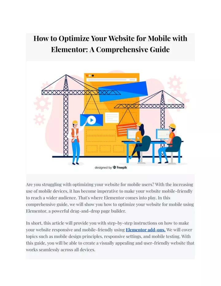
How to Optimize Your Website for Mobile with Elementor: A Comprehensive Guide Are you struggling with optimizing your website for mobile users? With the increasing use of mobile devices, it has become imperative to make your website mobile-friendly to reach a wider audience. That's where Elementor comes into play. In this comprehensive guide, we will show you how to optimize your website for mobile using Elementor, a powerful drag-and-drop page builder. In short, this article will provide you with step-by-step instructions on how to make your website responsive and mobile-friendly using Elementor add-ons. We will cover topics such as mobile design principles, responsive settings, and mobile testing. With this guide, you will be able to create a visually appealing and user-friendly website that works seamlessly across all devices.
But that's not all! We have enlisted the help of a renowned expert in the field to provide you with valuable insights and tips on mobile optimization. So, without any further ado, let's dive into the world of mobile optimization and learn how to enhance your website's performance and user experience. Understanding Mobile Optimization Before we dive into the specifics of using Elementor to optimize your website for mobile, it's important to understand what mobile optimization is and why it matters. Simply put, mobile optimization is the process of making sure that your website looks and functions well on mobile devices such as smartphones and tablets. There are several reasons why mobile optimization is essential. Firstly, mobile devices have smaller screens than desktop computers, so your website must be designed to fit these screens without compromising usability or readability. Secondly, mobile users have di?erent browsing habits and expectations than desktop users, so your website must be designed to meet these needs. Finally, Google and other search engines prioritize mobile-friendly websites in their search results, so mobile optimization is crucial for improving your search engine rankings. Using Elementor to Optimize Your Website for Mobile Now that we've established the importance of mobile optimization, let's dive into how to use Elementor to optimize your website for mobile. Step 1: Choose a Mobile-Responsive Elementor Theme The first step is to choose a mobile-responsive Elementor theme. This is essential because it ensures that your website is optimized for mobile right from the start. Elementor o?ers many mobile-responsive themes that you can choose from, so take the time to find one that fits your needs. Step 2: Use Elementor's Mobile Editing Features
Once you've chosen a mobile-responsive theme, it's time to start editing your website for mobile devices using Elementor's mobile editing features. These features allow you to see how your website looks on di?erent mobile devices and make adjustments as needed. Elementor's mobile editing features include: ● Device Preview: This feature allows you to preview your website on di?erent mobile devices, including smartphones and tablets. This makes it easy to see how your website looks and functions on di?erent screens. ● Mobile Editing Tools: Elementor's mobile editing tools allow you to make adjustments to your website specifically for mobile devices. For example, you can change font sizes, adjust margins and padding, and hide certain elements that may not be necessary on mobile. Step 3: Optimize Your Website's Speed Mobile users expect fast-loading websites, so optimizing your website's speed is crucial for delivering an excellent user experience. Elementor o?ers several features that can help you optimize your website's speed, including: ● Lazy Loading: This feature allows your website's images and videos to load only when the user scrolls to them, which can significantly improve page load times. ● Asset Loading: Elementor allows you to control how and when your website's assets, such as fonts and scripts, load. This can help improve page load times and reduce the amount of data that needs to be downloaded. ● Minification: Elementor can automatically minify your website's CSS and JavaScript files, which can reduce file sizes and improve page load times. Step 4: Test Your Website on Mobile Devices Finally, it's essential to test your website on real mobile devices to ensure that it looks and functions as intended. Elementor's device preview feature can be helpful, but nothing beats testing on actual mobile devices to catch any issues that may have been missed.
Conclusion Optimizing your website for mobile devices is essential for delivering an excellent user experience and improving your search engine rankings. By using Elementor's mobile editing features and optimizing your website's speed, you can create a mobile-friendly website that looks and functions well on all devices. With these tips, you can ensure that your website is optimized for mobile and stays ahead of the competition. FAQs 1. What is mobile optimization? Mobile optimization is the process of making sure that your website looks and functions well on mobile devices such as smartphones and tablets. 2. Why is mobile optimization important? Mobile optimization is important because it ensures that your website is accessible and easy to use on all devices, which improves user experience and search engine rankings. 3. How do I optimize my website for mobile? You can optimize your website for mobile by choosing a mobile-responsive theme, using Elementor's mobile editing features, optimizing your website's speed, and testing it on actual mobile devices. 4. What are Elementor's mobile editing features? Elementor's mobile editing features include device preview, mobile editing tools, lazy loading, asset loading, and minification. 5. Why should I test my website on mobile devices? Testing your website on mobile devices is essential to catch any issues that may have been missed and ensure that your website looks and functions as intended on all devices.