Download
1 / 13
130 likes | 255 Views
Adapting a Site Template. Using Drupal Themes and SASS/LESS. Responsive Design. Screen size Reorder, show or hide. Some Tools to Use. SASS What are pre-processors Mixins! Little example Semantic CSS Vs. Non-semantic Frameworks Bootstrap Zurb Foundation Zen Grids. Remember!.

E N D
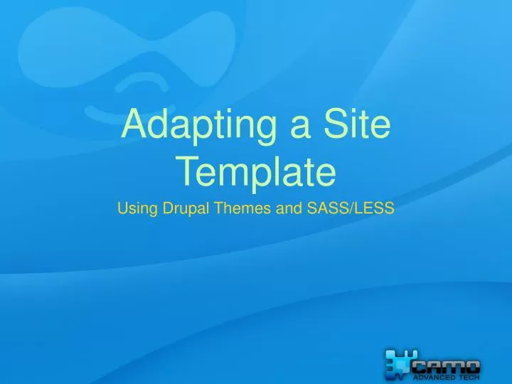
Adapting a Site Template • Using Drupal Themes and SASS/LESS
Responsive Design • Screen size • Reorder, show or hide
Some Tools to Use • SASS • What are pre-processors • Mixins! • Little example • Semantic CSS Vs. Non-semantic • Frameworks • Bootstrap • Zurb Foundation • Zen Grids
Remember! • Get a template • Use same framework or similar • Start locally • Easy Vs not so easy • Using classes • Using Mixins
What we use • Fences • Block Class • Node Class • Views • DS & Extras • Field Groups • Panels • Views Responsive Grid • Flexslider / Nivo Slider • Title • Blockify • Extra Modules
First Things First, Will It Look Nice? • The Template search. • What should I look for. • My rationale. • You are not alone.
Try To M.I.S.S. This • Keep it in the front end. • Fix page.tpl.php only if needed (we want to avoid this) • Why I’ve done it and where
And The Force May Be With Us If… • Start Top to bottom • Attack one section - Feature at a time • Convert to SASS / LESS when possible. • Use variables as crazy (Theme Colors, Fonts)
Plan Wisely • Design Content types • What is in place. • Manage Display (DS). • Create Views (Global Text).. • Panels. • Existing Modules • JQuery Scripts
The Grid Is The Backbone • Design the Grid per device • Adding grid clases • Using Mixins
Fill It Nicely • Apply the “Prettiness”. • Use SASS Changes and create mixins as desired • Applying the javascripts. • Remember, You Are Not Alone.
Check progress • Using Firebug to debug • Mobile debugging • Screen size vs remote debugging.
What Am I Missing? • Shoot your questions and comments!