Download
1 / 13
150 likes | 508 Views
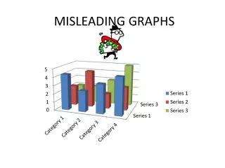
MISLEADING DIAGRAMS. Lines on the graph drawn too thick. Incorrectly plotted points. Scales do not start at 0. Scale is not linear. Misleading Title. Different size gaps or bars. How can a graph be designed to be misleading?. Lack of labelling on axes. Use of shadows.

E N D
Lines on the graph drawn too thick Incorrectly plotted points Scales do not start at 0 Scale is not linear Misleading Title Different size gaps or bars How can a graph be designed to be misleading? Lack of labelling on axes Use of shadows
What is wrong with these diagrams? Can you spot why they are misleading?
Lets have a look at what the chart looks like when the scale is correct. What differences can you see? How was the first chart misleading?
This graph shows sales figures in each quarter. Sales seem to increase very rapidly and then slow down… But what is really happening?
Lets have a look at what the chart looks like when the scale is correct. What differences can you see? How was the first chart misleading?
Lets have a look at what the chart looks like when the bars are 2-D. What differences can you see? How was the first chart misleading?
Lets have a look at what the chart looks like when the pictures are the same size. What differences can you see? How was the first chart misleading?
Task • In pairs each take a set of misleading graph cards. • In your pairs discuss how each one could be misleading.
There are three kinds of lies: lies, damned lies, and statistics What is meant by this quote??