Download
1 / 23
230 likes | 237 Views
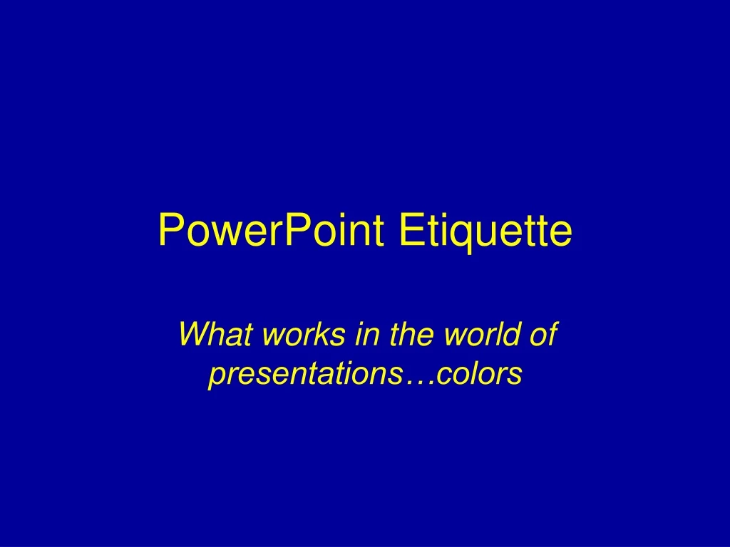
PowerPoint Etiquette. What works in the world of presentations…colors. Colors per slide…. Colors per slide. No more than four colors per slide Too busy if use more Viewers don’t know why you are using color The viewers don’t know what is important and highlighted if you use lots of colors.

E N D
PowerPoint Etiquette What works in the world of presentations…colors
Colors per slide • No more than four colors per slide • Too busy if use more • Viewers don’t know why you are using color • The viewers don’t know what is important and highlighted if you use lots of colors c2003. Kathy Schrock. kathy@kathyschrock.net
Colors per slide • No more than four colors per slide • Too busy if use more • Viewers don’t know why you are using color • The viewers don’t know what is important and highlighted if you use lots of colors c2003. Kathy Schrock. kathy@kathyschrock.net
Colors to use • Light yellow on a blue background • White on a black background • Black on a light yellow background • Black on a white background may be too bright c2003. Kathy Schrock. kathy@kathyschrock.net
Colors to use • Light yellow on a blue background • White on a black background • Black on a light yellow background • Black on a white background may be too bright c2003. Kathy Schrock. kathy@kathyschrock.net
Colors to use • Light yellow on a blue background • White on a black background • Black on a light yellow background • Black on a white background may be too bright c2003. Kathy Schrock. kathy@kathyschrock.net
Colors to use • Light yellow on a blue background • White on a black background • Black on a light yellow background • Black on a white background may be too bright c2003. Kathy Schrock. kathy@kathyschrock.net
Other color information… • Don’t use red for text • It is hard to see and read c2003. Kathy Schrock. kathy@kathyschrock.net
Other color information… • Avoid red on a green background • Colorblind viewers will have difficulty c2003. Kathy Schrock. kathy@kathyschrock.net
Other color information… • For gradients, think “earth to sky” • Darker colors on bottom and lighter on top c2003. Kathy Schrock. kathy@kathyschrock.net
Other color information… • Red backgrounds stimulate emotion • Use burgundy instead c2003. Kathy Schrock. kathy@kathyschrock.net
Other color information… • Red backgrounds stimulate emotion • Use burgundy instead c2003. Kathy Schrock. kathy@kathyschrock.net
Other color information… • Green backgrounds make the viewer feel involvement with the topic c2003. Kathy Schrock. kathy@kathyschrock.net
Other color information… • Gray backgrounds make the viewer feel that the information shows a lack of commitment or neutrality c2003. Kathy Schrock. kathy@kathyschrock.net
Other color information… • Blue backgrounds indicate a calm, conservative message c2003. Kathy Schrock. kathy@kathyschrock.net
Other color information… • Yellow backgrounds indicate hope for the future and cheerfulness c2003. Kathy Schrock. kathy@kathyschrock.net
Other color information… • Purple backgrounds give the feeling of fantasy or are perceived as child-like • Save purple for the “lighter” topics c2003. Kathy Schrock. kathy@kathyschrock.net
Other color information… • Brown backgrounds are perceived as the presentation of passive information • Viewers feel that information on brown backgrounds is less stable c2003. Kathy Schrock. kathy@kathyschrock.net
Other color information… • Black backgrounds indicate power and sophistication • Ideal for presenting information that the audience has no choice but to accept • fixed budget figures • student enrollment c2003. Kathy Schrock. kathy@kathyschrock.net