Download
1 / 10
100 likes | 101 Views
Learn about best practices for designing and presenting data in tables, graphs, maps, and visualizations. Explore principles of effective communication, aesthetics, and design guidelines. Discover new trends in scientific visualization.

E N D
Guidelines for design display Image: http://www.independent.co.uk/arts-entertainment/art/great-works/great-works-the-london-underground-map-1931-1771565.html?action=Popup Effective communication Aesthetically pleasing
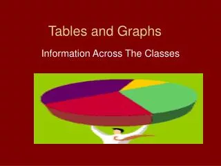
Tables • Are organized lists, arrays or matrices of data • Show data values directly with numbers (or class labels for nominal variables) • Communicate general patterns
Tables depict data in two ways • Distribution Tables • Frequency • Relative Frequency • Cumulative Frequency • Cumulative Relative Frequency • Derived Scores • Percentiles • z Scores • Contingency Table • Descriptive Index Tables • Presents measures of central tendency, variability, relationship, and so on.
Graphs are pictorial representations of data • Principles of Good Graphing • Label clearly and sufficiently • Avoid uninformative and content-free graphic marks • Fill the graph space with data marks • Types of graphs • Distribution Graphs • Line graphs • Curve-fitting graphs • Relationship Graphs • Scatterplot • Ternary Diagram • Bar Graph • Histogram • Circle Diagram • Small Multiples graph
Maps are graphic displays that depict earth-referenced features and data • Reference Maps focus on depicting a variety of actual earth-surface features as accurately and precisely as possible • Thematic Maps focus on showing the spatial distribution of one or a few thematic variables http://www.lib.utexas.edu/maps/us_2001/kentucky_ref_2001.jpg • http://soils.usda.gov/use/thematic/images/drought_1_gen_area_map.jpg
New Trends in Scientific Visualization • Information Visualization • Geo-visualization • Spatialization • Animations • Augmented Reality • Virtual Reality What are some examples of these types of visualizations?
Discussion • What does the design principle of “effective communication” mean, and what are some considerations that stem from this principle? • What are some principles of good graphing and specific design guidelines that derive from them • Selectivity, projection, generalization, and varying symbol abstractness are always involved in mapping. Why are they always involved, and why are they potentially misleading to map viewers?
John Snow’s map from 1854 mapping cholera deaths in London. http://www.ph.ucla.edu/epi/snow/snowmap1_1854_lge.htm