Download
1 / 3
30 likes | 41 Views
Responsive web design was supposed to stop the fall in conversion rates but it’s having the opposite effect, its kill two-thirds of your conversions. So go for other approach that you might want to reconsider that.

E N D
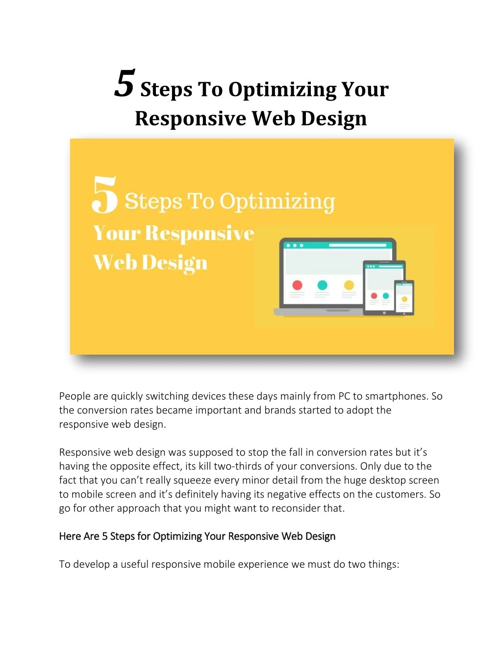
5 Steps To Optimizing Your Responsive Web Design People are quickly switching devices these days mainly from PC to smartphones. So the conversion rates became important and brands started to adopt the responsive web design. Responsive web design was supposed to stop the fall in conversion rates but it’s having the opposite effect, its kill two-thirds of your conversions. Only due to the fact that you can’t really squeeze every minor detail from the huge desktop screen to mobile screen and it’s definitely having its negative effects on the customers. So go for other approach that you might want to reconsider that. Here Are 5 Steps Here Are 5 Steps for for Optimizing Your Optimizing Your Responsive Web Design Responsive Web Design To develop a useful responsive mobile experience we must do two things:
1.Most importantly, consider why a mobile customer has come to your site. 2.And understand their intent. 1. 1.Optimize Optimize Image Scaling Image Scaling and Once again the issue is with the different screen sizes. No surprise there! But we images are scalable and that’s a good thing. If you don’t scale your images properly they might dominate the screen and sometimes will spread over other important layouts of the webpage rendering it into useless and ugly. 2. 2.Simplify Simplify Navigation Navigation In case of large displays we can have different layouts. But when it comes to mobile responsive web design you chances and choices might be limited. Moving forward navigation is pretty important no matter in which device you browse. For making a simple navigation for responsive web design you might want to do some research before. And based on your research you can integrate them into your design. You can use a button that will show a list of various menus upon clicking rather than having a lot of menu buttons and much more. and Consider Consider the the Value Value 3. 3.Kill Kill Responsive Pop Ups, Use Mobile Overlays Responsive Pop Ups, Use Mobile Overlays In desktops, pop-ups and overlays can be help. But once again in mobiles due there small screens it’s impossible to show both the pop-ups and overlays at the same time as when the user is scrolling. Since they take most of the screen time it’s kind of impossible for the user to interact with the website. We can’t really do much here but you can limit or just stop showing them pop-ups and overlays completely for better conversion rates. 4. 4.Less Is More: Simplify, Shorten Less Is More: Simplify, Shorten and and Optimize Your Text Optimize Your Text Overcrowding mobile screens with texts aren’t really great. As a content developer, I know how much effort and resources are used for creating content that is displayed on the web pages.
When it comes to desktops the fonts and styles work fine. But in mobiles sometimes the text will be hidden. Making all the efforts of the brands go into vain. So the better practice would be trying out new fonts especially for mobiles or some other styles that can be used in both desktops and mobiles. (that would be great) 5. 5.Reconsider Reconsider and and Clarify Your Calls Clarify Your Calls- -To To- -Action Action Call-to-action button is pretty important it can even be search engines that will help your customers find the products from your store with ease by searching. In other words, a button that will embody your company’s goals. Having it at a noticeable place will make your situation even better. Finally, it all boils down to screen size of the devices that people will be using to browse your content. So make sure that you are ready for every situation so that your customers will never find any troubles with your responsive web design At SFWP Wordpress Experts SFWP Wordpress Experts, we design and build unique and custom websites offering a variety of services from basic Wordpress corporate websites, membership driven content websites to complete e- commerce online shops. Our experts San Francisco San Francisco Wordpress Developers help you achieve your goals when it comes to a new website design and your online marketing plan. Wordpress website design website design to large Wordpress Developers team,