Download
1 / 9
90 likes | 247 Views
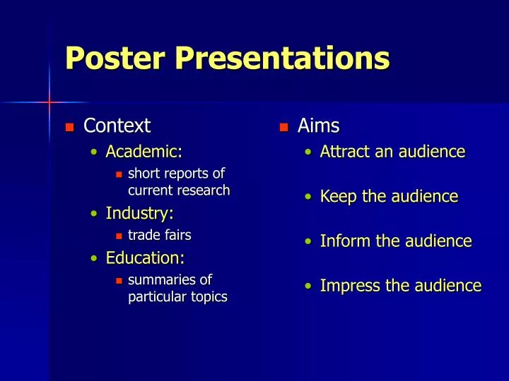
Context Academic: short reports of current research Industry: trade fairs Education: summaries of particular topics. Aims Attract an audience Keep the audience Inform the audience Impress the audience. Poster Presentations. Attract an Audience. Colour scheme

E N D
Context Academic: short reports of current research Industry: trade fairs Education: summaries of particular topics Aims Attract an audience Keep the audience Inform the audience Impress the audience Poster Presentations
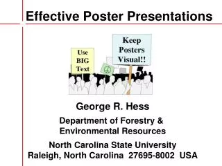
Attract an Audience • Colour scheme • make effective use of colour • but do check for legibility • Use of graphics • make them large enough • background graphic can be effective • Interesting title • make subject of poster clear
Content get the level right tell a coherent story put results in context explain motivation explain significance of results Layout clear navigation legible font sizes including graph axes and legends! design layout and colour scheme for ease of legibility Keep the audience
Content get the level right! stress the important points do not overwhelm with detail… …but do back up what you say Layout should complement content stress important points present results clearly introduction and conclusion Inform the Audience
Content make clear that you know what you’re doing and why be prepared for questions don’t include material you don’t understand stress any new or important findings Layout look professional no skew-whiff bits of paper glued to cardboard no typos or spelling mistakes good quality graphics Impress the Audience
Design Issues • Colour scheme • choose dark-on-light or light-on-dark • ensure good contrast between text and backgrounds • be careful when using patterned backgrounds • Layout • divide material into blocks • but not too many blocks • try to avoid long stretches of uninterrupted text • make sure it’s clear what graphs represent (title, axis labels, legend)
Navigation • Posters don’t automatically impose ordering of material • if order is important, make sure it is natural • English-speaking people will naturally work top to bottom, left to right • therefore introductory material should be on top or at left • ensure graphics and text relate naturally • try to avoid need for arrows etc.
Conclusion • Good posters are easier to recognise than to describe • lots of posters round department, by academics and students • look at them • decide which you like and which you don’t • try to analyse reasons why you like/dislike poster • check with friends (if everyone likes a particular poster, it’s doing something right)