Download
1 / 40
400 likes | 573 Views
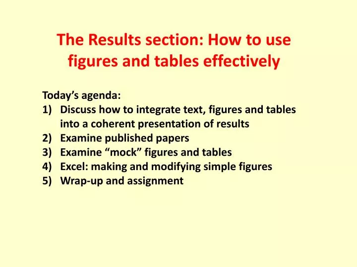
The Results section: How to use figures and tables effectively. Today’s agenda: Discuss how to integrate text, figures and tables into a coherent presentation of results Examine published papers Examine “mock” figures and tables Excel: making and modifying simple figures

E N D
The Results section: How to use figures and tables effectively Today’s agenda: Discuss how to integrate text, figures and tables into a coherent presentation of results Examine published papers Examine “mock” figures and tables Excel: making and modifying simple figures Wrap-up and assignment
The importance of figures: “A picture is worth a thousand words” Vision is probably the most important sensory system for humans, and we are instinctively drawn to images: art, photos and other visual stimuli. As authors, we should exploit this instinct to draw the reader’s attention to the most important findings or concepts. We do this by: Depicting the key results as figures Polishing them to optimize (but not necessarily maximize) the information content Presenting only the most important findings in figures. A barrage of graphs is not effective. The reader gets overwhelmed and misses the important one.
The importance of the caption Each figure and table must have a fully self-explanatory caption. This means that a reader should be able to look at the figure or table and the caption and understand what is being presented. Remember, the reader is busy and may skim the paper, notice a figure that seems interesting, and stop to look at it. Do not force the reader to study the whole paper to puzzle out what is being shown. Communicate!
What makes an effective caption? • Key points: • Describes dependent and independent data • Specifies limits of data • Indicates how data were collected Schindler et al. 1997. Oecologia
Concepts for data visualization • Your figures should: • present your interesting data • communicate complex ideas clearly and efficiently • When creating figures, you should: • always eliminate clutter and un-related information • include information such as labels that guide the reader through the figure
Types of graphs: scatterplots • Warnings: • Make sure data are continuous • Do not infer relationship from trend only • Make sure multiple series on graph are comparable • Attributes: • Shows relationship between data • Independent data (x axis) influences dependent data (y axis) • Good for continuous data • Can show trends • Shows exact values—no summary statistics (unless specified)
Types of graphs: line graphs • Warnings: • Data must be continuous! • Lines indicate values between points, so these intermediate values must be valid • Make sure multiple series on graph are comparable (same scale) • Attributes: • Shows changes over time • Can show trends in multiple series of data • Indicates values between data points • Patterns are readily apparent
Types of graphs: bar graphs • Warnings: • Should not be used for continuous data • Not the best way to compare means (use points and error bars or box-and-whisker) • Bars can be re-ordered to depict false trends • Attributes: • Each bar represents a discrete data point • Multiple bars can compare data series • Patterns are visually striking • The order of the bars can reveal patterns
In-class activity: Examine figures from “mock papers”. What are the strengths and weaknesses? Could we see ourselves making these mistakes too?
Graph showing average prey proportions in Lake Washington. Calculated from data collected from 1993-2011.
Graph showing average prey proportions in Lake Washington, calculated from data collected from 1993-2011. Critique: This figure is boring to look at and contains only three data points: the proportions of the three prey species. This can easily be expressed in a single sentence.
showing the vertical migration pattern of the 3-Spine Stickleback from 2000 – 2010 during fall
showing the vertical migration pattern of the 3-Spine Stickleback from 2000 – 2010 during fall Critique: There are only three data points, and the line is not appropriate. The caption is not adequate.
Average stream velocity of habitat where fish were captured in Rock Creek
Average stream velocity of habitat where fish were captured in Rock Creek Critique: Better, but the figure has the data in numerical form as well as the height of the bars, and this is redundant. This is also not the most appropriate format for displaying data means.
Critique: Lines connecting data points might not be appropriate. Y-axis should not represent both number of fish and substrate size. The formulas clutter up the figure; put them in the text or caption. Avoid interpretation in caption; just tell us what we are seeing.
Fig. 1. Water depth and velocity where fish were caught. Fig. 2. Water depth and velocity at random points in the creek.
Fig. 1. Water depth and velocity where fish were caught. Fig. 2. Water depth and velocity at random points in the creek. Critique: These figures are good but the information in them is more or less parallel. Can we consider merging the two data sets into a single figure to make more efficient use of space?
Stream velocity vs. depth of habitat occupied by captured fish in Rock Creek (fall) Critique: The two sets of points need more distinct symbols but otherwise, does this work?
The average velocity (m/s) of where the instream species were found.
The average velocity (m/s) of where the instream species were found. Critique: The x-axis has the label that belongs on the y-axis. More fundamentally, why are the species listed in this order? It is alphabetical but so what? What is the message here? Can the labeling scheme be better constructed?
The proportions of all species found at the two different habitat types throughout Rock Creek.
The proportions of all species found at the two different habitat types throughout Rock Creek. Critique: Many of the species are represented by such a sliver on the bar that we cannot estimate their proportion by eye. In addition, the shades of gray are hard to distinguish.
The average percent of different organisms found in the stomach contents of G. aculeatusper year. While copepods and cladocerans appear to be an important part of the diet, there are large fluctuations in consumption pattern depending on the year.
Average smelt frequencies across adjusted diel periods and depth categories.
Tips for figures: Use black and white for papers, color only for presentations Use the space efficiently – avoid a lot of “negative space” If there is too little “information content” (e.g., two or three bars) then consider putting the data in the text. If there is too much “information content” the reader will miss the important point or cannot discern some of the data; consider trimming the data in some way or presenting the data in table form. Make sensible use of decimal places. Label X and Y axes, and know the difference between the independent variable (on the X-axis) and the dependent variable (on the Y-axis). Try vertical and horizontal presentations to see which is more intuitive. Avoid drawing lines between points unless you really want to do so, as this implies continuity of values. Avoid gridlines unless you really need them to make a point. Avoid gray backgrounds.
In-class activity: Examine tables from “mock papers”. What are the strengths and weaknesses? Could we see ourselves making these mistakes too?
Plankton Type P-Value Copepod 0.004939 Neomysis 0.302102 Cladoceran 0.872516 The P-values associated with the selectivity versus availability of three groups of organisms, copepods, neomysis, and cladocerans, byG. aculeatus
Plankton Type P-Value Copepod 0.004939 Neomysis 0.302102 Cladoceran 0.872516 The P-values associated with the selectivity versus availability of three groups of organisms, copepods, neomysis, and cladocerans, byG. aculeatus Critique: Tables with statistical values like this waste space. Put the values in the text and do not use so many significant digits! Moreover, the caption is not a complete sentence, and is incorrectly located (table captions placed above table).
The average, standard deviation and the coefficient variable of the velocity (m/s), depth (cm) and the substrate size (mm) of the intermediate axis.
The average, standard deviation and the coefficient variable of the velocity (m/s), depth (cm) and the substrate size (mm) of the intermediate axis. Critique: Better – this would be awkward in the text but we can reduce the number of decimal places here too. Formatting can be improved in several ways to improve ease of reading, and caption needs to be moved.
showing the average values of the depth and velocity of the distribution of the sculpin and the habitat.
showing the average values of the depth and velocity of the distribution of the sculpin and the habitat. Critique: The caption is not a complete sentence much less a clear one. In addition, the lines and boxes around the data are to be minimized or avoided.
Critique: This is much better, but resist the temptation to interpret the data or tell the reader what to make of it. So, the second sentence of the caption should be dropped.
Tips for tables: Use the space well: avoid a lot of “negative space” Consider carefully what the columns and rows should be. One can give a very different emphasis depending on how the table is laid out. If there is too little “information content” (e.g., two or three numbers) then consider putting the data in the text. If there is too much “information content” that the reader will miss the important point, consider trimming the data in some way. Make sensible use of decimal places. Try vertical and horizontal presentations to see which is more intuitive.
In-class activity: Open the Excel sheet that was e-mailed to you. We are going to work through some example graphs.
In-class activity: Examine figures from published papers suggested by students. Why did you choose this one? What can we learn from it? Can it be improved? Is the caption adequate?
Assignment: Work on the tables and figures in your paper, using what you have learned to communicate clearly and efficiently. Take different approaches. Some data are better suited to a table, some to a figure, and some to the text. Use the examples and techniques given to create your own effective figures (refer to your Excel worksheet from class). Read pages 85 – 88 in the book.