Download
1 / 3

E N D
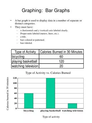
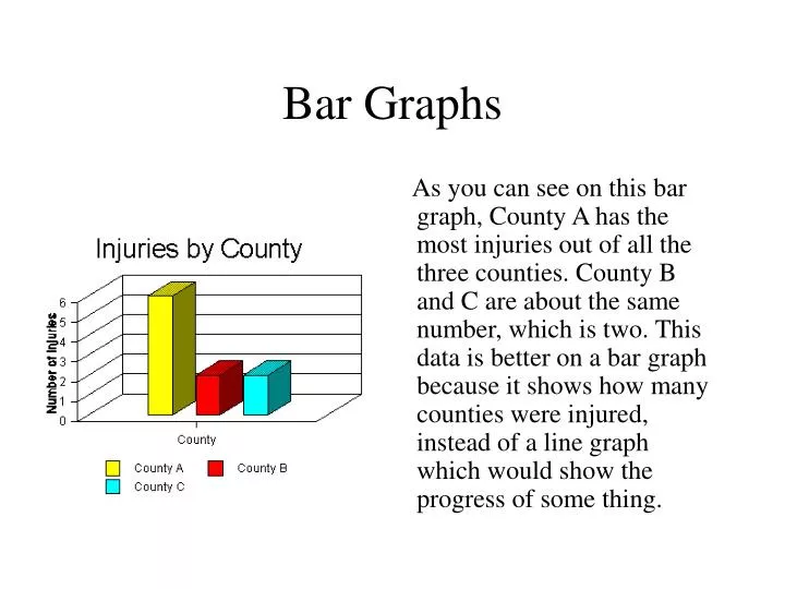
Bar Graphs As you can see on this bar graph, County A has the most injuries out of all the three counties. County B and C are about the same number, which is two. This data is better on a bar graph because it shows how many counties were injured, instead of a line graph which would show the progress of some thing.
Practice Questions For Bar Graphs 1.Which data would be better for a bar graph? (a)How many sales there were in Macy’s each day of December. (b)The number of shirts Stacey had in the colors of red, green, and blue. 2. Which data would be better for a bar graph? (a)How many African and Asian elephants there are in the world. (b)The population of New York over the past two hundred years. 3. Which data would better for a bar graph? (a) Ms. Armellino’s class’s favorite ice cream. (b) Most sold ice cream over the past hundred years.
Links http://www.statcan.ca/english/edu/power/ch9/first9.htm http://nces.ed.gov/nceskids/graphing/ http://www.mathleague.com/help/data/data.htm http://math.rice.edu/~lanius/Lessons/graph.html http://www.mste.uiuc.edu/courses/ci330ms/youtsey/intro.html