Download
1 / 22
220 likes | 225 Views
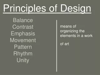
Principles of Design. What are the Principles of Design?. The Principles of design can be thought of as what we do to/with the Elements of design. How we apply the Principles of design determines how successful we are in creating a work of art. Balance.

E N D
Principles of Design
What are the Principles of Design? The Principles of design can be thought of as what we do to/with the Elements of design. How we apply the Principles of design determines how successful we are in creating a work of art.
Balance To show balance, elements of design are visually distributed to appear equally weighted. If the design was a scale, these elements should be balanced to make a design feel stable.
Types of Balance: Symmetrical balance or formal balance - the elements used on one side of the design are similar to those on the other side Asymmetrical balance or informal balance - the sides are different but still look balanced Radial balance - the elements are arranged around a central point and may be similar.
“The Boston Massacre” Series 1970 Screenprint Larry Rivers
“Charles M. Russell” 1991 Wood Engraving James Todd
Contrast Contrast is when you show opposing elements. Examples: opposite colors on the color wheel, contrast in tone or value - light vs. dark, contrast in direction - horizontal vs. vertical, contrast in subject matter. The major contrast in an artwork should be located at the center of interest. Too much contrast scattered throughout an artwork can destroy unity and make a work difficult to look at. Unless a feeling of chaos and confusion are what you are seeking, it is a good idea to carefully consider where to place your areas of maximum contrast.
“Grandfather’s Good Luck Piece” 1966 Collagraph, Lithograph, and Screenprint Robert R. Malone
“Untitled” 1895 Etching Kathe Kollwitz
Variety Variety can be emphasized with contrast in size, shape, color, texture, objects, etc. It offers contrast within a visual format and holds the viewer's attention to guide the viewer's eye through the artwork. Variety is the opposite of the principle of rhythm. It's what makes the art piece interesting. Too much variety can lead to chaos and confusion of the viewer.
“Cleopatra’s Suicide” Serigraph Ronald King
“Inner Weavings” Linocut, Photopolymer. And Embossed Susan Haywood-Smith
Dominance/Emphasis Dominance or Emphasis gives an artwork interest, counteracting confusion and monotony. It can be applied to one or more of the elements. It is the first thing that grabs the viewer's attention. This condition exists when an element or elements within a visual format contain a hierarchy of visual importance. Usually the artist will make one area stand out by contrasting it with other areas. The area will be different in size, color, texture, shape, etc.
“Fifties Grand Swank” Screenprint R.B. Kitaj
“By The Water’s Edge” 1997 Lithograph David B. Smith
Rhythm/Gradation/ Repetition Rhythm is a recurrence or repetition (pattern) of one or more elements or objects within a visual format, creating harmony. Gradation can add interest and movement to a shape. Gradation of size and direction produces linear perspective. Gradation of color from warm to cool and value from dark to light produces aerial perspective. Repetition is like having a pattern in the artwork. Repetition with variation is interesting, without variation repetition can become monotonous.
“Satsumas” Silkscreen Chris Mercier
“Montana Men” 1988 Lithograph Ben Steele
Harmony/Unity Harmony in artwork is the visually satisfying effect of combining similar, related elements. Examples: adjacent colors on the color wheel, similar shapes, etc. Unity is "Oneness," "Harmony," the condition of completeness with the use of all visual elements within a format. Relating the design elements to the idea being expressed in an artwork reinforces the principal of unity. Unity in an artwork also refers to the visual linking of various elements of the work.
“Waterlily Leaves” 2004 Momotype Marisa Keller
“Eagle Dance” Serigraph Woody Crumbo