Download
1 / 8
90 likes | 284 Views
Infographics . Informing Through Data & Images (Thatcher, Zeda 2012). WHAT IS AN INFOGRAPHIC?. Data Visualizations that present complex information QUICKLY and CLEARLY Visual Representation of Data, Information, and Knowledge Visual Elements: colors, graphics, icons, signs, maps

E N D
Infographics Informing Through Data & Images (Thatcher, Zeda 2012)
WHAT IS AN INFOGRAPHIC? • Data Visualizations that present complex information QUICKLY and CLEARLY • Visual Representation of Data, Information, and Knowledge Visual Elements: colors, graphics, icons, signs, maps Content Elements: text, facts, stats, time frames, sources Knowledge: the facts and conclusion to convey the overall message or “story”
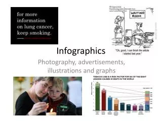
A Good Example • Hamburgers In America Link: http://visual.ly/hamburgers-economics-americas-favorite-food
Evaluating Infographs • Some Hamburgers are Good, some…not so good. So how do we go about determining GOOD Infograph from BAD Infograph?
Evaluating Infographs • Just as you would check a website’s CREDIBILITY, you should do the same with INFOGRAPHS
Credibility Check Some Good Questions to Ask: • Is it legible? Can you read and make sense of it? • Can you sum up “the point” or message easily? • Does it have a CLEAR and MEANINGFUL title? • Are there spelling or grammar errors? (If there are errors, chances are there are errors in the data also) • Who is the AUTHOR? • Are sources for data listed? Did you check them? • Color, Graphics, Font—overall Design—does it “work”?
Steps to Creating an Infograph • 1. Determine your Topic/Idea/Purpose • 2. Gather your data You need some NUMBERS Use MULTIPLE sources for your research • 3. Plan it Out: Create a sketch, outline, or flow chart • 4. Evaluate your Data/Research: How will it best LOOK? Pie Chart, Diagram, Bar Chart, Table? • 5. Apply DESIGN elements, guided by Hierarchy • 6. Create a Works Cited section
Some Resources • Tool for Creating or Investigating Infographic Theme Set-Ups: http://www.easel.ly/ Data Sources (Where to “shop” for your Research): • http://www.google.com/publicdata/directory • http://getthedata.org/ • http://www.numberof.net/ • http://www.gallup.com/ • http://datamarket.com/ (“explore our data collection”) • http://pewinternet.org/ • http://chartsbin.com/