Download
1 / 3
30 likes | 162 Views
Typography Sans serif font creates a modern style. Different sizes, colours, bold and italic sections draw attention to the names of the artists to attract their fans. Target Audience

E N D
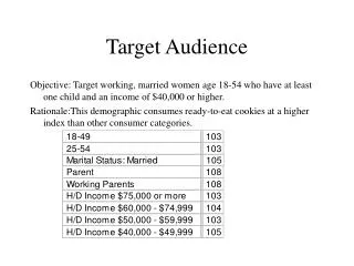
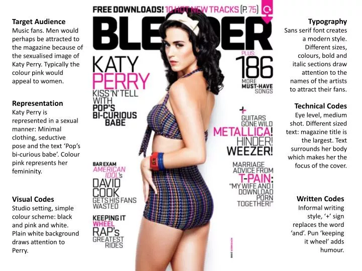
Typography Sans serif font creates a modern style. Different sizes, colours, bold and italic sections draw attention to the names of the artists to attract their fans. Target Audience Music fans. Men would perhaps be attracted to the magazine because of the sexualised image of Katy Perry. Typically the colour pink would appeal to women. Representation Katy Perry is represented in a sexual manner: Minimal clothing, seductive pose and the text ‘Pop’s bi-curious babe’. Colour pink represents her femininity. Technical Codes Eye level, medium shot. Different sized text: magazine title is the largest. Text surrounds her body which makes her the focus of the cover. Written Codes Informal writing style, ‘+’ sign replaces the word ‘and’. Pun ‘keeping it wheel’ adds humour. Visual Codes Studio setting, simple colour scheme: black and pink and white. Plain white background draws attention to Perry.
Representation Less sexualised representation of Perry, her facial expression and the mushroom prop suggest a child-like character. She looks small surrounded by white space. Typography ‘Contents’ title is in a sans serif, rounded font which matches the shape of the mushroom inflatable. Rest of text is in the same font as the cover. Visual Codes Colour scheme continues inside: white, black and pink with red also. Simple layout, there is lots of space. The list of features only highlights the key articles from the cover. Technical Codes Eye level, long shot of Perry. ‘Features’ list is kept neatly to the right of the page. Pull quote from Perry interests the reader in her article. Written Codes The word ‘girl’ is used in the pull quote which adds to the childish representation of Perry.
Representation Perry’s fighting pose presents her as a ‘feisty’ woman. Her facial expression appears to be quite seductive and inviting to men. Typography Article is writing in a serif font – traditional and easy to read. The heading and introduction are in a serif font and the name ‘Katy Perry’ in bold reflects the style of the cover. Written Codes The repetition of the word ‘girl’ draws attention to her femininity. The introduction uses sexual language which paints Perry as a very sexualised character. Visual Codes Black and white replaces the colour scheme. Picture takes up one whole page and article takes up the other which looks quite neat. Article is in two columns which makes it easier to read.