Download
1 / 11
120 likes | 133 Views
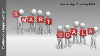
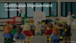
5 Minute Lesson: Continuous Improvement Methods. Cause-and-Effect Diagrams & Pareto Charts 7 Basic Quality Control (Old) Tools. Dr. Jamison V. Kovach Assistant Professor, College of Technology & Director, UH-Six Sigma Program

E N D
5 Minute Lesson: Continuous Improvement Methods Cause-and-Effect Diagrams & Pareto Charts 7 Basic Quality Control (Old) Tools Dr. Jamison V. Kovach Assistant Professor, College of Technology & Director, UH-Six Sigma Program Phone: 713-743-1704 Email: jvkovach@uh.edu Website: www.uhsixsigma.com
Basic Format: Purpose: Used to structure a brainstorming session Sorts ideas into useful categories Focuses a team on the causes, rather than the symptoms of a problem Identification of the possible causes puts the team in the position to develop appropriate solutions Cause-and-Effect Diagrams Also known as: Ishikawa diagram Fishbone diagram
Constructing a Cause-and-Effect Diagram Categories: • 5 M’s: Material, man, method, machine, mother nature • 5 P’s: People, places, politics, processes, procedures
Basic Format: Purpose: Used to identify and prioritize problems to be solved The lengths of the bars represent frequency or cost (time or money) associated with the different categories Aids in choosing a starting point for improvement Visually depicts which problems are more significant Frequency Categories Pareto Charts A type of bar graph (aided by the 80/20 rule)
Information Systems Example Analysis of Types of Complaints 80% of Complaints
Inventory Loss Example Pareto charts are easily created using statistical add-ins found in Excel or using a statistical software package, such as Minitab or JMP.
5 Minute Lesson: Continuous Improvement Methods Dr. Jamison V. Kovach Assistant Professor, College of Technology Director, UH-Six Sigma Program Phone: 713-743-1704 Email: jvkovach@uh.edu www.tmacgc.orgwww.uhsixsigma.com