Download
1 / 14

E N D
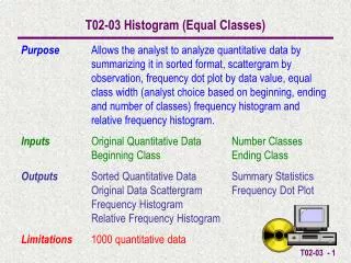
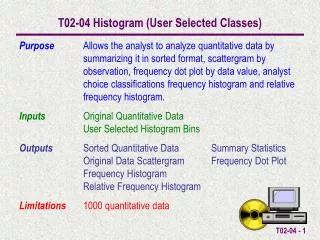
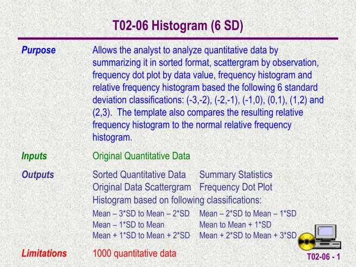
T02-06 Histogram (6 SD) Purpose Allows the analyst to analyze quantitative data by summarizing it in sorted format, scattergram by observation, frequency dot plot by data value, frequency histogram and relative frequency histogram based the following 6 standard deviation classifications: (-3,-2), (-2,-1), (-1,0), (0,1), (1,2) and (2,3). The template also compares the resulting relative frequency histogram to the normal relative frequency histogram. Inputs Original Quantitative Data Outputs Sorted Quantitative Data Summary Statistics Original Data Scattergram Frequency Dot Plot Histogram based on following classifications: Mean – 3*SD to Mean – 2*SD Mean – 2*SD to Mean – 1*SD Mean – 1*SD to Mean Mean to Mean + 1*SD Mean + 1*SD to Mean + 2*SD Mean + 2*SD to Mean + 3*SD Limitations 1000 quantitative data
An Example A college professor has given an exam with the test scores shown here. Are the grades normally distributed. She wants to examine this within 5 standard deviations of the mean.
Excel Bins Mean – 5*SD Mean – 4*SD Mean – 3*SD Mean – 2*SD Mean – 1*SD Mean Mean + 1*SD Mean + 2*SD Mean + 3*SD Mean + 4*SD Mean + 5*SD An Example The classifications that must be calculated are arranged from smallest to largest as shown below: Mean – 5*SD to Mean – 4*SD Mean – 4*SD to Mean – 3*SD Mean – 3*SD to Mean – 2*SD Mean – 2*SD to Mean – 1*SD Mean – 1*SD to Mean Mean to Mean + 1*SD Mean + 1*SD to Mean + 2*SD Mean + 2*SD to Mean + 3*SD Mean + 3*SD to Mean + 4*SD Mean + 4*SD to Mean + 5*SD
Data can either be entered directly into the OriginalData cells or copy/paste special/values into the cells.
Once the data is entered SummaryStatistics (Mean, Standard Deviation, Count, Max, Min & Range) are automatically calculated. Also, the Bins and Classifications are automatically calculated.
The SortMacro can be run to sort the OriginalData into the SortedData cells. This also automatically calculates the necessary information for the DotPlot.
The HistogramMacro can be run to automatically calculate the Histogram Frequency Information.
The Histogram Frequency Information is displayed along with an interpretation of the “hard to read” EXCEL output (e.g. the number of data observations greater than 72.8 and less than or equal to 90.2438 is 5).
The Observed Proportion and Normal Proportion within each classification is also automatically calculated.
WorksheetTabs can be selected to view the Original Data Scattergram, Frequency Dot Plot, Frequency Histogram & Observed vs Normal Histogram
The Scattergram displays a plot of the observations in the sequence they were entered.
The Frequency Histogram shows the histogram for the Classifications. The legend should be read bottom-up.
The Observed vs Normal Histogram shows the observed Histogram compared to the Normal Histogram. The legend should be read bottom-up.