Download
1 / 4
40 likes | 186 Views
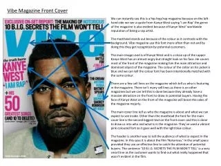
Magazine Front Cover Analysis . MOJO. The banner gives more information about what is inside, and with bright colours attracts attention. Retro style text to replicate the retro them through the front cover . All of the band are looking face on to the camera, to engage the reader.

E N D
MOJO The banner gives more information about what is inside, and with bright colours attracts attention Retro style text to replicate the retro them through the front cover All of the band are looking face on to the camera, to engage the reader Lists of all the other artists which feature in the magazine, in 2 neat columns either side of the front page. Clear title to display the name of the band, using similar style text to duplicate the look of the name of the magazine Psychedelic pattern to go with the theme of the magazine, and era of the band.
NME Banner to emphasise the main stories in the magazine, both bold in colour and font Simple font in the title, which links with the rest of the font. A simple font which looks like Arial/Impact works well with the busy colours and pictures. Again all of the band members are face on to the camera, serious emotions and positioned sat down with the lead at the front, the middle member in the back is an exception and looks as if he is looking up at something Slanted writing with various colours to stand out on the page A quote used to show the band and what they believe, to make it more real Bold texts, with the word ‘The’ slanted to the left hand side just like the text on the left hand side. Bold colours make it stand out
KERRANG! The banner at the top is used to inform the reader about the main story that is inside the magazine Red/orange colours are used well to link with the dynamite theme being used, the colours have connotations of fire and explosives Slanted pictures, given the name ‘selfies’ – slanted which adds and links to the slanted writing to make it more effective Typewriter font used, link in most editions of Kerrang! This makes every edition similar in some aspect Bold colours to attract attention, although it is a simple font the bright colours make it more effective The picture is effective as it looks as if she has been caught throwing this dynamite as a sign of rebellion