Download
1 / 21
220 likes | 399 Views
Organizing and Reading Data. How can I represent data? How can I read and interpret different graphical representations of data?. Recall…. There are ____ types of data. The types are called … . Categorical Data. Categorical data is any set of data that can be put in groups or categories.

E N D
Organizing and Reading Data How can I represent data? How can I read and interpret different graphical representations of data?
Recall… • There are ____ types of data. • The types are called …
Categorical Data • Categorical data is any set of data that can be put in groups or categories. • Note: When looking at categorical data, there is no meaning to the data when you try to perform any mathematical operations. Ex. If you take the average of a list of zip codes, there is no mathematical meaning to the results. • Examples: eye color, gender, birthday, favorite food, names of siblings, etc.
Numerical Data • Numerical data is any set of data that can be measured. • Note: When looking at numerical data, there is a meaning to the data when you perform any mathematical operation (like averages) unlike with categorical data. Example: taking the average of a set of ages gives you something meaningful (average age) • Examples: number of siblings, income, number of students, test scores, etc.
You Try… • Are the following Categorical (C) or Numerical (N)? • Number of pets you have • Type of cell phone you have • How many hours you sleep at night • Favorite song • Amount of money you spend in vending machine • Social Security number • Telephone number • Favorite Disney Princess
Recall… • We have different graphical representations that are more appropriate to use when talking about each type of data. • For each of the following representations, hold up a (C) for categorical or (N) for numerical in order to say which type of data uses this representation. • Bar Graph • Stem and Leaf Plot • Box Plot • Line Graph • Pie Graph • Scatter Plot • Histogram • Dot Plot
Now What? • Now that we know what types of representations are appropriate for categorical and numerical data, let’s look at these representations individually to review what they are (from 7th grade) and practice how to read and interpret them.
Bar Graph • A Bar Graph (also called Bar Chart) is a graphical display of data using bars of different heights. What could this bar graph be representing? What is the most favorite fruit? How many people like Kiwifruit best? How many people prefer grapes?
Histogram • A Histogram is a graphical display of data using bars of different heights. • It is similar to a Bar Chart, but a histogram groups numbers into ranges and you decide what ranges to use! • Histograms are a great way to show continuous data such as weights, heights, and time. • Remember: If your data is categorical, though, you should use a bar graph.
Histogram • A survey of customers at a certain store was taken, and they recorded the ages of each person that took the survey. The results are shown below in the histogram. How many ages are represented in each bar of the histogram? What age range was represented most at the store during the survey time? Make a conjecture at what type of store we may be looking at based on the age range that shops there most. Why might there be so few people ages 1-5 in the store compared to the other ages? Age of Customer
Pie Chart • A Pie Chart is a special chart that uses “pie slices” to show relative sizes of data. • When making a pie chart, you need to find the percentages associated with the number of data points in each of your categories. These percentages will then be used to find out how many degrees of your whole circle (360 degrees total) will be dedicated to each category you collected data for.
Pie Chart • A survey was conducted on what letter grades student got on a test. The results are shown below in the pie chart. How many people made a C on the test? What percentage? What grade was made the most on the test? How many people failed the test? What does the green sector of the circle represent?
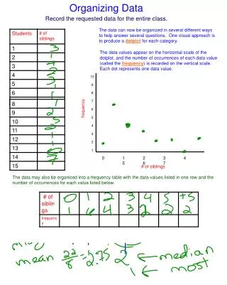
Dot Plot • A Dot Plot represents data by placing dots over a number line where the number of dots above each number line value is the frequency of that value in the set of data. How would we find the total number of people that were in the gym when this survey was taken? How many people spent a half hour at the gym? Make a conjecture at what type of people might have only been at the gym for 5 minutes. How many people were in the gym for 45 minutes or more? Time Spent at the Gym
Line Graph • A Line Graph is a graph that shows information that is connected in some way such as change over time. What day did this person earn the most money? How much money did this person earn on Thursday? Explain the general trend in this set of data. On what day did this person bottom out and make the least amount of money?
Stem and Leaf Plot • A Stem and Leaf Plot is a special table where each data value is split into a "leaf" (usually the last digit) and a "stem" (the other digits). • The "stem" values are listed down, and the "leaf" values go right (or left) from the stem values. • The "stem" is used to group the scores and each "leaf" indicates the individual scores within each group.
Stem and Leaf Plot How many students are in this class that we are looking at data for? How many students made an A? How many students made an F? List out the test scores that are found with the 7 stem. Test Scores
Box Plot • A Box Plot (also called a box and whisker plot) shows data using the middle value of the data and the quartiles, or 25% divisions of the data.
Box Plot The box plot below shows a random set of data. What is the smallest number in the data set? What is the biggest number in the data set? What is the median of the data set?
Scatter Plot • A Scatter Plot is a graph of plotted points that show the relationship between two sets of data. • An ice cream shop kept track of how much money they made when the weather was a certain temperature. The results are below. At what temperature did the shop make the least money? How much money did they make on the hottest day? What is the general trend of the data they collected? Could we predict what the shop would make if it were 10 degrees or 30 degrees?
Summarizer • Write the following on your paper and then put a C or N to tell which type of data they go with (categorical or numerical). • Bar Graph • Stem and Leaf Plot • Box Plot • Line Graph • Pie Graph • Scatter Plot • Histogram • Dot Plot