Download
1 / 11
110 likes | 111 Views
Learn how to create and customize charts and graphs in Excel 2000, and use macros for repetitive tasks. Includes speaker notes.

E N D
Creating Charts & Graphs(and maybe Macros) Speakers notes are in the “Notes” section of this presentation Using Excel 2000 1st Feb 2008
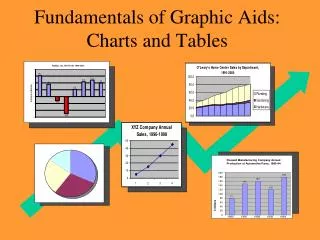
What I hope to cover • Why create a chart or graph? • Creating a spreadsheet • Creating a Chart • Changing its Attributes • Updating the Chart • The use of Macros to provide a short cut when doing repetitive operations
Creating a Spreadsheet • Important points when creating a spreadsheet for a chart are – The Column Headings The X-axis data • In this case we have column headings – a) units of Electricity used during the Day, b) during the Night c) and the Overall Total • The X-axis is the Date every quarter • The last column contains the Average Usage, based on a rolling average over the last 4 quarters
Creating the Basic Chart • Highlight the area of data including the Headings • Initiate the Chart “Wizard” or click on “Insert” and “Charts” from the Header Bar • Then decide what type of Chart you want, the three most relevant are: – a) Columns, b) Lines, c) Areas, • Then where you want the chart
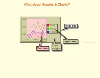
Changing the Attributes • Background • Axis Labels and Fonts • Grid Lines • Line Styles and Markers • Move the “Key” onto the chart. • Resize the Chart
Changing the Attributes • Changing one of the Line types. • Remove a line from the Chart. • Adding a new line to the Chart. • Three months on and we need to add new data to the Chart. Several ways of doing it. Repeat the creation of the chart from scratch Add to the existing chart Redraw the chart using a Macro
Add to the existing Chart • To add more data to the existing chart:- select “Chart” and then “Source Data”, then “Series”. For each line, increment the row number by 1 in the “Values” window. Remember to increment the X-axis value. • Creating an Area chart. The overall total is a function of the chart:- Highlight the Date, Day & Night columns from the data. Initiate the Chart Wizard Choose “Area – Stacked” as the type of chart. Now modify as required.
Creating a Macro to produce your Chart Macros are excellent for any repetitive work; but they have there restrictions in that they repeat what you have done precisely. • To demonstrate, highlight the data in the spreadsheet:- then select “Tools”, “Macro” and “Record New Macro”. Click OK • Create the Chart as you want it. • Stop the recording. • Create a Macro Button:- Select “View”, “Toolbars”, “Forms”. • Click the button symbol and draw a button where you want it. Link it to the macro you have created.
Creating a Macro to produce your Chart • You can update the chart – but not without modifying the Macro. Select “Tools”, “Macro” and then “Macros”. Highlight the macro just created and click “Edit”. • In the first formula line, change the row number to the new value. • Close the macro and then press the button.