Download
1 / 7
70 likes | 83 Views
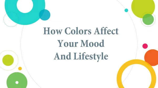
How the color of the room affects our mood

E N D
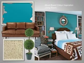
Color affects people in many ways, depending on age, gender, ethnic background and climate. Certain colors (or groups of colors) tend to get a similar reaction from most people; the variations come from the shades or tones used. This is why it’s so important to choose colors wisely when it comes to decorating. You don’t have to worry about trends in order to have a beautiful home. Color trends will come and go. The people who live in a home make it beautiful by choosing colors that reflect their preferences and personalities. The trick is to blend the colors you like into a pleasing combination. Get these interior decorations with home renovation contractors.
RED • Red raises a room’s energy level. The most intense color, it pumps the adrenaline like no other hue. It is a good choice when you want to stir up excitement, particularly at night. In the living room or dining room, red draws people together and stimulates conversation. In an entryway, it creates a strong first impression.
YELLOW • Yellow captures the joy of sunshine and communicates happiness. It is an excellent choice for kitchens, dining rooms and bathrooms, where it is energizing and uplifting. In halls, entries and small spaces, yellow can feel expansive and welcoming.
BLUE • Blue is said to bring down blood pressure and slow respiration and heart rate. That is why it is considered calming, relaxing and serene, and it is often recommended for bedrooms and bathrooms.A pastel blue that looks pretty on the paint chip can come across as unpleasantly chilly on the walls and furnishings, however, especially in a room that receives little natural light.
GREEN • Green is considered the most restful color for the eye. Combining the refreshing quality of blue and the cheerfulness of yellow, green is suited for almost any room on the house. In the kitchen, green cools things down; in a family room or living room, it encourages unwinding but has enough warmth to promote comfort and togetherness.
PURPLE • Purple, in its darkest values (eggplant, for example), is rich, dramatic and sophisticated. It is associated with luxury and creativity; as an accent or secondary color, it gives a scheme depth. Lighter versions of purple, such as lavender and lilac, bring the same restful quality to bedrooms as blue does, but without the risk of feeling chilly.