Download

1 / 14
150 likes | 160 Views
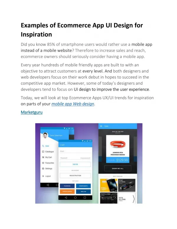
Find the best UI Design App agency in Toronto? We have an expert team of graphic designers to meet with User Interface design for the Website & App. The number of smartphone users is forecast to grow from 2.1 billion in 2016 to around 2.5 billion in 2019, hence having a good mobile app design will help retain users. Users depend on mobile apps to deliver content and services. Visit www.ideatheorem.com

E N D
Idea Theorem UI Design App
Guide to Mobile App Design – 10 Quick & Actionable UI UX Tips The number of smartphone users is forecast to grow from 2.1 billion in 2016 to around 2.5 billion in 2019, hence having a good mobile app design will help retain users. Users depend on mobile apps to deliver content and services.
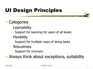
App Navigation App navigation is very crucial for mobile design. App navigation should be intuitive and friendly. Buttons should be clearly labeled with proper attributes. DO NOT write jargons which users will not be able to understand. Menu categories should not overlap. Allow users to go back easily. Engage users by highlighting key or new features. Keep in mind: Navigation should NEVER be hidden. Navigation should follow the same pattern across the mobile app. Use tab bar for iOS and Navigation Drawer for Android for easy user interaction.
Declutter UI Keep mobile UI design user interface clutter-free. Clarity is an important characteristic of a good mobile design. Too much design elements like buttons, images, text can make any phone app complicated and unable to use. Keep in mind: Try for minimal design for better and easy user interaction Try to focus on 1 or 2 actions per screen Don’t fill the screen with random content Keep headlines and text concise and clear Use white space wisely Don’t use colors full-heartedly, it will confuse the user and also use brand colors Use simple icons
Readability Mobile devices have small screens as compared to desktops, fitting in a lot of information in a small mobile UI is a big challenge. Hence, keep the content should be short and easy to skim (users don’t read every word instead they pick out keywords and phrases). The content should be accessible when the user has no data connection. The content needs to be prioritized to enable a seamless user experience.
Finger-Friendly Tap Targets When designing a mobile UI, keep in mind the tap targets. The tap targets should be big enough for the user to tap easily. The smaller the tap targets, the user will have a tendency to tap on the wrong target. Keep in mind: Research indicates that the average human finger pad is 10 x 14mm and the average fingertip is 8-10mm, making 10mm x 10mm a good minimum touch target size. Keep the touch target at least 10 x 10mm. Have enough distance between 2 or more tap targets, so the user does not accidentally tap on the wrong target.
Don’t Forget The Thumb Zone With every new phone release, the screen sizes have increased, holding the device with one hand and browsing the app is becoming difficult. The mobile app design should not only be aesthetically designed but also should focus on the movement of the fingers and thumb (and also keeping in mind which handed side the user is).
Use OS Design Guidelines Follow the design conventions set by Android/iOS. Each has a different way of navigation, content layout, buttons etc. If you have Android design guidelines for iOS (or vice versa), you are risking a seamless user experience of the app. Try to keep everything as native as possible. Mobile UI kits are different for each OS. Understand each OS guidelines and then start working on mobile app design.
Accessibility With governments taking measures to make products accessible for everyone, designers need to have empathy and create a different experience for different people through the same mobile design. Keep in mind: Contrast: Use color combination with high contrast. Language: Use simple language as there would be many users for whom English will be a second language. Focus: Use focus to determine the order in which the elements should receive first priority
Buttons Use familiar mobile UI designs for the buttons. Do not make any fancy shape or element and say that this is a button. For mobile app design, do not use text links as a button. Few common button design types are: 1. 2. 3. 4. Filled rectangle with square edges Filled rectangle with round edges Ghost Buttons Floating buttons used in the material design
Typography As the real estate for the mobile screen is very less, it is quite difficult to make the right typographical decisions. Mobile typography needs a huge attention to detail with the use of the right fonts, white space, and alignment. The key things to keep in mind while designing a mobile UI is that the content should be legible and readable. 10 Creative and Innovative
Keep in mind: Font size: The font size should be of the optimum size. Overall, anything below 16px would be difficult to read. Font: Choose the right font which is easy to read and expresses the mood of the app. Do not use more than 3 fonts. (2 is better). Typeface: Choose one typeface. If you feel that there should be a secondary typeface, choose the one which flows between the primary typeface. BUT do not go with more than 2 different typefaces. Leading: Keep the leading (distance between 2 lines) just the right size so that it is easy to read and skim through different lines. Do not think that since mobile has less space you can cram up everything in one screen. Tracking & Kerning: Keep tracking (space for groups of letters) and kerning (space between pairs of letters) consistent all through the mobile app design. The closer or farther the tracking or the kerning, it might make users unable to read the text.
Reduce The Number of User Inputs Users don’t like to be bombarded with huge forms, especially in the mobile phone where they like things to be done quickly. Keep in mind: Keep the forms short and sweet. Remove unnecessary fields. Customize the keyboards according to the input fields. If the field requires numbers, show the numeric keyboard. Validate the forms dynamically, so that the users don’t have to update the error inputs while submitting the forms.
Contact Us www.ideatheorem.com (416) 655-2935 hello@ideatheorem.com