Download
1 / 1
10 likes | 268 Views
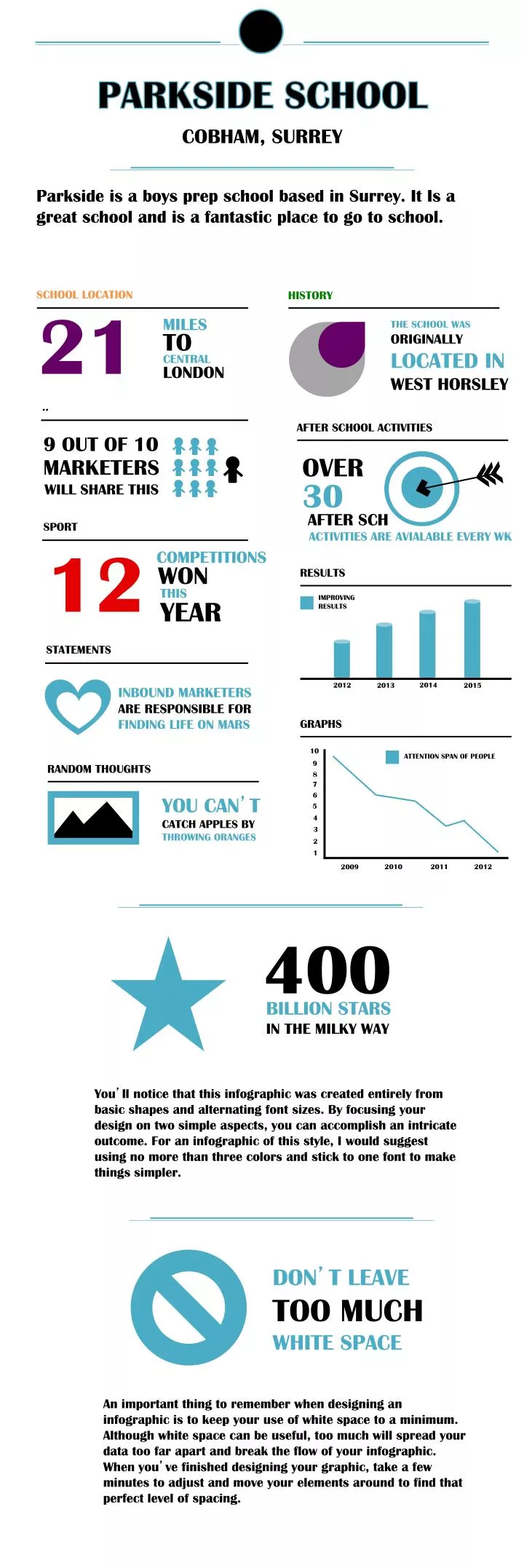
PARKSIDE SCHOOL. COBHAM, SURREY. Parkside is a boys prep school based in Surrey. It Is a great school and is a fantastic place to go to school. SCHOOL LOCATION. HISTORY. 21. MILES. THE SCHOOL WAS ORIGINALLY LOCATED IN WEST HORSLEY. TO. CENTRAL. LONDON. . AFTER SCHOOL ACTIVITIES .

E N D
PARKSIDE SCHOOL COBHAM, SURREY Parkside is a boys prep school based in Surrey. It Is a great school and is a fantastic place to go to school. SCHOOL LOCATION HISTORY 21 MILES THE SCHOOL WAS ORIGINALLY LOCATED IN WEST HORSLEY TO CENTRAL LONDON .. AFTER SCHOOL ACTIVITIES 9 OUT OF 10 OVER MARKETERS 30 WILL SHARE THIS AFTER SCH SPORT ACTIVITIES ARE AVIALABLE EVERY WK 12 COMPETITIONS WON RESULTS THIS IMPROVING RESULTS YEAR STATEMENTS 2014 2012 2013 2015 INBOUND MARKETERS ARE RESPONSIBLE FOR FINDING LIFE ON MARS GRAPHS 10 ATTENTION SPAN OF PEOPLE 9 RANDOM THOUGHTS 8 7 6 YOU CAN’T CATCH APPLES BY THROWING ORANGES 5 4 3 2 1 2010 2011 2012 2009 400 BILLION STARS IN THE MILKY WAY You’ll notice that this infographic was created entirely from basic shapes and alternating font sizes. By focusing your design on two simple aspects, you can accomplish an intricate outcome. For an infographic of this style, I would suggest using no more than three colors and stick to one font to make things simpler. DON’T LEAVE TOO MUCH WHITE SPACE An important thing to remember when designing an infographic is to keep your use of white space to a minimum. Although white space can be useful, too much will spread your data too far apart and break the flow of your infographic. When you’ve finished designing your graphic, take a few minutes to adjust and move your elements around to find that perfect level of spacing.