Download
1 / 48
480 likes | 641 Views
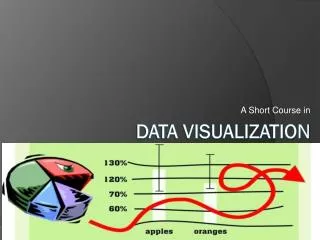
Data Visualization. http://www.ted.com/talks/hans_rosling_shows_the_best_stats_you_ve_ever_seen.html. Data Ambiguity. F ailure to precisely define just what the data represent. Data Distortion. E xaggerating or understating the values of some of the data points. Data Distraction.

E N D
http://www.ted.com/talks/hans_rosling_shows_the_best_stats_you_ve_ever_seen.htmlhttp://www.ted.com/talks/hans_rosling_shows_the_best_stats_you_ve_ever_seen.html
Data Ambiguity Failure to precisely define just what the data represent
Data Distortion Exaggerating or understating the values of some of the data points
Data Distraction Extraneous lines, graphics, etc.
How to make graphs that work(advice from Seth Godin) 1. Don't let popular spreadsheets be in charge of the way you look. 2. Tell a story. 3. Follow some simple rules.* 4. Break some other rules.
Classics – The Table • While it might be possible to display data better graphically, a table often does the job quite nicely.
*Godin’s Rules • Time goes from left to right.
Classics – Pie Charts • Pie charts have a mixed reputation. • They are popular in business and the media but many information designers have criticized the technique. • Some claim that the pie slice shape communicates numbers less exactly than other possibilities such as line length. • At least one study indicates that use of a pie chart for analyzing a problem as opposed to a bar chart changes the way people think about the problem.
*Godin’s Rules • Pie charts are spectacularly overrated. If you want to show me that four out of five dentists prefer Trident and that we need to target the fifth one, show me a picture of 5 dentists, but make one of them stand out. I'll remember that.
Classics – Line Graphs • Line graphs are classic diagrams that usually give a good picture of the data. • Line graphs should only be used when the positions on the x-axis have a natural ordering. If your labels are "2000, 2001, 2002" that's fine. If your labels are "US, England, Germany" you should consider a bar graph instead.
*Godin’s Rules • Good results should go up on the Y axis. This means that if you're charting weight loss, don't chart "how much I weigh" because good results would go down. Instead, chart "percentage of goal" or "how much I lost.
*Godin’s Rules • "Don't connect unrelated events. For example, a graph of IQs of everyone in your kindergarten class should be a series of unrelated points, not a line graph. On the other hand, your weight loss is in fact a continuous function, so each piece of data should be attached.
Classics – Bar Charts • Bar charts are classic diagrams that usually give a good picture of the data. • Their main problem is that when there are many bars, labeling becomes problematic. • They also imply that the data is discrete; if your data is something that is plausibly continuously changing over time, for instance, you might consider a line graph instead.
New Classics – Network Diagram • Real-world information often comes in the form of relationships between entities or items, such as people who know each other (social networks), or Web pages that are connected to each other. • In a network diagram, entities are connected to each other in the form of a node and link diagram.
New Classics – Word Cloud • A "Word Cloud" enables you to see how frequently words appear in a given text, or see the relationship between a column of words and a column of numbers. • You can tweak your word "clouds" with different fonts, layouts, and color schemes. • Wordle.net
New Classics - Infographics • Information graphics or infographics are graphic visual representations of information, data or knowledge.
The future of visualization • One word: DATA
Example: NYT Cascade • Cascade allows for precise analysis of the structures which underly sharing activity on the web. • Links browsing behavior on a site to sharing activity to construct a detailed picture of how information propagates through the social media space. • The tool and its underlying logic may be applied to any publisher or brand interested in understanding how its messages are shared.