Download
1 / 4

E N D
MOVIE MAGAZINE CODES AND CONVENTIONS
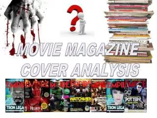
I gathered a number of images of the front covers of successful movie magazines Total Film, Entertainment and Empire to create a visual representation of their codes and conventions and in doing so I can instantly recognise a number of shared features! For example, the masthead is always placed along the skyline of the magazine with a strapline frequently positioned above it. We can also see that a single main image tends to dominate the cover and our attention is then drawn to the scattering of cover-lines around the edges. Puffs may also be included to draw further interest.
The use of direct address ‘Your essential preview’ explicitly involves readers in the magazine and encourages them to purchase The masthead is depicted along the skyline of the cover, in capital letters and a bold-stand out font to ensure audience attention is drawn. Because the magazine is a well-known and established piece, they can afford to allow their main image to conceal some of the title as it is still instantly recognisable as Total Film. The monochromatic colour-scheme creates a polished and sophisticated look that appeals to their target audience and allows for the selective use of a bright red and yellow across coverlines to stand out further. Even with just a brief glance at the cover, we can tell this is the main cover-line due to its size, central positioning and the use of a different font to all others on the page. A single image forms the backdrop and indeed main focus of the page – our eyes are immediately drawn to the figure and intrigued by his piercing stare and the weapon in hand. It’s evident the actor is in character. Various coverlines appear across the magazine cover, each using capital letters and a bright yellow to draw attention and a lower case white text to provide a brief description of the article which should intrigue audiences further A large plus sign is used to draw our attention to the level of content included in the magazine
Similar to the masthead, Empire’s claim in the strapline to be the world’s biggest movie magazine will be familiar for audiences and therefore it too is partially covered by the main image. Again, the masthead is depicted along the skyline of the cover, in bright red capital letters and a bold-stand out font to ensure audience attention is drawn. Because the magazine is a well-known and established piece, they can afford to allow their main image to conceal some of the title as it is still instantly recognisable as that of Empire. The space left by the main image is utilised to display the main cover-line. Our attention is drawn here by the contrast between the hot pink in a scrawled font and the eroded, bold white text which highlights the name of the film. A single image forms the backdrop and indeed main focus of the page – taken from a low angle, the figures are immediately perceived as dominant and more intriguing with their dark attire and fierce stares adding further intrigue. We can tell both are in character. Exclusivity is emphasised by underlining the word ‘only’ – readers know the information will not be featured in any other magazine and are thereby more encouraged to buy. The use of the scrawled font here also creates a more informal look A plus sign draws our attention to the level of content featured within the magazine. Against the dark colour-scheme of the main image, selective use of pink and blue highlights the various stories and creates a sense of fluency across the page with a splash of yellow adding further interest.