Download
1 / 31
310 likes | 343 Views
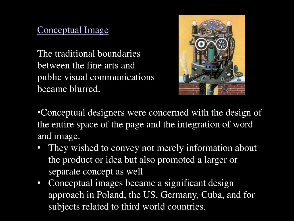
Conceptual Image The traditional boundaries between the fine arts and public visual communications became blurred. Conceptual designers were concerned with the design of the entire space of the page and the integration of word and image. .

E N D
Conceptual Image • The traditional boundaries • between the fine arts and • public visual communications • became blurred. • Conceptual designers were concerned with the design of the entire space of the page and the integration of word and image. • They wished to convey not merely information about the product or idea but also promoted a larger or separate concept as well • Conceptual images became a significant design approach in Poland, the US, Germany, Cuba, and for subjects related to third world countries.
In the information culture of the 1950s–2000, the entire history of visual arts was available to graphic artists There was a library of potential forms and images; • the spatial configurations of cubism • the juxtapositions, dislocations, and scale changes of surrealism • pure color loosened from natural reference by expressionism and fauvism • the recycling of mass-media images of pop art.
New approaches to illustration emerged: During the first half of the twentieth century narrative illustration ruled American graphic design. • Improvements in paper, printing, and photography had caused the illustrator’s edge over the photographer to decline rapidly. • As photography stole illustration’s traditional function—the creation of narrative and descriptive images—new approaches to illustration emerged.
21-03 Tadeusz Trepkowski, antiwar poster, 1953. A passionate statement is reduced to just one word, No!
21-05 Henry K. Tomaszewski, poster for the play Marie and Napoleon, 1964. Tomaszewski led Polish graphic design toward colorful and artistic expression.
21-06 Jerzy Flisak, cinema poster for Rzeczpospolita Babska, undated. Bright colors and informal shapes convey the delightful resonance of the 1950s Polish poster.
21-07 Roman Cieslewicz, circus poster, 1962. Collage elements superimpose the word Cyrk and a clown on a high-contrast photograph of an elephant.
Franciszek Starowiejski, Warsaw Drama Theater poster, 1962. The cube drawn in perspective transforms the flat page into deep space, forcing the strange complex above it to float. 21-08
21-09 Jan Lenica, Warsaw Poster Biennale poster, 1976. Meandering arabesques metamorphose into a winged being.
21-09 Push Pin Studios • A group of young New York graphic artists who had all been classmates at the Cooper Union. Seymour Chwast, Milton Glaser, Reynolds Ruffins, Edward Sorel. • In 1954 they formed Push Pin Studio where they attained a global influence. • Freelance assignments were solicited through a joint publication called The Push Pin Almanack. • Published bi-monthly, it featured interesting editorial material from old almanacs illustrated by the group.
21-09 • They were primary contibutors to the conceptual approach to illustration • The term Push Pin Style became widely used for the studio’s work and influence, which spread around the world. • The Push Pin approach: is less a set of visual conventions, or a unity of visual techniques or images—but an attitude. • Approach to visual communications with an openness about trying new forms and techniques and reinterpreting work from earlier periods • Characterized by the ability to integrate word and image into a conceptual and decorative whole.
21-17 Reynolds Ruffins, illustration for Amtrak Express magazine, 1983. Decorative color and abstracted forms typify Ruffins’s work over a half century.
21-18 Milton Glaser, record album cover for The Sound of Harlem, 1964. In this early example of Glaser’s contour line and flat color period, the figures are weightless shapes flowing in musical rhythm.
Milton Glaser, Bob Dylan poster, 1967. Transcending subject and function, this image became a symbolic crystallization of its time. Transcending subject and function, this image became a symbolic crystallization of its time. The brightly-colored pattern in Dylan's hair, inspired by Islamic design, contrasts against the black silhouette of Dylan's profile.
21-20 Milton Glaser, Dada and Surrealism exhibition poster, 1968. The smaller table isolates the word real within the longer word surrealism. He often assimilated spatial devices and imagery from surrealism as vehicles to express complex concepts.
During the 1980s and 1990s Glaser became increasingly interested in illusions and dimensionality. Drawings are presented as dimensional objects in ways that intensify their meaning. For Glaser, geometric forms, words, and numbers are not merely abstract signs but tangible entities with an object-life that allows them to be interpreted as motifs, just as figures and inanimate objects are interpreted by an artist. Glaser explores the dialogue between perceptual and the conceptual iconography. 21-20
21-21 Milton Glaser, Poppy Records poster, 1968. A poppy blooming from a granite cube symbolizes a new, independent company breaking through the monolithic conventions of the recording industry.
21-22 Milton Glaser, “Bach Variations” poster, 1985. A variety of drawing approaches signifies the diversity of Bach’s musical oeuvre.
21-23 Milton Glaser, “Art Is” poster, 1996. Visual and verbal meanings are explored by manifesting a hat as a photograph, a shadow, a word, a pictograph, and a written definition.
Seymour Chwast’s vision is very personal but communicates on a universal level. His influences are: children’s art, primitive art, folk art, expressionist woodcuts, comic books. 21-23 In contrast to Glaser’s spatial depth, an absolute flatness is usually maintained and evidences a remarkable ability to present serious subjects with irony by calling upon popular vernaculars and a willingness to apply graphic humor to politics, economics, and even venerated works of art. Chwast’s innocent vision, love of Victorian and figurative letterforms, and ability to integrate figurative and alphabetic information has enabled him to produce unexpected design solutions.
21-23 Seymour Chwast, Poster Protesting the bombing of Hanoi (1968) and marketed during the Vietnam war.
Typefaces by Chwast: Both Chwast and Glaser developed a number of novelty display typefaces. Often these began as lettering assignments, then were developed into full alphabets. These designs by Chwast playfully echo Victorian, art-nouveau, op-art, and art-deco forms 21-23 Artone—developed for Artone Ink Blimp—based on old woodtypes. FilmSense—originally designed for a film studio. Myopic—for a Mademoiselle poster. Buffalo—originally for a French product named Buffalo Gum.
Seymour Chwast, Exhibition poster for Push Pin Studios (The 80’s) A group of young New York graphic artists who had all been classmates at the Cooper Union. Seymour Chwast, Milton Glaser, Reynolds Ruffins, Edward Sorel. In 1954 they formed Push Pin Studio where they attained a global influence. 21-23
21-52 Willy Fleckhouse (art director), Twen, 1970. cropping, a full-page symbol, and white space create a dynamic and expansive layout.
Gunter Rambow (b. 1938) is a German designer who is known for his poster designs. • He was trained as a glass painter prior to entering the graphic department of the Hochshule für bildende Kunste (Academy of Art and Design in Kasse). • At twenty-two, while still a student, Gunter Rambow started his own design studio in Kassel. He lead the creative team with Gerhard Lienemeyer and Michael van de Sand. • In his designs the medium of photography is montaged and manipulated. He would re-draw and re-photograph the subjects to turn ordinary into extraordinary. 21-57
21-57 Gunter Rambow, posterfor Othello, 1978. The pathos of the play is expressed by an image within an image: a tattered poster hanging on a wire fence in front a bleak apartment complex.
21-57 Gunter Rambow, Book posters for Frankfurt-based publishing house, S.Fischer Verlag, 1970’s illustrating the concept of the portability of the book
21-57 Gunter Rambow
Raul Martinez, poster honoring the Cuban people, c. 1970. Leaders and workers are cheerfully depicted in a comic book drawing style and bright, intense color. 21-65
21-66 Artist not identified, poster for COR, 1967. Clouds part to reveal an orange sun, symbolizing the ill-fated 26 July 1953 assault on the Santiago army barracks, which launched the Cuban revolution.
21-67 Elena Serrano, “Day of the Heroic Guerrilla” poster, 1968. An iconographic image of Che Guevara transforms into a map of South America in a radiating image signifying revolutionary victory.