Download
1 / 38
380 likes | 385 Views
Discover the six principles of design that will help you create balanced, visually appealing vector illustrations. Explore balance, repetition, contrast, dominance, unity, and space to enhance your designs.

E N D
CHAPTER 2(part 2) Design Production Principle Design In Vector Graphic
What is principle design in vector graphic? • With the right combination of aesthetic and design, you can turn a good idea into a great piece of illustration. • There are SIX (6) principles that we can apply to our illustration. The principles are: • Balance • Repetition • Contrast • Dominance • Unity • Space
Balancing • Balance is the equal distribution of visual weight in a design. • Visual balance occurs around a vertical axis; our eyes require the visual weight to be equal on the two sides of the axis. • When elements are not balanced around a vertical axis, the effect is disturbing and makes us uncomfortable . • FOUR (4) types of balancing are: • Symmetrical • Asymmetry • Radial • Crystallographic
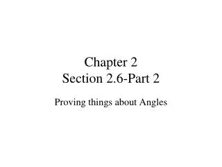
Balancing-symmetrical • Symmetrical, or formal balance, is also known as bilateral symmetry. • It is created by repeating the reverse of a design on the opposite side of the vertical axis; each side, in essence, becomes the mirror image of the other. • Symmetrical balance is considered formal, ordered, stable and quiet. It can also be boring. Symmetrical balance is often used in architecture.
Balancing-asymmetry While symmetry achieves balance through repetition, asymmetry achieves balance through contrast. Asymmetrical, or informal balance, involves different elements that have equal visual weight; the weight is equal but the elements are not identical.
Balancing- symmetrical & asymmetry
Balancing-radial • Radial balance occurs when all the elements radiate out from a central point and the visual weight is distributed equally. • Radial balance creates a strong focal point in the center of the design. Clock faces and daisies are examples of radial balance.
Balancing-crystallographic Crystallographic balance, or an allover pattern, is created by repeating elements of equal weight everywhere. Emphasis is uniform; there is no distinct focal point. Chessboards are examples of crystallographic balance.
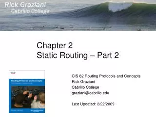
Repetition • Repeating visual elements such as line, color, shape, texture, value or image tends to unify the total effect of a work of art as well as create rhythm. • is the use of similar or connected pictorial elements. For example, similar shapes, colours or lines that are used more than once • can be regular or irregular and even or uneven.
Repetition • Can be in the form of RADIATION where the repeated elements spread out from a central point. • may be in the form of GRADATION where the repeated elements slowly become smaller or larger.
Repetition Sample
Contrast • Refers to the arrangement of opposite elements. • The opposite elements are: • light vs. dark colors • rough vs. smooth textures • large vs. small shapes • Apply to a piece to create visual interest, excitement and drama. • There are THREE (3) main purpose of contrast: • Attractive to the eye • Aid organization of information • Created a focus
Contrast 1. Contrast is attractive to the eye • One of the main reasons to use contrast in your designs, whether for print or web, is to grab attention. • These site design uses contrast to make an impact. The site has large bold text and images, as well as a reversed out, high contrast color scheme.
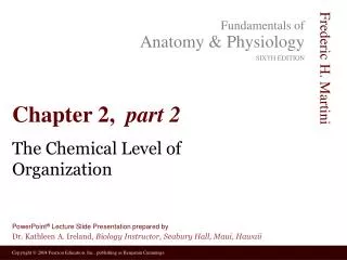
Contrast 2. Contrast aids organization of information • Not only is a page more attractive when contrast is used, but the purpose and organization of the document are much clearer. • In the magazine spread below, studio8 have used Contrast, Balance and Proximity laws to produce an unusual, eye-catching page.
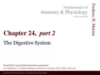
Contrast 3. Contrast creates a focus • The famous adverts for the iPod expertly used contrast to focus the viewers attention on the music player. • The ads featured a silhouetted character on a brightly colored background. The iPod and earphones appear in white and stand out clearly against the silhouettes and colored backgrounds.
Dominance • Dominance is created by contrasting size, positioning, color, style, or shape. • There are THREE (3) types of Dominance: • Dominant • Sub – Dominant • Subordinate
Dominance • Dominant: The element given the most visual weight, the element of primary emphasis. • The dominant element will advance into the foreground in your composition.
Dominance 2. Sub-Dominant: The element(s) of secondary emphasis that will become the middle ground in your composition.
Dominance 3. Subordinate: The elements with tertiary emphasis, given the least visual weight. Subordinate elements will recede into the background of your composition.
This is a good example of dominance used in graphic design. The words “No More War” are the dominant feature of the article and attract the readers attention. The sub-dominant feature is the blue writing and the sub ordinate feature is the article itself.
Unity • Unity is the relationship among the elements of a visual that helps all the elements function together. • Unity gives a sense of oneness to a visual image. In other words, the words and the images work together to create meaning. • Unity helps organize a visual image, facilitating interpretation and understanding.
Unity This visual is confusing. It is hard to see the relationships between the various parts.
Unity With better unity, the visual is now organized and easier to understand
This advertisement for coke shows unity with the colors and shapes and text it uses throughout the entire picture.
Space • Space, in two-dimensional design, is essentially flat; it has height and width, but no depth. • There are certain visual cues, however, that can create the illusion of space in the mind of the viewer. By using those cues, artists and designers can create images that are interpreted as three-dimensional. • There has FOUR (4) types of space: • Size • Overlapping • Compositional • atmospheric
Space-size • Size is one of the easiest ways to create the illusion of space. • A larger image will appear closer than a smaller one because we observed (very early in life) that objects appear to become smaller as they get farther away.
Space-overlapping • Overlapping is another easy way to suggest depth in an image. • When objects overlap each other, the viewer perceives the one that is covering parts of other to be in front and the one that is covered to be in the back.
Space-compositional • Compositional location refers to where a form is positioned vertically in the image.
Space-atmospheric • Atmospheric perspective uses value, contrast and color to give the illusion of space. • Atmospheric perspective is based on the fact that the farther something is away from us, the more the atmospheric haze may obscure our view of it.
THANK YOU END OF CHAPTER 2